


Components
Our components combine to create intuitive interactions and layouts.

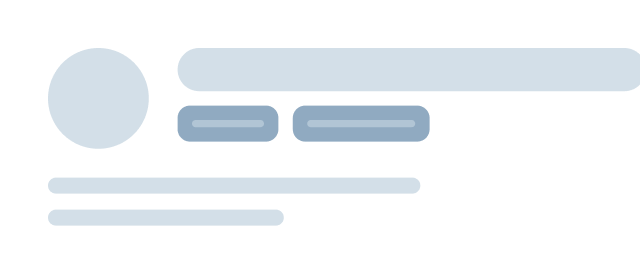
Button
Buttons trigger actions and help users complete tasks or navigate workflows.
Learn more


Avatar
Avatars represent users with an image or their initials.
Learn more
Chip
Chips display selections, filters, or tags in a compact format.
Coming soon

Testimonial
Testimonials showcase customer feedback to provide social proof.
Coming soon
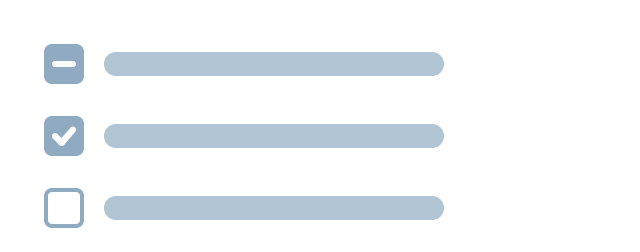
Checkbox
Checkboxes let users select multiple options or toggle individual settings.
Learn more

Pagination
Pagination helps users navigate large data sets or results.
Coming soon

Toggle
Toggles let users turn settings on or off instantly.
Coming soon
Radio
Radio buttons allow users to choose one option from a set of alternatives.
Coming soon

Dropdown
Dropdowns let users select from a list of options within a collapsible menu.
Coming soon
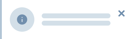
Notification
Eu et integer nunc lorem suspendisse venenatis ac integer.
Learn More

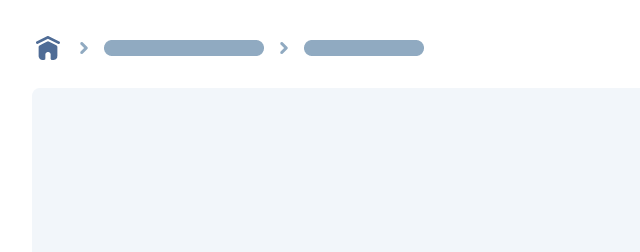
Breadcrumb
Breadcrumbs show users where they are within a site hierarchy.
Coming soon
Text Field
Text fields allow users to enter and edit freeform text.
Learn more

Nested Icon
Nested icons offer consistent visual cues throughout the user interface.
Learn more


Contact Us
Terms
Privacy Policy
Copyright © 2006-2025 Spokeo, Inc.


Components
Our components combine to create intuitive interactions and layouts.
Button
Buttons trigger actions and help users complete tasks or navigate workflows.
Learn more
Notification
Eu et integer nunc lorem suspendisse venenatis ac integer.
Learn More
Accordion
Accordions let users expand and collapse content when needed.
Learn more
Breadcrumb
Breadcrumbs show users where they are within a site hierarchy.
Coming soon
Avatar
Avatars represent users with an image or their initials.
Learn more
Text Field
Text fields allow users to enter and edit freeform text.
Learn more
Checkbox
Checkboxes let users select multiple options or toggle individual settings.
Learn more
Chip
Chips display selections, filters, or tags in a compact format.
Coming soon
Dropdown
Dropdowns let users select from a list of options within a collapsible menu.
Coming soon
Pagination
Pagination helps users navigate large data sets or results.
Coming soon
Radio
Radio buttons allow users to choose one option from a set of alternatives.
Coming soon
Testimonial
Testimonials showcase customer feedback to provide social proof.
Coming soon
Toggle
Toggles let users turn settings on or off instantly.
Coming soon
Nested Icon
Nested icons offer consistent visual cues throughout the user interface.
Learn more

Contact Us
Terms
Privacy Policy
Copyright © 2006-2025 Spokeo, Inc.