

Buttons
Buttons prompt most actions in a UI.
Rationale
#
Component
Rationale
Example actions
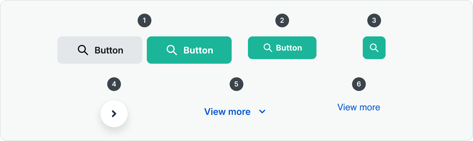
High emphasis - For the primary, most important, or most common action on a screen
1
The standard button group uses color, motion, and shape to capture attention. Use it to show multiple key actions.
Cancel
Save
Dismiss
Ok
2
The most prominent button after the FAB. It’s used for final or unblocking actions in a flow.
Save
Confirm
Done
Medium emphasis: For important actions that don’t distract users from the main task
3
An icon button in a design system is a compact, clickable UI component that uses a recognizable icon without text to represent and trigger a specific action, especially useful where space is limited or the action is familiar to users.
Search
4
The Floating Action Button (FAB) represents the primary or most common action on the screen. The FAB remains in place on scroll such as a back to top button or over a carousel to prompt the user to go to the next item.
Next
Previous
Low emphasis: For optional or supplementary actions with the least amount of prominence
5
The Link Button provides a visually prominent, interactive element that behaves like a hyperlink but is styled like a button.
View More
View All
6
The Hyperlink component provides a consistent, accessible way to present inline or standalone text links.
Vew More
Read More
Read Docs


Contact Us
Terms
Privacy Policy
Copyright © 2006-2025 Spokeo, Inc.


Buttons
Buttons prompt most actions in a UI.

Rationale
#
Component
Rationale
Example actions
High emphasis: For the primary, most important, or most common action on a screen
1
The standard button group uses color, motion, and shape to capture attention. Use it to show multiple key actions.
Cancel
Save
Dismiss
Ok
2
The most prominent button after the FAB. It’s used for final or unblocking actions in a flow.
Save
Confirm
Done
Medium emphasis: For important actions that don’t distract users from the main task
3
An icon button in a design system is a compact, clickable UI component that uses a recognizable icon without text to represent and trigger a specific action, especially useful where space is limited or the action is familiar to users.
Search
4
The Floating Action Button (FAB) represents the primary or most common action on the screen. The FAB remains in place on scroll such as a back to top button or over a carousel to prompt the user to go to the next item.
Next
Previous
Low emphasis: For optional or supplementary actions with the least amount of prominence
5
The Link Button provides a visually prominent, interactive element that behaves like a hyperlink but is styled like a button.
View More
View All
6
The Hyperlink component provides a consistent, accessible way to present inline or standalone text links.
Vew More
Read More
Read Docs

Contact Us
Terms
Privacy Policy
Copyright © 2006-2025 Spokeo, Inc.