

Notifications
Notifications play a crucial role in communicating with users and providing feedback. There are three notification types vary from detailed, inline responses to user actions, to broader system-wide messages.

Table of Contents
Anatomy
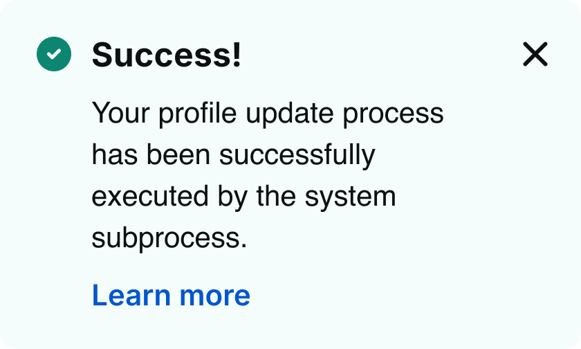
Alert notification
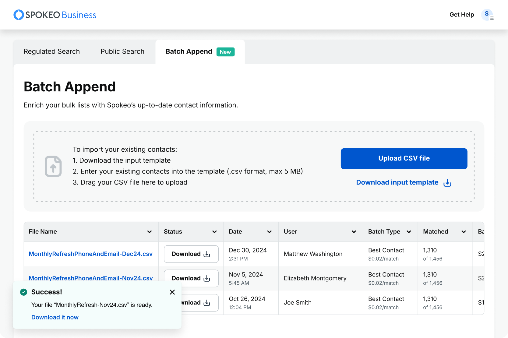
Toast notification
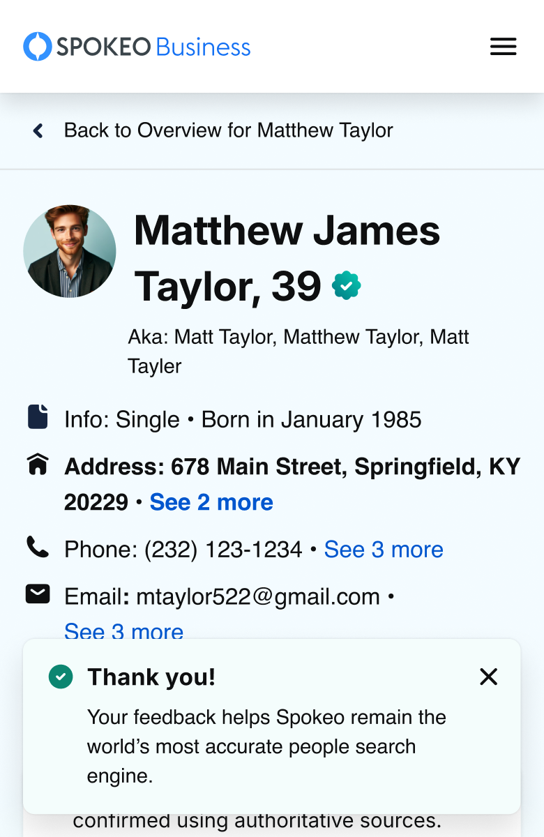
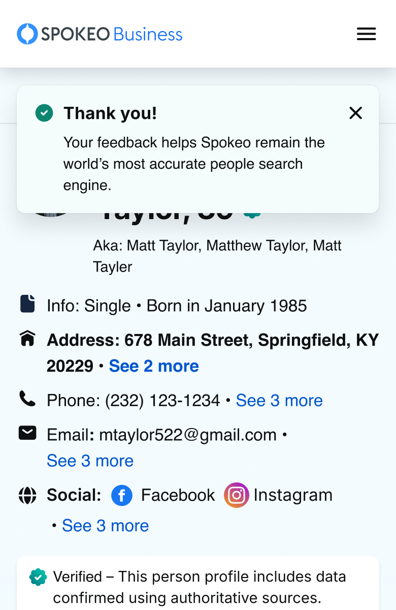
Inline notification
#
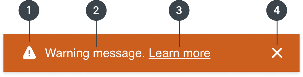
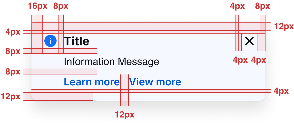
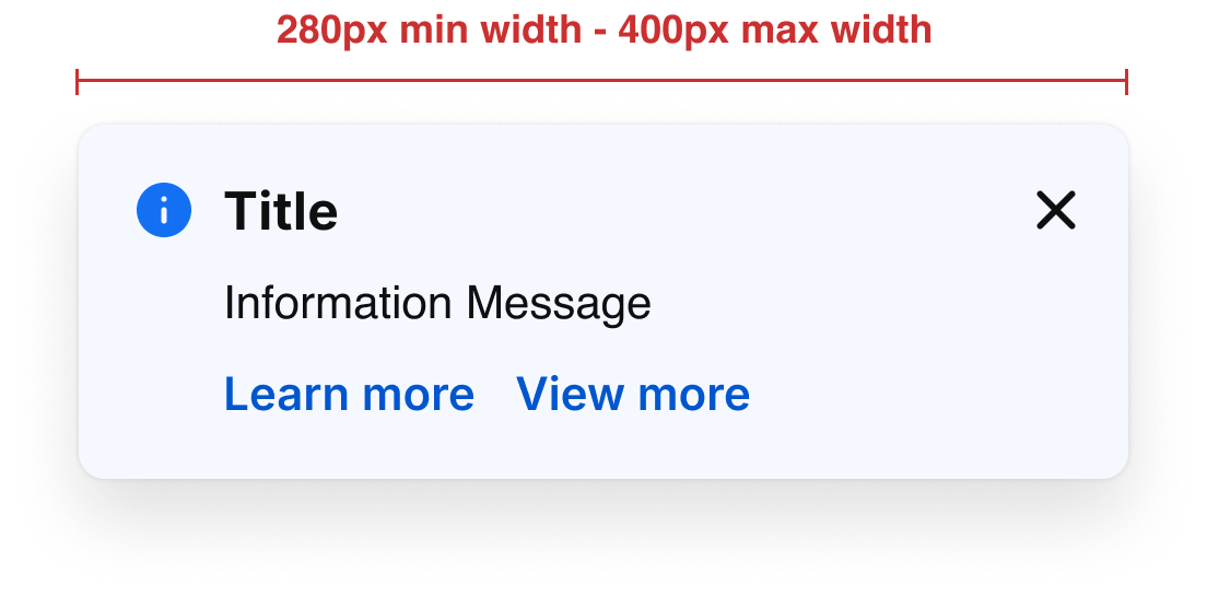
Element
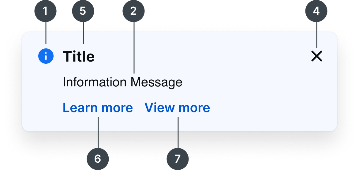
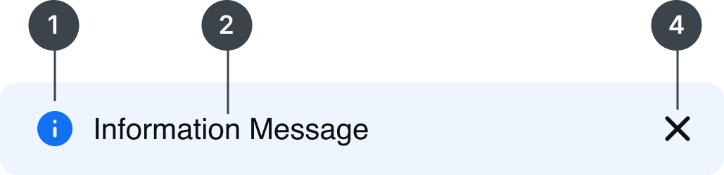
1
Leading Icon
2
Description Text
3
Inline hyperlink (optional)
4
Dismiss
5
Title Text
6
Primary CTA
7
Second CTA
Usage
Notifications play a crucial role in communicating with users and providing feedback. There are three notification types vary from detailed, inline responses to user actions, to broader system-wide messages.
Notification Types
There are three types of notifications in place: in-line, toast, and top hat
Inline
Toast
Alert
Deciding what to use
Notification Types
Usage

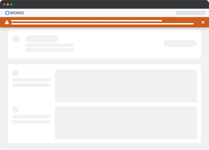
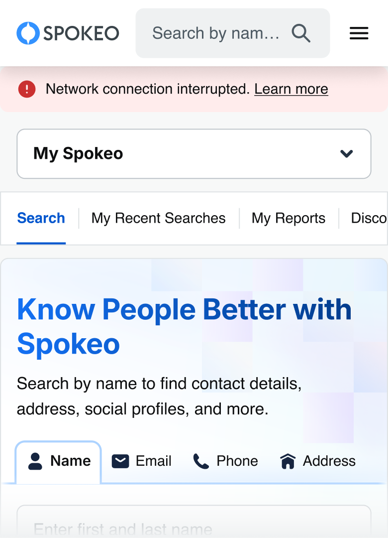
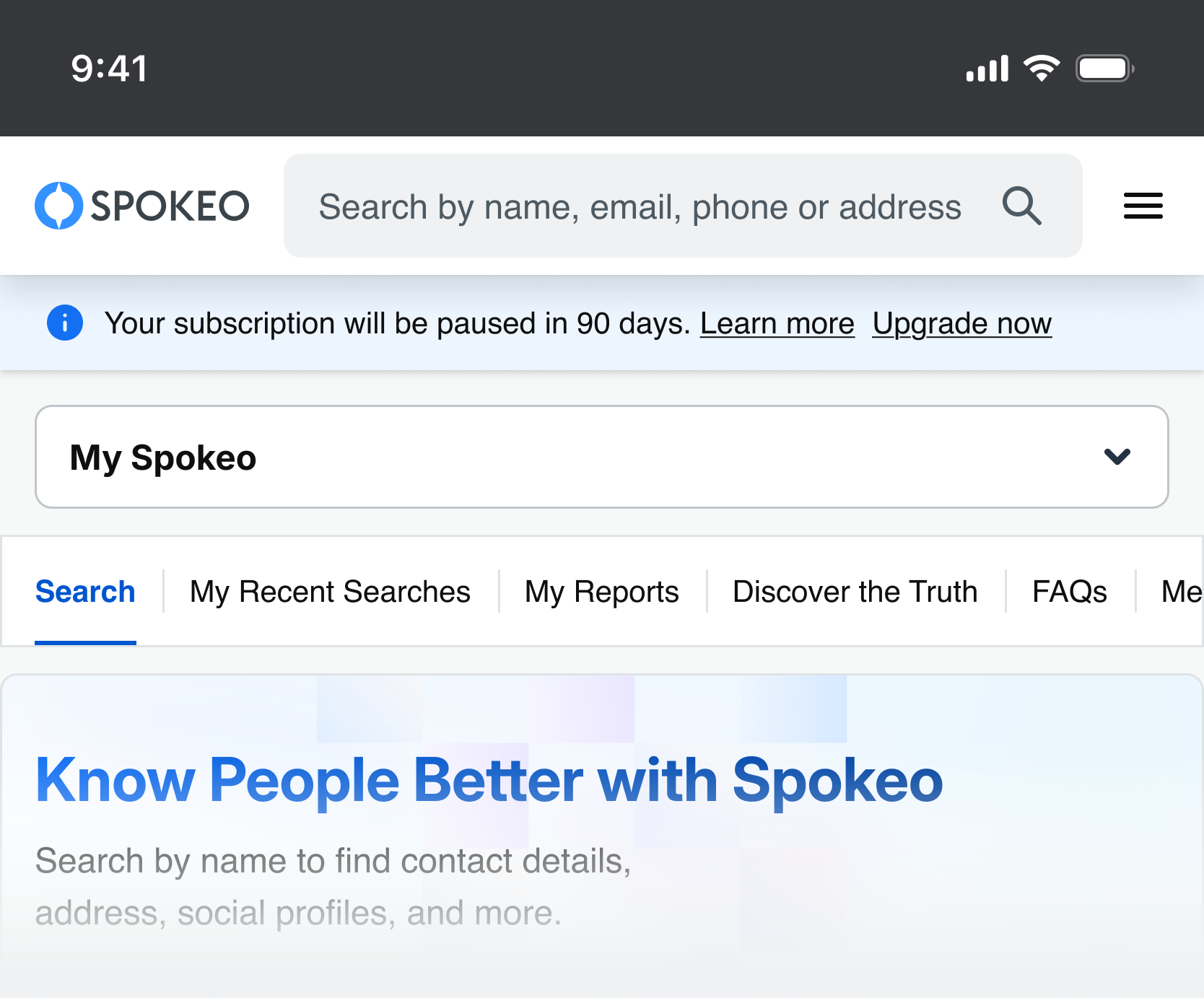
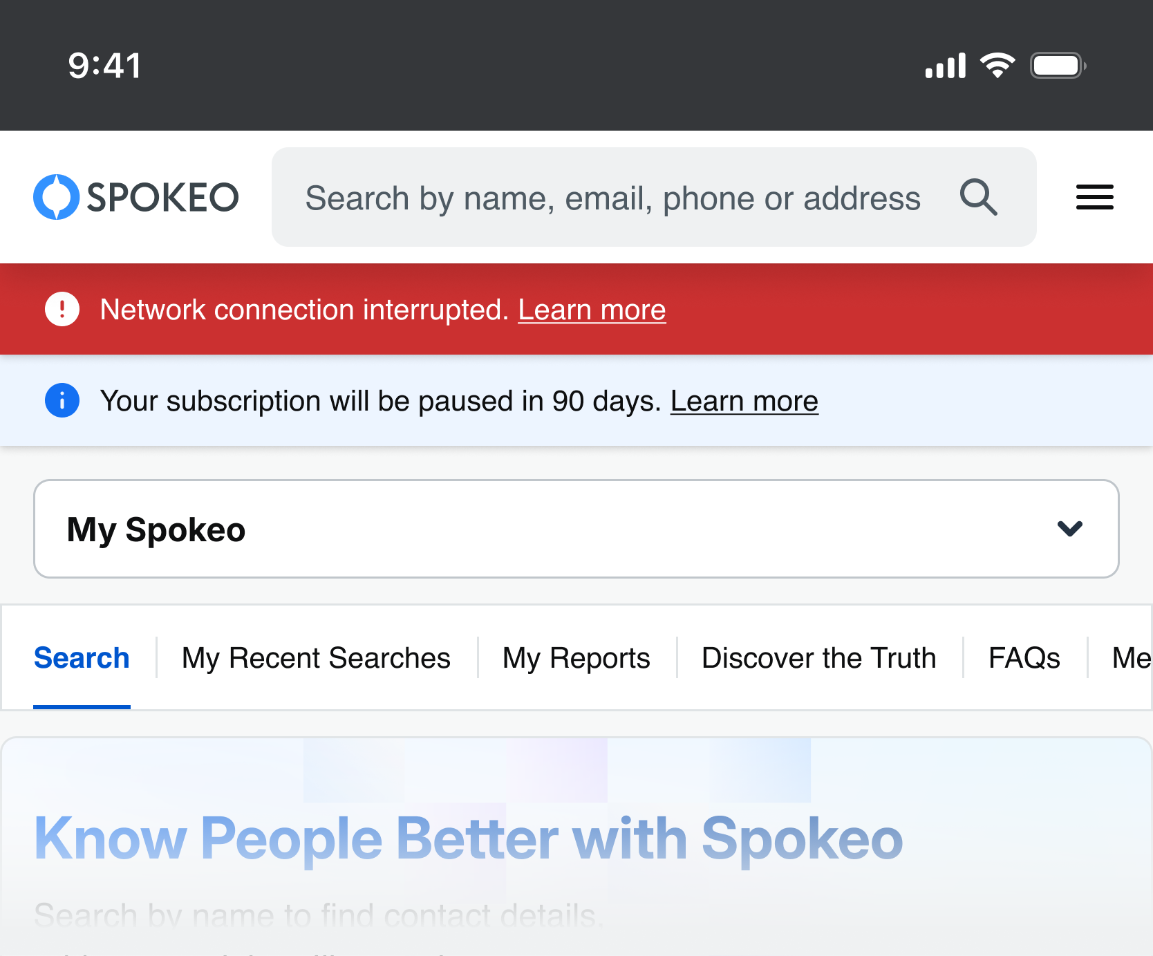
The Alert Notifications are system-generated messages (e.g., lost network connection, trial expired). They load with the page, are visible immediately, and appear at the top of the page below the header, pushing content downward.

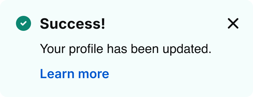
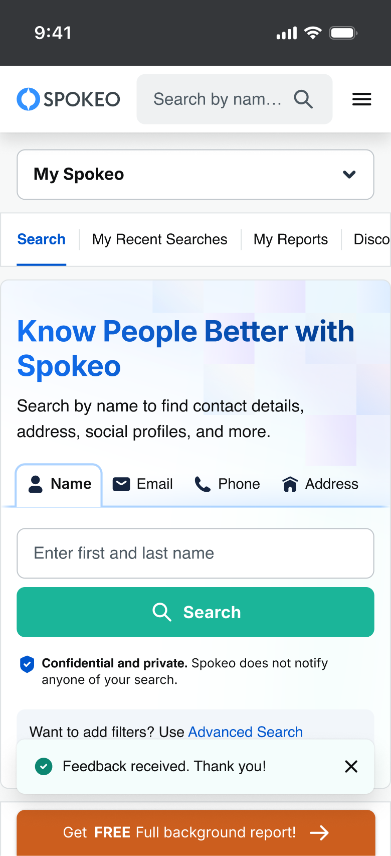
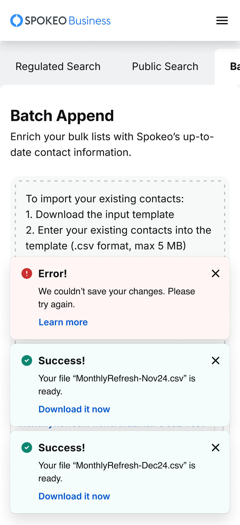
The Toast Notifications are task-generated, time-based messages that slide in and out to provide non-disruptive information (e.g., file ready to download, feedback received), appearing at the bottom left on desktop and the bottom right or center on tablet and mobile.

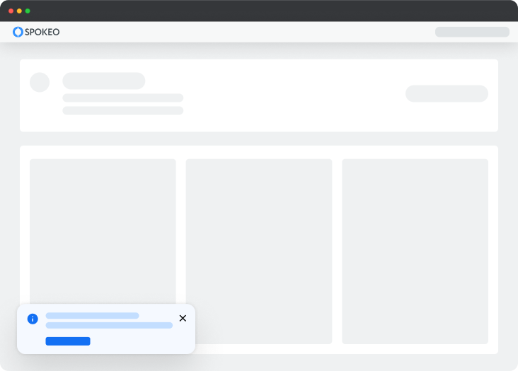
The Inline Notifications are task-generated messages (e.g., check for any typos). They are placed near their related items, and their width varies based on context and page layout.
Notification Status
The available notification status are information, neutral (new), success, warning, and error.
Status
Usage
Action

Information is used to provide additional details about the state or status of something.
Does not require immediate action. It can persist or be dismissed depending on the context

Neutral is used for messages that are neutral in tone and do not require extra attention, compared to information messages.
Does not require immediate action. It can persist or be dismissed depending on the context

Success is used to confirm or communicate that a task was completed as expected.
Typically does not require further action and can persist or be dismissed

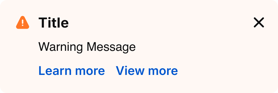
Warning is used to inform users that there may be undesirable or unexpected results.
Often persists until the user dismisses the notification or continues in their task

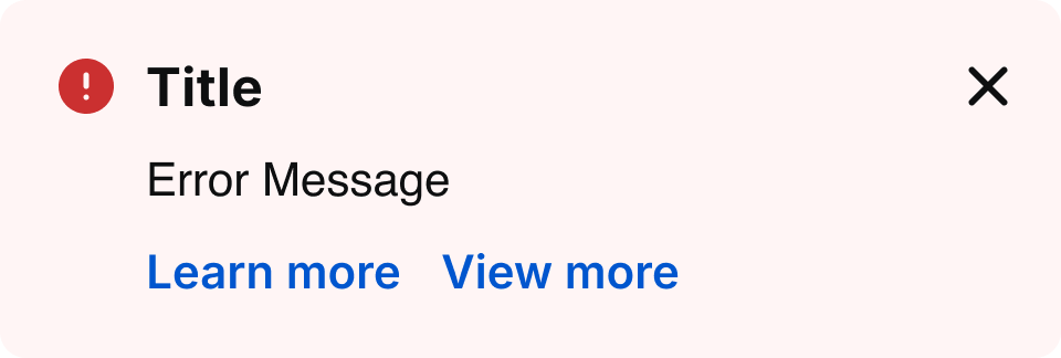
Error is used to inform users of an error or critical failure and may block them from proceeding until the issue is resolved.
Always persists until the user dismisses them or resolves the error
Priority queue rules
To prevent notification overload, only one notifications of the same type may be displayed at a time. They follow a priority queue to determine display order and replacement behavior.
-
One at a time
Only one notification of the same type (toast, alert) may be visible at a time.
-
Higher priority replaces lower priority
If a higher-priority notification is triggered, it immediately replaces any visible lower-priority notification of the same type.
-
Same priority queues
Notifications with the same priority are queued and displayed in the order they are triggered.
-
Lower priority waits or is skipped
If a lower-priority notification is triggered while a higher-priority one is active, it is queued or suppressed based on its dismiss behavior.
Priority
Notification type
Behavior
1
Error
Overrides lower-priority notifications. If same priority, placed next in queue.
2
Warning
Is placed in queue at second-level priority.
3
Success
Is placed next in the queue; if auto-dismiss, it can be replaced by higher-priority notifications.
4
Informative
Is placed next in the queue; if auto-dismiss, it can be replaced by higher-priority notifications.
5
Neutral
Is placed next in the queue; if auto-dismiss, it can be replaced by higher-priority notifications.
Specifications
Placeholder text for specifications of the component.
Alert
Specs for alert notification banner:
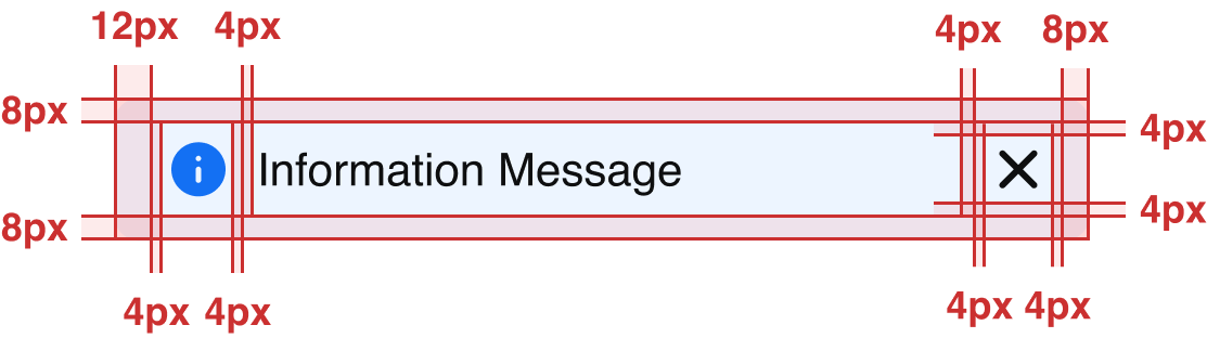
Spacing
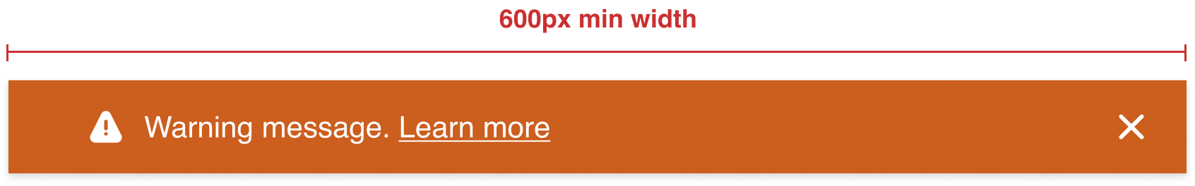
Device size: 1400-600
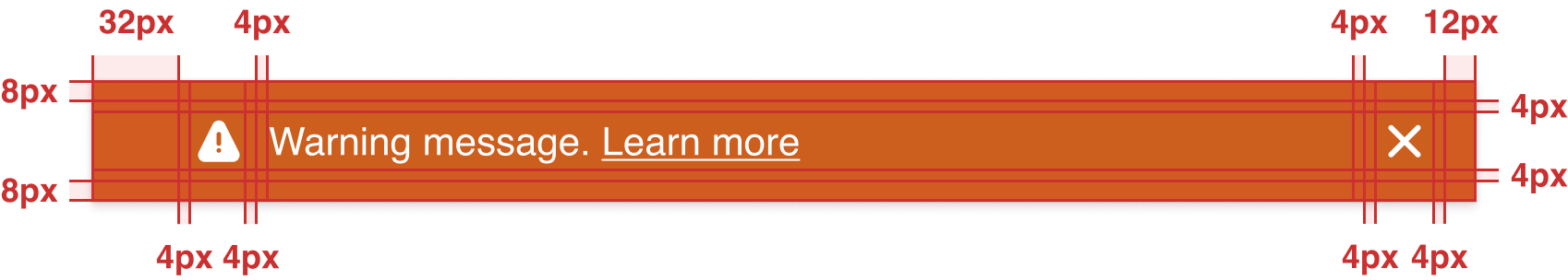
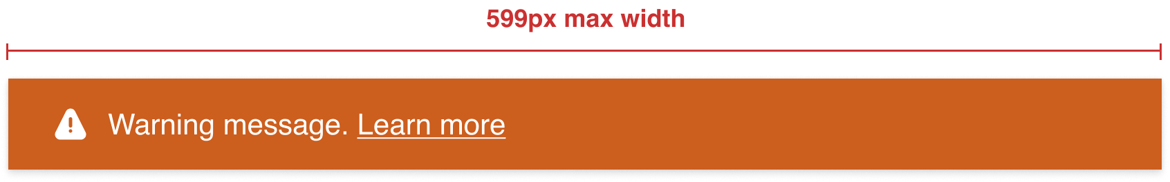
Device size: ≤599
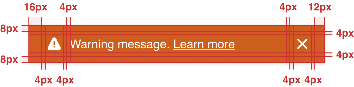
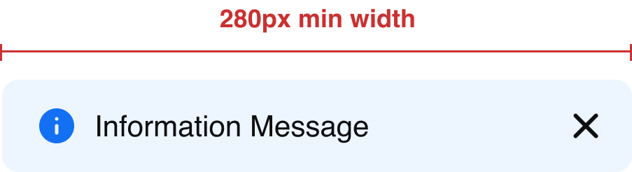
Width
Device size: 1400-600
Device size: ≤599
Status
Info

Warning

Error

Toast
Specs for toast notification banner:
Spacing
Width
Status
Info

Success

Warning
Error
In-Line
Specs for in-line notification banner:
Spacing
Width
Status
Info
Success

Warning

Error

Neutral

Best Practices


Do: Use an Alert notification for system-level message.


Don’t: Use an Inline notification for system-level message.
Do: Push content down when using Alert notifications to avoid multiple sticky elements at the top.

Don’t: Overlay content when using Alert notifications to keep the top section clean.
Don’t: Include more than one action in an Alert notification, as multiple actions can overwhelm users and make it harder to decide what to do next.
Don’t: Show multiple Alert notifications at the same time; when multiple alerts are triggered, they should follow a priority queue and a higher-priority alert should replace a lower-priority one until addressed.
Do: Use clear and concise language.
Don’t: Use overly long or technical wording.
Do: Use the Toast notification for task-generated message and place it at the bottom left of the page.
Do: Place Toast notifications at the bottom of the page.
Don’t: Place Toast notifications at the top of the page.
Do: Place Toast notifications above floating buttons on mobile.
Don’t: Show multiple Toast notifications at the same time; when multiple toasts are triggered, they should follow a priority queue and a higher-priority toast should replace a lower-priority one until addressed.


Do: Add inline links at the end of a sentence for inline notifications if needed.
Reference
Stay up to date with the latest UX decisions, patterns, and component updates in our product.


Contact Us
Terms
Privacy Policy
Copyright © 2006-2025 Spokeo, Inc.


Notifications
Notifications play a crucial role in communicating with users and providing feedback. There are three notification types vary from detailed, inline responses to user actions, to broader system-wide messages.


Table of Contents
Anatomy
Alert notification
Toast notification
Inline notification
#
Element
1
Leading Icon
2
Description Text
3
Inline hyperlink (optional)
4
Dismiss
5
Title Text
6
Primary CTA
7
Second CTA
Usage
Notifications play a crucial role in communicating with users and providing feedback. There are three notification types vary from detailed, inline responses to user actions, to broader system-wide messages.
Notification Types
There are three types of notifications in place: alert, toast, and inline.
Alert
Toast
Inline
Deciding what to use
Notification Types
Usage
The Alert Notifications are system-generated messages (e.g., lost network connection, trial expired). They load with the page, are visible immediately, and appear at the top of the page below the header, pushing content downward.
The Toast Notifications are task-generated, time-based messages that slide in and out to provide non-disruptive information (e.g., file ready to download, feedback received), appearing at the bottom left on desktop and the bottom right or center on tablet and mobile.
The Inline Notifications are task-generated messages (e.g., check for any typos). They are placed near their related items, and their width varies based on context and page layout.
Notification Status
The available notification status are information, neutral (new), success, warning, and error.
Status
Usage
Action
Information is used to provide additional details about the state or status of something.
Does not require immediate action. It can persist or be dismissed depending on the context
Neutral is used for messages that are neutral in tone and do not require extra attention, compared to information messages.
Does not require immediate action. It can persist or be dismissed depending on the context
Success is used to confirm or communicate that a task was completed as expected.
Typically does not require further action and can persist or be dismissed
Warning is used to inform users that there may be undesirable or unexpected results.
Often persists until the user dismisses the notification or continues in their task
Error is used to inform users of an error or critical failure and may block them from proceeding until the issue is resolved.
Always persists until the user dismisses them or resolves the error
Priority queue rules
To prevent notification overload, only one notifications of the same type may be displayed at a time. They follow a priority queue to determine display order and replacement behavior.
-
One at a time
Only one notification of the same type (toast, alert) may be visible at a time.
-
Higher priority replaces lower priority
If a higher-priority notification is triggered, it immediately replaces any visible lower-priority notification of the same type.
-
Same priority queues
Notifications with the same priority are queued and displayed in the order they are triggered.
-
Lower priority waits or is skipped
If a lower-priority notification is triggered while a higher-priority one is active, it is queued or suppressed based on its dismiss behavior.
Priority
Notification type
Behavior
1
Error
Overrides lower-priority notifications. If same priority, placed next in queue.
2
Warning
Is placed in queue at second-level priority.
3
Success
Is placed next in the queue; if auto-dismiss, it can be replaced by higher-priority notifications.
4
Informative
Is placed next in the queue; if auto-dismiss, it can be replaced by higher-priority notifications.
5
Neutral
Is placed next in the queue; if auto-dismiss, it can be replaced by higher-priority notifications.
Specifications
Placeholder text for specifications of the component.
Alert
Specs for alert notification banner:
Spacing
Device size: 1400-600
Device size: ≤599
Width
Device size: 1400-600
Device size: ≤599
Status
Info
Warning
Error
Toast
Specs for toast notification banner:
Spacing
Width
Status
Info
Success
Warning
Error
In-Line
Specs for in-line notification banner:
Spacing
Width
Status
Info
Success
Warning
Error
Neutral
Neutral

Neutral Message

Best Practices

Do: Use an Alert notification for system-level message.

Don’t: Use an Inline notification for system-level message.
Do: Push content down when using Alert notifications to avoid multiple sticky elements at the top.
Don’t: Overlay content when using Alert notifications to keep the top section clean.

Don’t: Include more than one action in an Alert notification, as multiple actions can overwhelm users and make it harder to decide what to do next.
Don’t: Show multiple Alert notifications at the same time; when multiple alerts are triggered, they should follow a priority queue and a higher-priority alert should replace a lower-priority one until addressed.
Do: Use clear and concise language.
Don’t: Use overly long or technical wording.

Do: Use the Toast notification for task-generated message and place it at the bottom left of the page.
Do: Place Toast notifications at the bottom of the page.
Don’t: Place Toast notifications at the top of the page.
Do: Place Toast notifications above floating buttons on mobile.
Don’t: Show multiple Toast notifications at the same time; when multiple toasts are triggered, they should follow a priority queue and a higher-priority toast should replace a lower-priority one until addressed.
Do: Add inline links at the end of a sentence for inline notifications if needed.
Reference
Stay up to date with the latest UX decisions, patterns, and component updates in our product.

Contact Us
Terms
Privacy Policy
Copyright © 2006-2025 Spokeo, Inc.