

Nested Icon
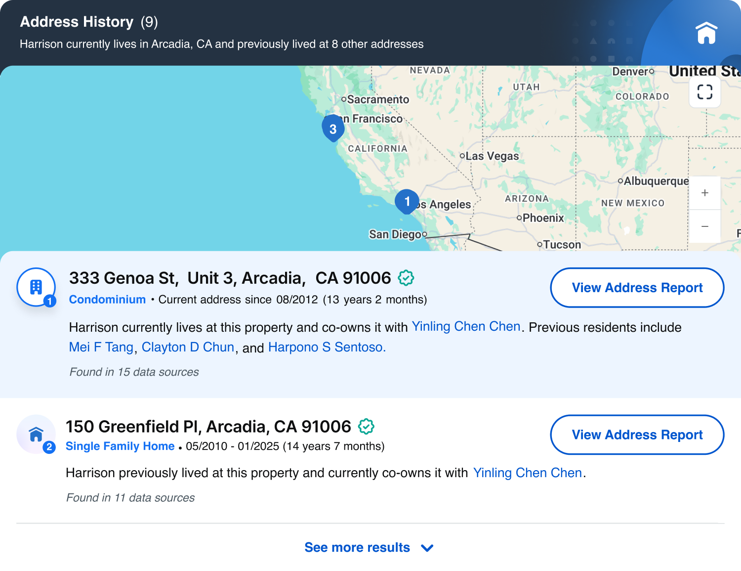
Spokeo uses nested icons to help users recognize and scan different categories of data. They combine a main icon with a supporting subicon and include status variations like available, unavailable, or deactivated.

Table of Contents
Specifications
Anatomy
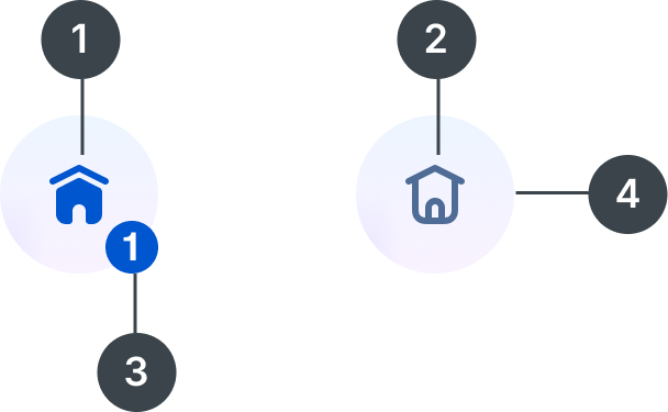
#
Element
1
Solid icon
2
Line icon
3
Subicon
4
Container

Usage
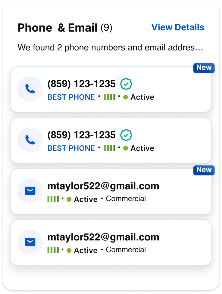
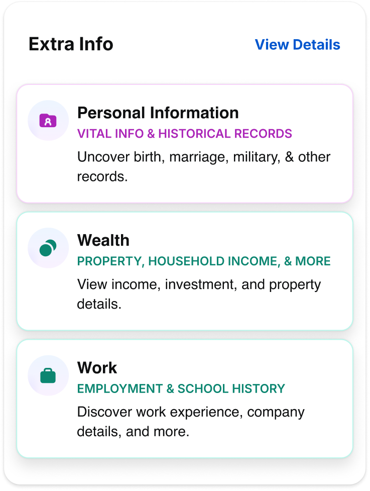
Nested icons are typically used on profile preview and detail pages to help users scan different data categories more efficiently.
Types
When to Use

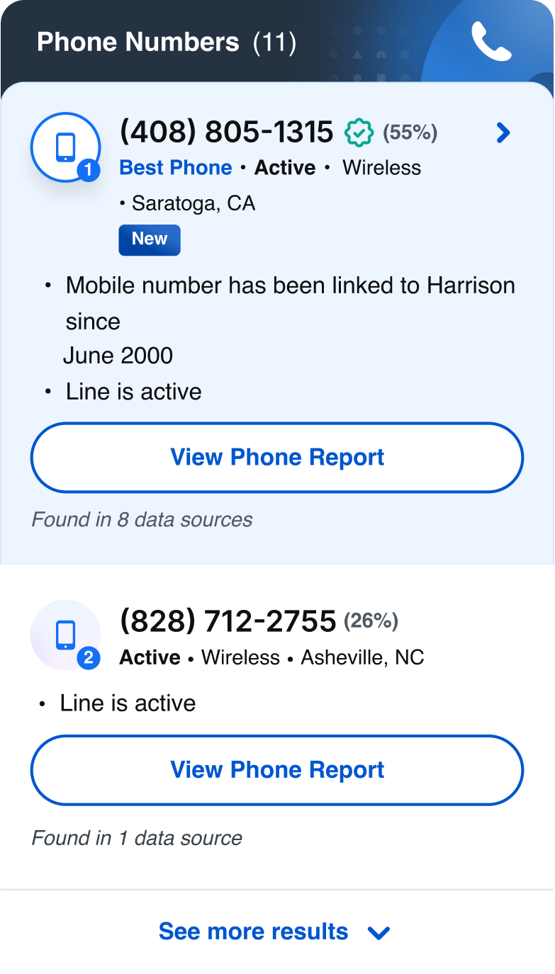
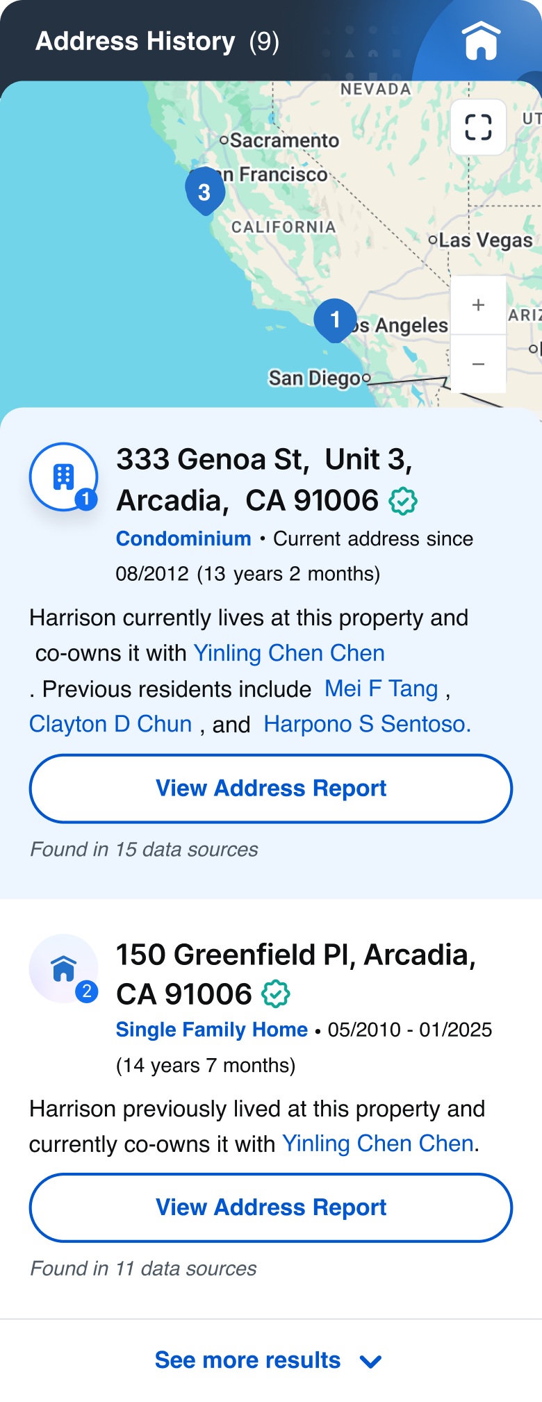
The Colored Nested Icon is used to highlight the best or primary data. It’s designed to stand out on colored backgrounds, with a drop shadow for extra emphasis.

The Inverted Nested Icon can be used in marketing ad banners to help draw attention to key content. Its high-contrast style works well in promotional moments.

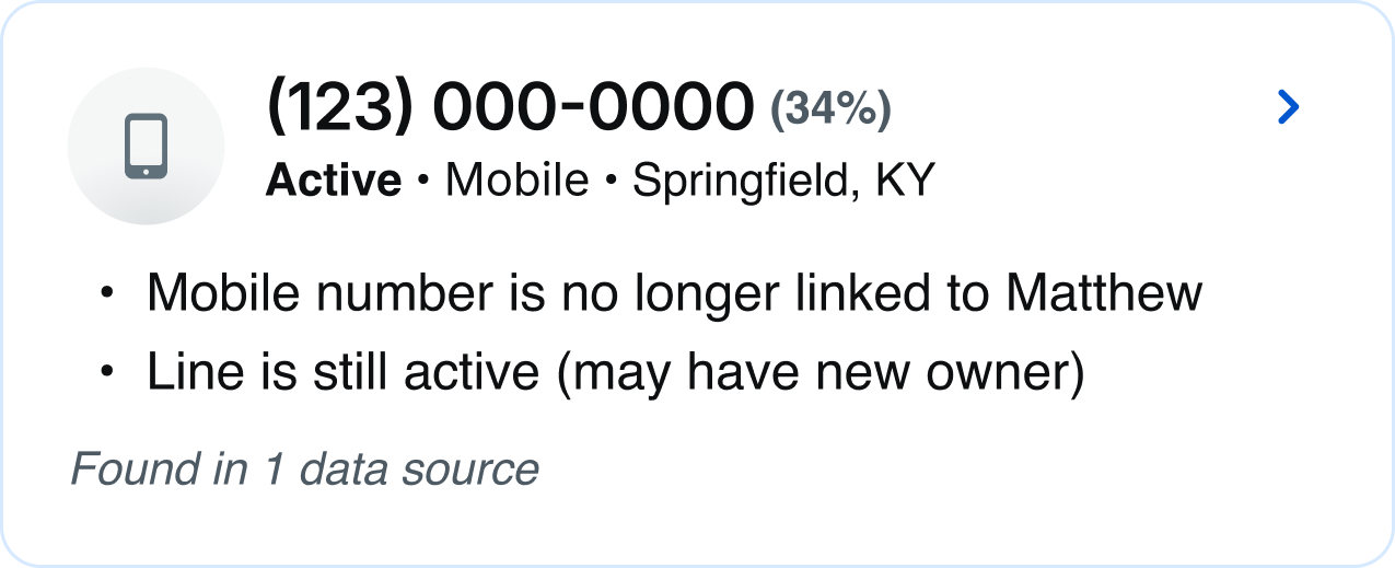
The Gradient Solid Nested Icon is our most commonly used style and works best on white backgrounds, making it ideal for most cases. The solid icon also indicates that results are available.

The Gradient Line Nested Icon is used when there’s no available info or no results.

The Neutral Nested Icon is used when results are found, but the source is deactivated or disabled.
Specifications
Sizes

Size:
144px

Size:
96px

Size:
80px

Size:
64px
Size:
48px

Size:
40px

Size:
28px

Size:
24px
Color
The default color options adhere to our product category colors and accessibility standards, but color and icon can be adjusted depending on context and use case. Learn more about color usage.
Default color:
Blue 700
Blue 700 is recommended for communication-based categories such as phone, email, and address.


Default color:
Magenta 700
Magenta 700 is recommended for personal information such as family members, household, interests, and birth and marital data.


Default color:
Purple 700
Purple 700 is recommended for social media information, accounts, and digital identity.


Default color:
Orange 700
Orange 700 is recommended for public records such as historical records, birth records, marriage records, census data, and court and criminal records.


Default color:
Teal 700
Teal 700 is recommended for professional information such as wealth, assets, and employment.


Custom color:
Blue Grey 900
Designers can customize colors as needed, as long as they meet accessibility requirements and align with Spokeo’s color palette.
Subicon
Subicons are recommended for use at the following sizes:


Sizes:
144px, 96px, 80px, 64px, 48px, 40px
Best Practices


Do: Use the Gradient Solid Nested Icon to show different categories of data.
Do: Use the Gradient-Solid Nested Icon for accordions.
Do: Use the Colored Nested Icon for primary or best matched results, and use the Gradient Nested Icon for secondary matches
Do: Use the Colored Nested Icon on colored backgrounds


Don’t: Use the Gradient-Solid Nested Icon on colored backgrounds.

Do: Use the Gradient Line Nested Icon when there are no results (e.g., no work history found)
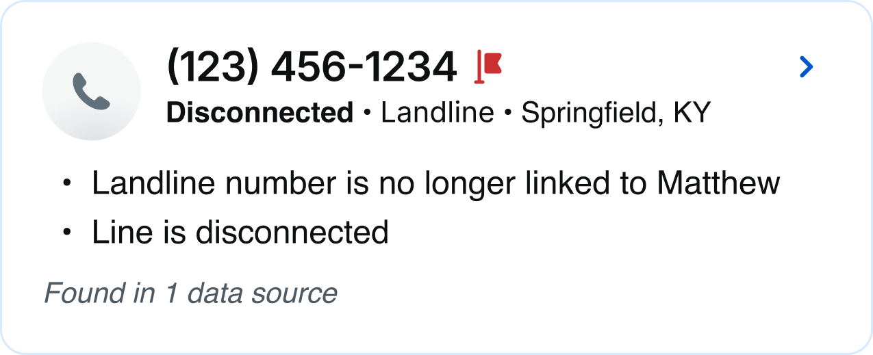
Do: Use the Neutral Nested Icon when results are found, but the source is deactivated or disabled

Do: Use the Neutral Nested Icon with the company icon kept in its original full color to reflect an inactive state
Related
Stay up to date with the latest UX decisions, patterns, and component updates in our product.


Contact Us
Terms
Privacy Policy
Copyright © 2006-2025 Spokeo, Inc.


Nested Icon
Spokeo uses nested icons to help users recognize and scan different categories of data. They combine a main icon with a supporting subicon and include status variations like available, unavailable, or deactivated.


Table of Contents
Anatomy
#
Element
1
Solid icon
2
Line icon
3
Subicon
4
Container

Usage
Nested icons are typically used on profile preview and detail pages to help users scan different data categories more efficiently.
Types
When to Use
The Colored Nested Icon is used to highlight the best or primary data. It’s designed to stand out on colored backgrounds, with a drop shadow for extra emphasis.
The Inverted Nested Icon can be used in marketing ad banners to help draw attention to key content. Its high-contrast style works well in promotional moments.
The Gradient Solid Nested Icon is our most commonly used style and works best on white backgrounds, making it ideal for most cases. The solid icon also indicates that results are available.
The Gradient Line Nested Icon is used when there’s no available info or no results.
The Neutral Nested Icon is used when results are found, but the source is deactivated or disabled.
Specifications
Sizes
Size:
144px
Size:
96px
Size:
80px
Size:
64px
Size:
48px
Size:
40px
Size:
28px
Size:
24px
Color
The default color options adhere to our product category colors and accessibility standards, but color and icon can be adjusted depending on context and use case. Learn more about color usage.
Default color:
Blue 700
Blue 700 is recommended for communication-based categories such as phone, email, and address.
Default color:
Magenta 700
Magenta 700 is recommended for personal information such as family members, household, interests, and birth and marital data.
Default color:
Purple 700
Purple 700 is recommended for social media information, accounts, and digital identity.
Default color:
Orange 700
Orange 700 is recommended for public records such as historical records, birth records, marriage records, census data, and court and criminal records.
Default color:
Teal 700
Teal 700 is recommended for professional information such as wealth, assets, and employment.
Custom color:
Blue Grey 900
Designers can customize colors and icons as needed, as long as they meet accessibility requirements and align with Spokeo’s color palette.
Subicon
Subicons are recommended for use at the following sizes:
Sizes:
144px, 96px, 80px, 64px, 48px, 40px
Best Practices

Do: Use the Gradient Solid Nested Icon to show different product categories
Do: Use the Gradient Solid Nested Icon for accordions
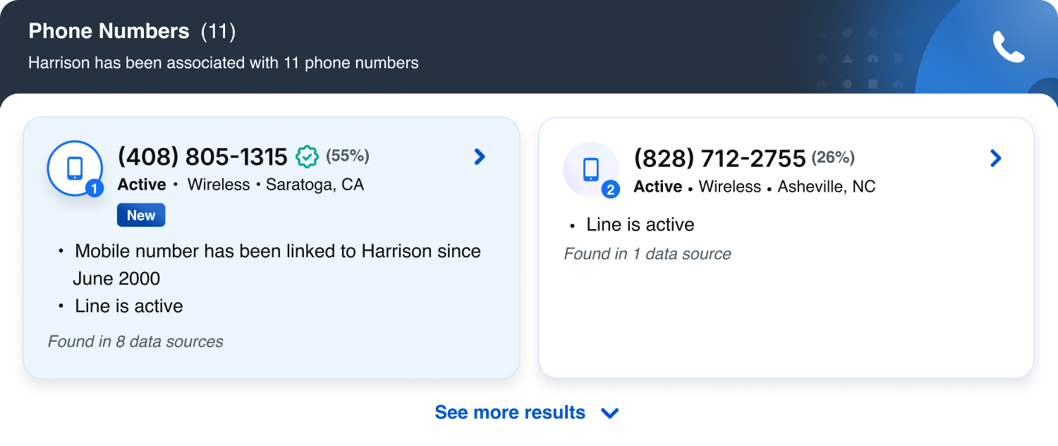
Do: Use the Colored Nested Icon for primary or best matched results, and use the Gradient Nested Icon for secondary matches

Do: Use the Colored Nested Icon on colored backgrounds

Don’t: Use the Gradient Solid Nested Icon on colored backgrounds

Do: Use the Gradient Line Nested Icon when there are no results (e.g., no work history found)
Do: Use the Neutral Nested Icon when results are found, but the source is deactivated or disabled
Do: Use the Neutral Nested Icon with the company icon kept in its original full color to reflect an inactive state
Related
Stay up to date with the latest UX decisions, patterns, and component updates in our product.

Contact Us
Terms
Privacy Policy
Copyright © 2006-2025 Spokeo, Inc.