

Text Field
A flexible input element for capturing brief user information. It supports labels, helper text, error states, and optional icons, with variants for size and states. Designed for consistency across forms and adaptable to various layouts.

Table of Contents
Usage
Anatomy


First Name
Please limit first name to 60 characters
1

2

3

Password
•••••••••

Use a minimum of 8 characters with at least 1 number
4

5


6
#
Element
1
Leading Icon
2
Placeholder *Required
3
Hint Text
4
Label
5
Trailing Icon
6
Progress Bar

Usage
Basic
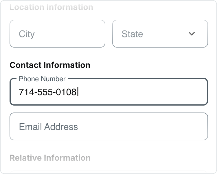
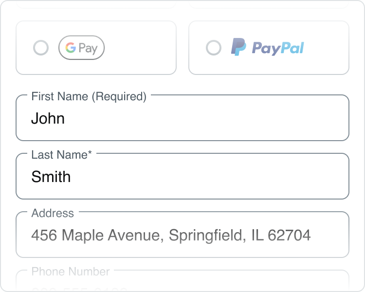
Basic input fields are designed to gather personal details from users, such as their name, address, phone number, and email.
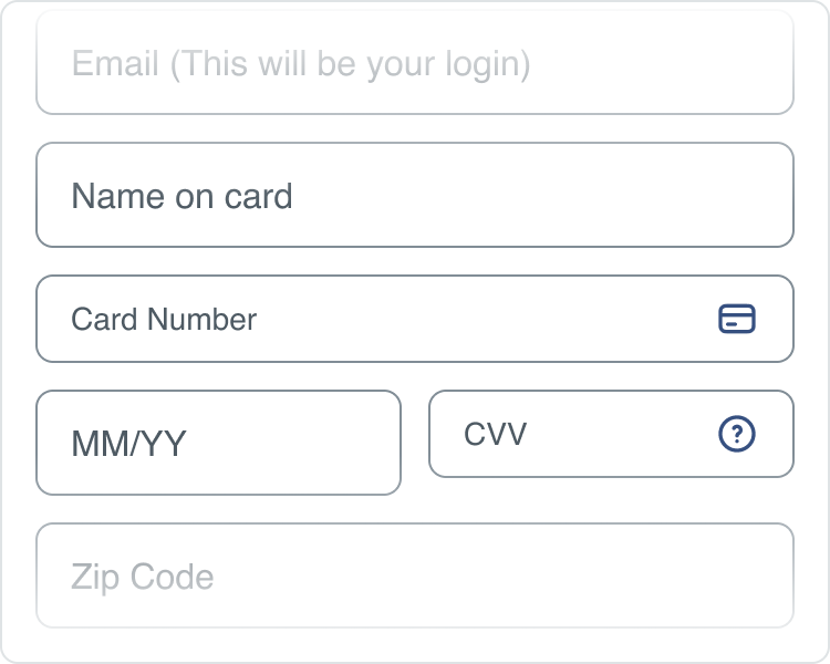
Payment
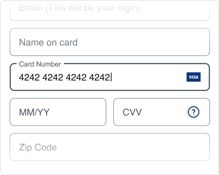
Payment input fields are crafted to securely gather sensitive payment details. They usually feature spaces for the card number, expiration date, and CVV, and have the ability to display credit card icons by default.
Password
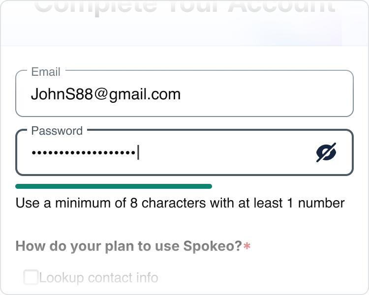
Password input typically include spaces for the password and a validation progress bar that visually indicates the strength of the entered password. Additionally, these fields often feature hints or icons to guide users in creating a strong password.
States
Basic
Default
First Name
Placeholder Text: spk.color.text.secondary
Container: spk.color.surface.container
Outline: spk.color.grey.500
Filled
John Smith
First Name
Label Text: spk.color.text.secondary
Text Field: spk.color.text.primary
Container: spk.color.surface.container
Outline: spk.color.grey.500
Active
First Name
John Smith

Label Text: spk.color.text.secondary
Text Field: spk.color.text.primary
Container: spk.color.surface.container
Outline: spk.color.grey.700
Error
First Name
John Smith

Please limit first name to 60 characters
Label and Hint Text: spk.color.text.error
Text Field: spk.color.text.primary
Container: spk.color.surface.container
Outline and Icons: spk.color.error
Success
First Name
John Smith

Verified Name
Label Text: spk.color.text.secondary
Text Field: spk.color.text.primary
Hint Text: spk.color.text.success
Container: spk.color.surface.container
Outline and Icons: spk.color.success
Disabled
First Name
Text and Outline: spk.color.grey.300
Container: spk.color.surface.container
Payment
Default
Card Number


Placeholder Text: spk.color.text.secondary
Container: spk.color.surface.container
Outline: spk.color.grey.500
Icon: spk.color.blueGrey.700
Filled
Card Number
4242 4242 4242 4242


Label Text: spk.color.text.secondary
Text Field: spk.color.text.primary
Container: spk.color.surface.container
Outline: spk.color.grey.500
Active
Card Number
4242 4242 4242 4242
Label Text: spk.color.text.secondary
Text Field: spk.color.text.primary
Container: spk.color.surface.container
Outline: spk.color.grey.700
Error
Card Number
4242 4242 4242 4242
Please enter a valid credit card number
Label and Hint Text: spk.color.text.error
Text Field: spk.color.text.primary
Container: spk.color.surface.container
Outline and Icons: spk.color.error
Success
Card Number
4242 4242 4242 4242
Field validation is successful
Label Text: spk.color.text.secondary
Text Field: spk.color.text.primary
Hint Text: spk.color.text.success
Container: spk.color.surface.container
Outline and Icons: spk.color.success
Disabled
Card Number


Text and Outline: spk.color.grey.300
Container: spk.color.surface.container
Icon: spk.color.blueGrey.300
Password
Default
Password
Use a minimum of 8 characters with at least 1 letter and 1 number
Placeholder Text: spk.color.text.secondary
Container: spk.color.surface.container
Outline: spk.color.grey.500
Icon: spk.color.blueGrey.900
Progressbar: spk.color.grey.300
Hint: spk.color.text.primary
Filled
Password
•••••••••
Use a minimum of 8 characters with at least 1 number
Label Text: spk.color.text.secondary
Text Field and Hint: spk.color.text.primary
Container: spk.color.surface.container
Outline: spk.color.grey.500
Icon: spk.color.blueGrey.900
Progressbar: spk.color.grey.300
Progress: spk.color.error
Active
Password
•••••••••
Use a minimum of 8 characters with at least 1 number
Label Text: spk.color.text.secondary
Text Field and Hint: spk.color.text.primary
Container: spk.color.surface.container
Outline: spk.color.grey.700
Icon: spk.color.blueGrey.900
Progressbar: spk.color.grey.300
Progress: spk.color.error
Error
Password
•••••••••
Use a minimum of 8 characters with at least 1 number
Label: spk.color.text.error
Text Field and Hint: spk.color.text.primary
Container: spk.color.surface.container
Outline: spk.color.error
Icon: spk.color.blueGrey.900
Progressbar: spk.color.grey.300
Progress: spk.color.warning
Success
Password
•••••••••
Your password is ready to go
Label,Text Field and Hint: spk.color.text.primary
Container: spk.color.surface.container
Outline: spk.color.success
Icon: spk.color.blueGrey.900
Progressbar: spk.color.grey.300
Progress: spk.color.success
Disabled
Password

Text and Outline: spk.color.grey.300
Container: spk.color.surface.container
Icon: spk.color.blueGrey.300
Password
Specifications
Specifications for text fields include a standard width of 300 pixels, a height of 40 pixels, and a minimum spacing of 8 pixels from surrounding elements. These dimensions ensure usability and accessibility, allowing for a seamless user experience.
Height
John Smith
First Name
48px
Size:
Medium
Medium text field is recommended for advanced desktop search forms.
John Smith
First Name
40px
Size:
Small
Small text field is recommended for advanced mobile search forms.
Spacing
Basic
John Smith
First Name
4px
4px
16px
16px
12px
12px
Medium text field with no icon
John Smith
First Name
4px
4px
16px
16px
10px
10px
Small text field with no icon
First Name
8px
24x24px icon
Medium text field with icon


First Name
4px
20x20px icon
Small text field with icon
First Name
John Smith
Verified Name
8px
4px
4px
20x20px icon
Medium text field with validation
First Name
John Smith
Verified Name
4px
8px
4px
20x20px icon
Small text field with validation

Payment
Card Number
16px
16px
12px
12px
24x24px icon
8px
Medium text field with default icon
Card Number


16px
16px
10px
10px
20x20px icon
4px
Small text field with default icon
Card Number
4242 4242 4242 4242


24w icon
4px
8px
Medium text field with multiple CC icons
Card Number
4242 4242 4242 4242
24w icon
4px
8px
Small text field with multiple CC icons
Password
Password
•••••••••
Use a minimum of 8 characters with at least 1 number
16px
16px
12px
8px
8px
12px
8px
24x24px icon
Medium text field with progress bar
Password
•••••••••

Use a minimum of 8 characters with at least 1 number
16px
16px
12px
8px
8px
12px
8px
20x20px icon
Small text field with progress bar
Card Number
4242 4242 4242 4242
24w icon
4px
8px
Medium text field with multiple CC icons
Card Number
4242 4242 4242 4242
24w icon
4px
8px
Small text field with multiple CC icons
Best Practices
First Name


Do: Use placeholder text to guide users on the expected data for each field.
Must match ID on file


Don’t: Avoid placing crucial info in placeholder text, as it vanishes when users type. Instead, use the Hint.
First Name
John Smith
Verified Name
Do: Show validation messages close to the relevant field to help users easily comprehend and make necessary edits.
Email*
First Name
Field Required.
Please enter a valid email address.
Don’t: Avoid showing multiple validation messages at once, as this can frustrate users and increase the likelihood of them abandoning the process.
800-980-2440
Phone Number
Do: Keep label short, clear, and fully visible.
800-980-2440
Best Phone Number to Reach you at
Don’t: Avoid lengthy labels that may truncate or span multiple lines.
Card Number
4242 4242 4242 4242
Please enter a valid credit card number
Do: Swap supporting text with error text.
Card Number
4242 4242 4242 4242
Required
Please enter a valid credit card number
Don’t: Add error text in addition to supporting text.
Do: Spell out “(Required)” for required input fields.
Don’t: Mix style for required fields as it may create confusion.
Don’t: Mix sizes of text fields between small and medium within a form.
Related Links
Stay up to date with the latest UX decisions, patterns, and component updates in our product.


Contact Us
Terms
Privacy Policy
Copyright © 2006-2025 Spokeo, Inc.


Text Field
A flexible input element for capturing brief user information. It supports labels, helper text, error states, and optional icons, with variants for size and states. Designed for consistency across forms and adaptable to various layouts.


Table of Contents
Anatomy
First Name
Please limit first name to 60 characters
1

2

3

Password
•••••••••
Use a minimum of 8 characters with at least 1 number
4
5


6
#
Element
1
Leading Icon
2
Placeholder *Required
3
Hint Text
4
Label
5
Trailing Icon
6
Progress Bar

Usage
Basic
Basic input fields are designed to gather personal details from users, such as their name, address, phone number, and email.
Payment
Payment input fields are crafted to securely gather sensitive payment details. They usually feature spaces for the card number, expiration date, and CVV, and have the ability to display credit card icons by default.
Password
Password input typically include spaces for the password and a validation progress bar that visually indicates the strength of the entered password. Additionally, these fields often feature hints or icons to guide users in creating a strong password.
States
Basic
Default
Placeholder Text: spk.color.text.secondary
Container: spk.color.surface.container
Outline: spk.color.grey.500
First Name
Filled
Label Text: spk.color.text.secondary
Text Field: spk.color.text.primary
Container: spk.color.surface.container
Outline: spk.color.grey.500
John Smith
First Name
Active
Label Text: spk.color.text.secondary
Text Field: spk.color.text.primary
Container: spk.color.surface.container
Outline: spk.color.grey.700
First Name
John Smith
Error
Label and Hint Text: spk.color.text.error
Text Field: spk.color.text.primary
Container: spk.color.surface.container
Outline and Icons: spk.color.error
First Name
John Smith
Please limit first name to 60 characters
Success
Label Text: spk.color.text.secondary
Text Field: spk.color.text.primary
Hint Text: spk.color.text.success
Container: spk.color.surface.container
Outline and Icons: spk.color.success
First Name
John Smith
Verified Name
Disabled
Text and Outline: spk.color.grey.300
Container: spk.color.surface.container
First Name
Payment
Default
Placeholder Text: spk.color.text.secondary
Container: spk.color.surface.container
Outline: spk.color.grey.500
Icon: spk.color.blueGrey.700
Card Number
Filled
Label Text: spk.color.text.secondary
Text Field: spk.color.text.primary
Container: spk.color.surface.container
Outline: spk.color.grey.500
Card Number
4242 4242 4242 4242
Active
Label Text: spk.color.text.secondary
Text Field: spk.color.text.primary
Container: spk.color.surface.container
Outline: spk.color.grey.700
Card Number
4242 4242 4242 4242
Error
Label and Hint Text: spk.color.text.error
Text Field: spk.color.text.primary
Container: spk.color.surface.container
Outline and Icons: spk.color.error
Card Number
4242 4242 4242 4242
Please enter a valid credit card number
Success
Label Text: spk.color.text.secondary
Text Field: spk.color.text.primary
Hint Text: spk.color.text.success
Container: spk.color.surface.container
Outline and Icons: spk.color.success
Card Number
4242 4242 4242 4242
Field validation is successful
Disabled
Text and Outline: spk.color.grey.300
Container: spk.color.surface.container
Icon: spk.color.blueGrey.300
Card Number
Password
Default
Placeholder Text: spk.color.text.secondary
Container: spk.color.surface.container
Outline: spk.color.grey.500
Icon: spk.color.blueGrey.900
Progressbar: spk.color.grey.300
Hint: spk.color.text.primary
Password
Use a minimum of 8 characters with at least 1 letter and 1 number
Filled
Label Text: spk.color.text.secondary
Text Field and Hint: spk.color.text.primary
Container: spk.color.surface.container
Outline: spk.color.grey.500
Icon: spk.color.blueGrey.900
Progressbar: spk.color.grey.300
Progress: spk.color.error
Password
•••••••••
Use a minimum of 8 characters with at least 1 number
Active
Label Text: spk.color.text.secondary
Text Field and Hint: spk.color.text.primary
Container: spk.color.surface.container
Outline: spk.color.grey.700
Icon: spk.color.blueGrey.900
Progressbar: spk.color.grey.300
Progress: spk.color.error
Password
•••••••••
Use a minimum of 8 characters with at least 1 number
Error
Label: spk.color.text.error
Text Field and Hint: spk.color.text.primary
Container: spk.color.surface.container
Outline: spk.color.error
Icon: spk.color.blueGrey.900
Progressbar: spk.color.grey.300
Progress: spk.color.warning
Password
•••••••••
Use at least 1 number
Success
Label,Text Field and Hint: spk.color.text.primary
Container: spk.color.surface.container
Outline: spk.color.success
Icon: spk.color.blueGrey.900
Progressbar: spk.color.grey.300
Progress: spk.color.success
Password
•••••••••
Your password is ready to go
Disabled
Text and Outline: spk.color.grey.300
Container: spk.color.surface.container
Icon: spk.color.blueGrey.300
Password
Specifications
Specifications for text fields include a standard width of 300 pixels, a height of 40 pixels, and a minimum spacing of 8 pixels from surrounding elements. These dimensions ensure usability and accessibility, allowing for a seamless user experience.
Height
John Smith
First Name
48px
Size:
Medium
Medium text field is recommended for advanced desktop search forms.
John Smith
First Name
40px
Size:
Small
Small text field is recommended for advanced mobile search forms.
Spacing
Basic
John Smith
First Name
4px
4px
16px
16px
12px
12px
Medium text field with no icon
John Smith
First Name
4px
4px
16px
16px
10px
10px
Small text field with no icon
First Name
8px
24x24px icon
Medium text field with icon
First Name
4px
20x20px icon
Small text field with icon
First Name
John Smith
Verified Name
8px
4px
4px
20x20px icon
Medium text field with validation
First Name
John Smith
Verified Name
4px
8px
4px
20x20px icon
Small text field with validation

Payment
Card Number
16px
16px
12px
12px
24x24px icon
8px
Medium text field with default icon
Card Number
16px
16px
10px
10px
20x20px icon
4px
Small text field with default icon
Card Number
4242 4242 4242 4242
24w icon
4px
8px
Medium text field with multiple CC icons
Card Number
4242 4242 4242 4242
24w icon
4px
8px
Small text field with multiple CC icons
Password
Password
•••••••••
Use a minimum of 8 characters with at least 1 number
16px
16px
12px
8px
8px
12px
8px
24x24px icon
Medium text field with progress bar
Password
•••••••••
Use a minimum of 8 characters with at least 1 number
16px
16px
12px
8px
8px
12px
8px
20x20px icon
Small text field with progress bar
Card Number
4242 4242 4242 4242
24w icon
4px
8px
Medium text field with multiple CC icons
Card Number
4242 4242 4242 4242
24w icon
4px
8px
Small text field with multiple CC icons
Best Practices
First Name

Do: Use placeholder text to guide users on the expected data for each field.
Must match ID on file

Don’t: Avoid placing crucial info in placeholder text, as it vanishes when users type. Instead, use the Hint.
First Name
John Smith
Verified Name
Do: Show validation messages close to the relevant field to help users easily comprehend and make necessary edits.
Email*
First Name
Field Required.
Please enter a valid email address.
Don’t: Avoid showing multiple validation messages at once, as this can frustrate users and increase the likelihood of them abandoning the process.
800-980-2440
Phone Number
Do: Keep label short, clear, and fully visible.
800-980-2440
Best Phone Number to Reach you at
Don’t: Avoid lengthy labels that may truncate or span multiple lines.
Card Number
4242 4242 4242 4242
Please enter a valid credit card number
Do: Swap supporting text with error text.
Card Number
4242 4242 4242 4242
Required
Please enter a valid credit card number
Don’t: Add error text in addition to supporting text.
Do: Spell out “(Required)” for required input fields.
Don’t: Mix style for required fields as it may create confusion.

Don’t: Mix sizes of text fields between small and medium within a form.
Related Links
Stay up to date with the latest UX decisions, patterns, and component updates in our product.

Contact Us
Terms
Privacy Policy
Copyright © 2006-2025 Spokeo, Inc.