

Avatar
Spokeo uses avatars to visually represent a person, group, or business.

Table of Contents
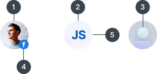
Anatomy
#
Element
1
Profile avatar
2
Text avatar
3
Default avatar
4
Subicon
5
Container

Usage
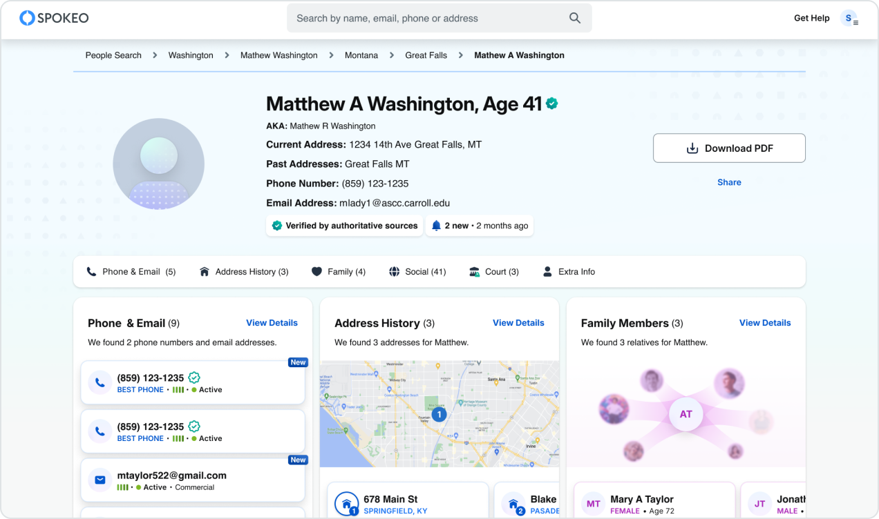
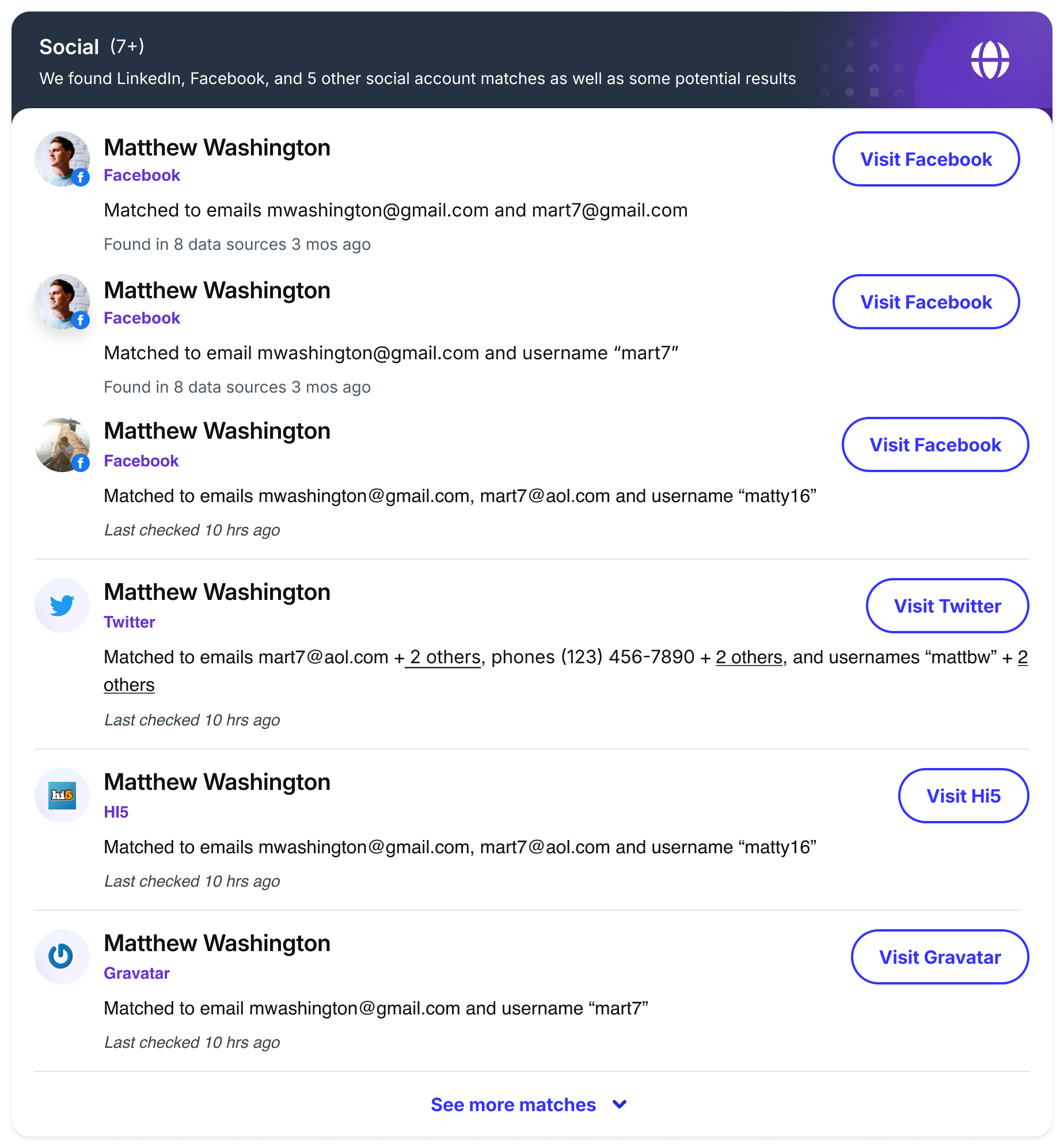
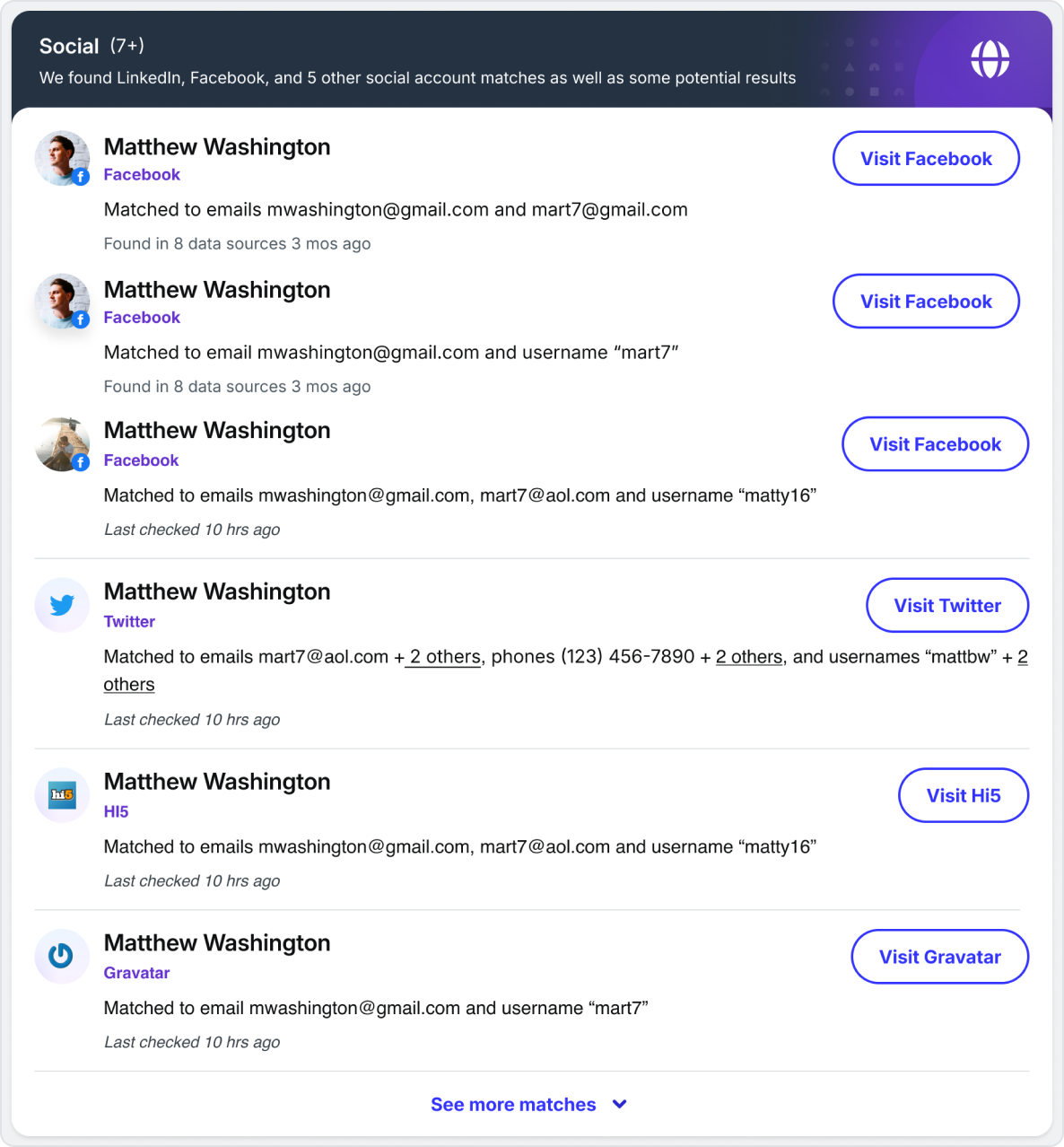
Avatars are used to represent people within our search result and profile pages. They can also be used to represent users and businesses within our Spokeo for Business products.
Avatar Variants
When to Use

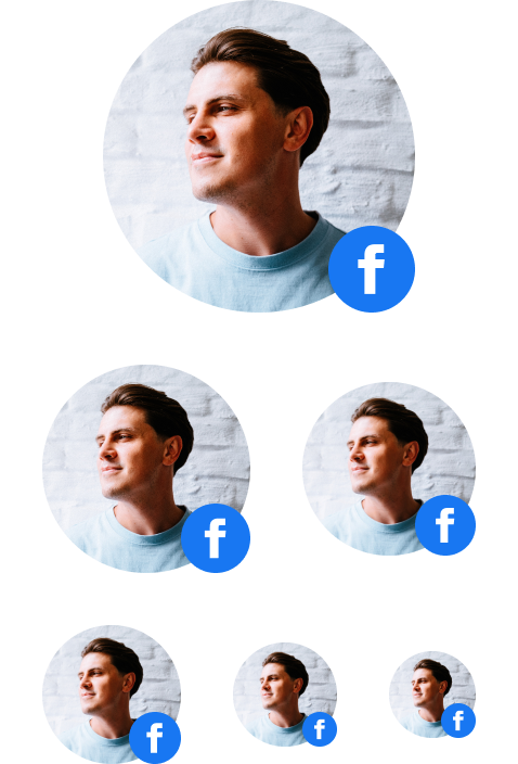
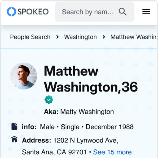
The Profile Avatar is a photo used to represent a person within our product.

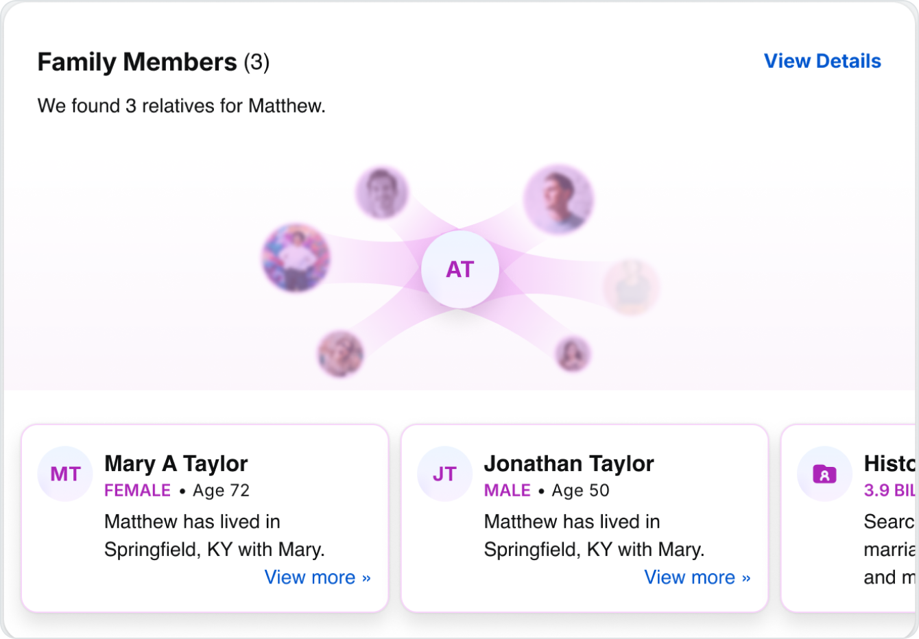
JS
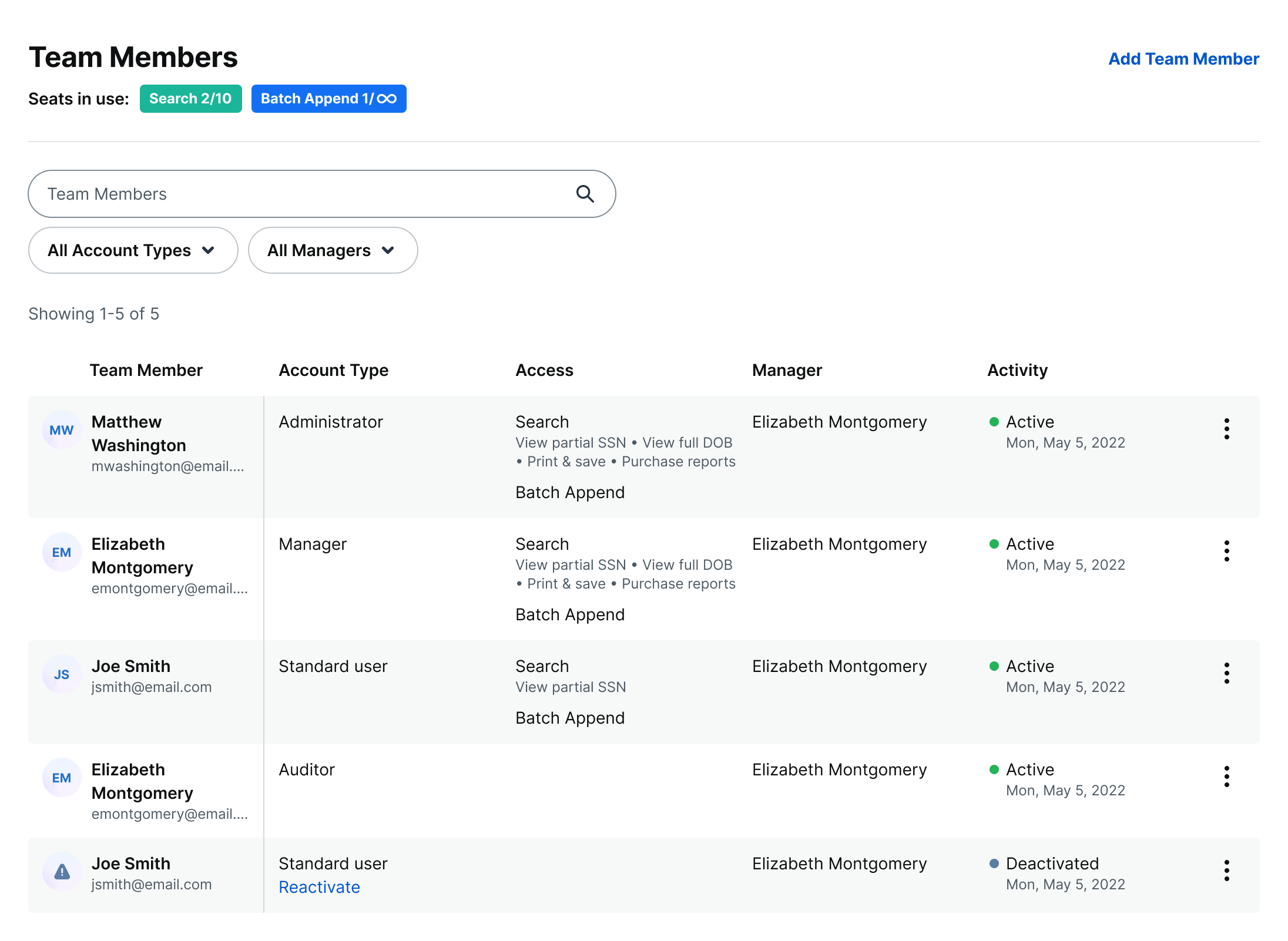
The Text Avatar uses two initials to represent a person's first and last name. It helps differentiate between multiple people when a photo is unavailable. Use text avatars to represent family members or users within an organization.

The Default Avatar is an illustration used to represent a person when no photo is available. Use default avatars when there is a single primary subject. Examples include billboards for search results, name reports, and payment pages.

The Disabled Text Avatar is used to represent a deactivated user when no profile photo is available.
Specifications
Profile and Text Sizes


Size:
144px
Font style:
Inter Bold 48px
144px is recommended when larger avatars are needed, like billboards and hero sections for wider screen sizes.

Size:
96px
Font style:
Display XL / Inter Bold 40px
96px is recommended when larger avatars are needed, like billboards and hero sections for smaller screen sizes.

Size:
80px
Font style:
Display L / Inter Bold 32px
80px is recommended when larger avatars are needed and ample space is available.

Size:
64px
Font style:
Display S / Inter Bold 24px
64px is recommended for detailed person profile billboards for smaller screen sizes.

Size:
48px
Font style:
Display XS / Inter Bold 20px
48px is recommended for medium-large cards within the person profile for larger screen sizes.

Size:
40px
Font style:
Display 4XS / Inter Bold 14px
40px is recommended for small cards within the person profile.

Size:
28px
Font style:
Display 5XS / Inter Bold 12px
28px is recommended for smaller cards or content areas where space is limited.

Size:
24px
Font style:
Display 5XS / Inter Bold 12px
24px is recommended for smaller cards or content areas where space is limited.
Customization

Profile Avatar
Show photos for unlocked or premium reports to help users identify a person.

Profile Avatar With Blur
Blur photos for locked or non-premium reports to create curiosity and encourage users to unlock them.

Disabled Text Avatar
Show black and white initials to indicate that a user or account has been deactivated.
Subicons
Subicons are recommended for use at the following sizes:
Sizes:
144px, 96px, 80px, 64px, 48px, 40px

Subicon With Number Badge
Use a subicon with a number to indicate a quantity, such as recent updates.

Subicon With Social Icon
Use a subicon with a social icon to indicate a related social media account.
Examples
144 - 96px Default Avatars
Use in person profile billboards.
64px Profile Avatars
Use in person profile billboards.
48px Profile Avatars
Use in detailed person profile results.
40px Text Avatars
Use when displaying multiple people with no photos available.
Active and Disabled Text Avatars
Use disabled avatars when a user account has been deactivated.
Best Practices


Do: Use first and last name initials when no photo is available for family members and B2B user avatars


Don’t: Change the font size or spell out a name in an avatar
Do: Use a circle shape to display avatars

Don’t: Change or customize the shape of an avatar

Do: Show a subicon for social networks associated with a user or account

Don’t: Swap the avatar so it appears nested within a social network icon

Don’t: Blur a text avatar

Don’t: Blur a default avatar


JS
Don’t: Change the font size of a text avatar


Don’t: Change or invert the color of a default or text avatar

Do: Use the same size avatars within an avatar group


+12
Don’t: Use different size avatars within an avatar group
Related
Stay up to date with the latest UX decisions, patterns, and component updates in our product.


Contact Us
Terms
Privacy Policy
Copyright © 2006-2025 Spokeo, Inc.


Avatar
Spokeo uses avatars to visually represent a person, group, or business.


Table of Contents
Anatomy
#
Element
1
Profile avatar
2
Text avatar
3
Default avatar
4
Subicon
5
Container

Usage
Avatars are used to represent people within our search result and profile pages. They can also be used to represent users and businesses within our Spokeo for Business products.
Avatar Variants
When to Use
The Profile Avatar is a photo used to represent a person within our product.
JS
The Text Avatar uses two initials to represent a person's first and last name. It helps differentiate between multiple people when a photo is unavailable. Use text avatars to represent family members or users within an organization.
The Default Avatar is an illustration used to represent a person when no photo is available. Use default avatars when there is a single primary subject. Examples include billboards for search results, name reports, and payment pages.
The Disabled Text Avatar is used to represent a deactivated user when no profile photo is available.
Specifications
Profile and Text Sizes
Size:
144px
Font style:
Inter Bold 48px
144px is recommended when larger avatars are needed, like billboards and hero sections for wider screen sizes.
Size:
96px
Font style:
Display XL / Inter Bold 40px
96px is recommended when larger avatars are needed, like billboards and hero sections for smaller screen sizes.
Size:
80px
Font style:
Display L / Inter Bold 32px
80px is recommended when larger avatars are needed and ample space is available.
Size:
64px
Font style:
Display S / Inter Bold 24px
64px is recommended for detailed person profile billboards for smaller screen sizes.
Size:
48px
Font style:
Display XS / Inter Bold 20px
48px is recommended for medium-large cards within the person profile for larger screen sizes.
Size:
40px
Font style:
Display 4XS / Inter Bold 14px
40px is recommended for small cards within the person profile.
Size:
28px
Font style:
Display 5XS / Inter Bold 12px
28px is recommended for smaller cards or content areas where space is limited.
Size:
24px
Font style:
Display 5XS / Inter Bold 12px
24px is recommended for smaller cards or content areas where space is limited.
Customization
Profile Avatar
Show photos for unlocked or premium reports to help users identify a person.
Profile Avatar With Blur
Blur photos for locked or non-premium reports to create curiosity and encourage users to unlock them.
Disabled Text Avatar
Show black and white initials to indicate that a user or account has been deactivated.


Disabled Default Avatar
Show a black and white user illustration to indicate that a user or account has been deactivated.
Subicons
Subicons are recommended for use at the following sizes:

Sizes:
144px, 96px, 80px, 64px, 48px, 40px
Subicon With Number Badge
Use a subicon with a number to indicate a quantity, such as recent updates.
Subicon With Social Icon
Use a subicon with a social icon to indicate a related social media account.
Examples
144 - 96px Default Avatars
Use in person profile billboards.
64px Profile Avatars
Use in person profile billboards.
48px Profile Avatars
Use in detailed person profile results.
40px Text Avatars
Use when displaying multiple people with no photos available.
Active and Disabled Text Avatars
Use disabled avatars when a user account has been deactivated.
Best Practices

Do: Use first and last name initials when no photo is available for family members and B2B user avatars

Don’t: Change the font size or spell out a name in an avatar
Do: Use a circle shape to display avatars
Don’t: Change or customize the shape of an avatar
Do: Show a subicon for social networks associated with a user or account
Don’t: Swap the avatar so it appears nested within a social network icon
Don’t: Blur a text avatar
Don’t: Blur a default avatar
JS
Don’t: Change the font size of a text avatar
Don’t: Change or invert the color of a default or text avatar
Do: Use the same size avatars within an avatar group
+12
Don’t: Use different size avatars within an avatar group
Related
Stay up to date with the latest UX decisions, patterns, and component updates in our product.

Contact Us
Terms
Privacy Policy
Copyright © 2006-2025 Spokeo, Inc.