

Checkbox
Checkboxes provide users with the ability to make a multiple choice selection.

Table of Contents
Anatomy
The anatomy is the same for all of our button variations: Primary Non-Premium, Primary Premium, Secondary (Outline), and Tertiary (Tonal).
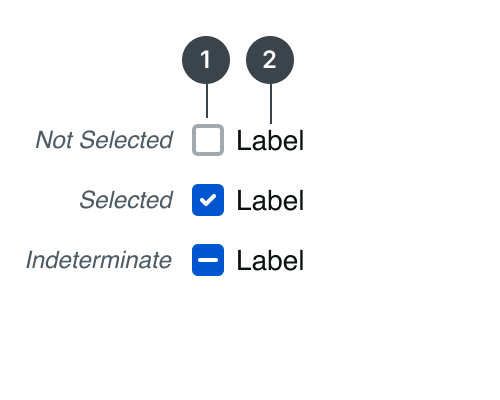
#
Element
1
Checkbox
2
Label

Usage
Use checkboxes when users need to select multiple options from a list. Some other instanced in which a checkbox can be used it the following:
- A multiple choice list containing sub-selections
- An off and on switch similar to a toggle
Some alternative selection controls are radio buttons and switches. You should use checkboxes to select multiple related options in a list, a radio button to select a single option in a list and a toggle to select settings within more content rich lists.
States
Label
When using the checkbox component, the checkbox should always have a label. There are some instanced where it is acceptable to remove the label, but only if there is adequate context such as a disclaimer where a user must acknowledge terms.
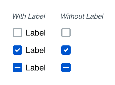
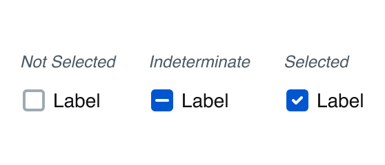
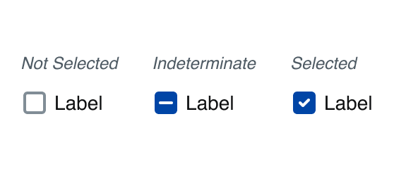
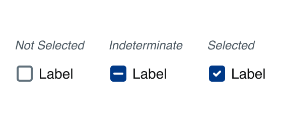
Selection
There are three selection states for the checkbox: not selected, indeterminate, and selected.
Hover
A state to communicate when a user has placed their cursor over the checkbox.
Pressed
A state to communicate user tap
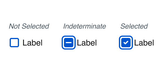
Focused - Visible
The focused state communicates when a user has highlighted the checkbox, using an input method such as a keyboard or voice.
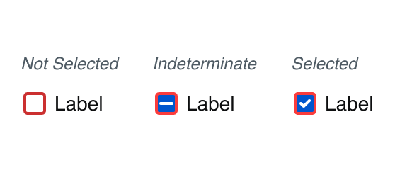
Error
A checkbox should use the error state to communicate an invalid state to the user. For example, in a form where the user must acknowledge certain terms and conditions before proceeding.
Disabled
A disabled checkbox communicates to a user that an action might become available later.
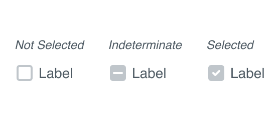
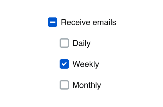
Indeterminate
Indeterminate checkbox is when it is controlling a set of checkboxes. When none of the checkboxes are checked, neither is the master checkbox. When all of them are checked, so is the master checkbox. But if some are checked and some are not checked? The master checkbox state cannot be determined—it is indeterminate!
Specifications
Height
Label
24px
Size:
Medium

Label
20px
Size:
Small
Spacing
Label
8px
Size:
Medium
Label
4px
Size:
Small
Best Practices
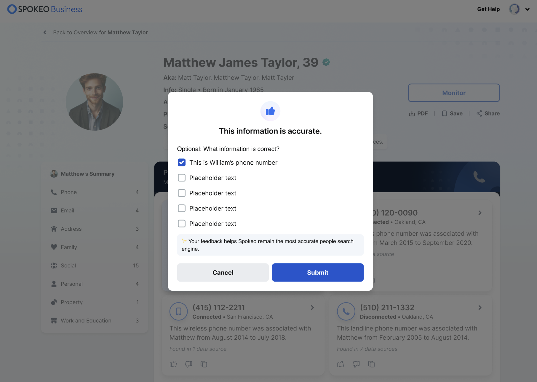
What information is correct?
Phone number
Email address
Home address


Do: Use checkboxes for multi-selection in a related item list.
Pick one info that is right
Phone number
Email address
Home address


Don’t: Use checkboxes when asking for one selection, use a radio button instead.
I agree to the terms and conditions
I agree to the terms and conditions
Do: Use text that is the same line-height as the checkbox icon.
I agree to the terms and conditions
Don’t: Use checkboxes with text whose line-height misaligns. Small text variables go with small checkbox etc.

**** **** **** 0026
Expires 12/33
EDIT
I agree to the terms and conditions
Reactivate Membership
Do: Use a single checkbox in forms where the selection takes effect after submitting the form
Turn on location tracking
Don’t: Use a checkbox to turn a state on and off with immediate effect, use a toggle instead.
Regulated and Public Search
Run individual searches of Spokeo’s regulated and publicly available data.
Batch Append
Enrich bulk lists with Spokeo’s up-to-date contact information.
Do: Vertically align the checkbox with the first line of a multi-lined label.
Regulated and Public Search
Run individual searches of Spokeo’s regulated and publicly available data.
Batch Append
Enrich bulk lists with Spokeo’s up-to-date contact information.
Don’t: Vertically center the checkbox with the overall custom label.
Related Links
Stay up to date with the latest UX decisions, patterns, and component updates in our product.


Contact Us
Terms
Privacy Policy
Copyright © 2006-2025 Spokeo, Inc.


Checkbox
Checkboxes provide users with the ability to make a multiple choice selection.

Table of Contents
Anatomy
The anatomy is the same for all of our button variations: Primary Non-Premium, Primary Premium, Secondary (Outline), and Tertiary (Tonal).
#
Element
1
Checkbox
2
Label

Usage
Use checkboxes when users need to select multiple options from a list. Some other instanced in which a checkbox can be used it the following:
- A multiple choice list containing sub-selections
- An off and on switch similar to a toggle
Some alternative selection controls are radio buttons and switches. You should use checkboxes to select multiple related options in a list, a radio button to select a single option in a list and a toggle to select settings within more content rich lists.
States
Label
When using the checkbox component, the checkbox should always have a label. There are some instanced where it is acceptable to remove the label, but only if there is adequate context such as a disclaimer where a user must acknowledge terms.
Selection
There are three selection states for the checkbox: not selected, indeterminate, and selected.
Hover
A state to communicate when a user has placed their cursor over the checkbox.
Pressed
A state to communicate user tap
Focused - Visible
The focused state communicates when a user has highlighted the checkbox, using an input method such as a keyboard or voice.
Error
A checkbox should use the error state to communicate an invalid state to the user. For example, in a form where the user must acknowledge certain terms and conditions before proceeding.
Disabled
A disabled checkbox communicates to a user that an action might become available later.
Indeterminate
Indeterminate checkbox is when it is controlling a set of checkboxes. When none of the checkboxes are checked, neither is the master checkbox. When all of them are checked, so is the master checkbox. But if some are checked and some are not checked? The master checkbox state cannot be determined—it is indeterminate!
Specifications
Height
Label
24px
Size:
Medium
Label
20px
Size:
Small
Spacing
Label
8px
Size:
Medium
Label
4px
Size:
Small
Best Practices
What information is correct?
Phone number
Email address
Home address

Do: Use checkboxes for multi-selection in a related item list.
Pick one info that is right
Phone number
Email address
Home address

Don’t: Use checkboxes when asking for one selection, use a radio button instead.
I agree to the terms and conditions
I agree to the terms and conditions
Do: Use text that is the same line-height as the checkbox icon.
I agree to the terms and conditions
Don’t: Use checkboxes with text whose line-height misaligns. Small text variables go with small checkbox etc.
**** **** **** 0026
Expires 12/33
EDIT
I agree to the terms and conditions
Reactivate Membership
Do: Use a single checkbox in forms where the selection takes effect after submitting the form
Turn on location tracking
Don’t: Use a checkbox to turn a state on and off with immediate effect, use a toggle instead.
Regulated and Public Search
Run individual searches of Spokeo’s regulated and publicly available data.
Batch Append
Enrich bulk lists with Spokeo’s up-to-date contact information.
Do: Vertically align the checkbox with the first line of a multi-lined label.
Regulated and Public Search
Run individual searches of Spokeo’s regulated and publicly available data.
Batch Append
Enrich bulk lists with Spokeo’s up-to-date contact information.
Don’t: Vertically center the checkbox with the overall custom label.
Related Links
Stay up to date with the latest UX decisions, patterns, and component updates in our product.

Contact Us
Terms
Privacy Policy
Copyright © 2006-2025 Spokeo, Inc.