

Button Group
Button groups give users options to perform actions in relation to one another.

Table of Contents
Related Links
Options
Button groups can be customized to fit different layouts and use cases. The group’s orientation, size, and state can be adjusted to ensure clarity, usability, and consistency across the interface.
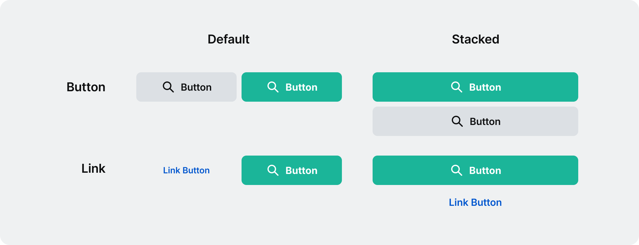
Orientation
While by default a button group is horizontal, it can also be stacked vertically when space is limited.
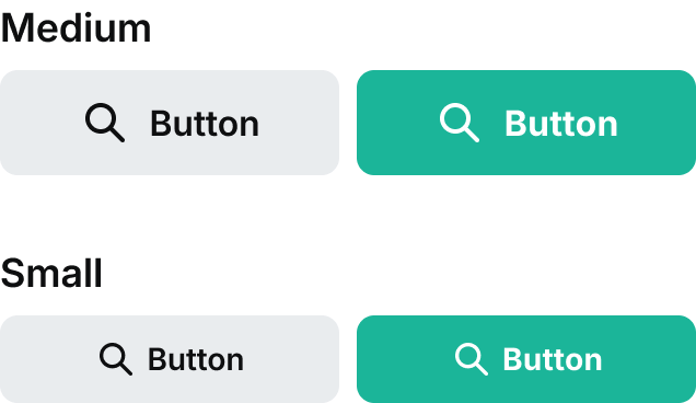
Size
Button groups come in two different sizes: medium and small. The medium size is the default and most frequently used. Use the small size with discretion.
Disabled
A button group in a disabled state indicates that the actions are currently unavailable but may become active once certain conditions are met.


Usage
The button group is commonly used in forms and modal dialogs.
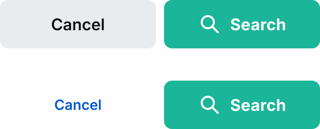
Use the recommended option for subsequent actions
The most important action within the button group should be a primary button. The other actions should always be a secondary or link button.


Do: make sure that the primary button is using icons and is the primary call to action.
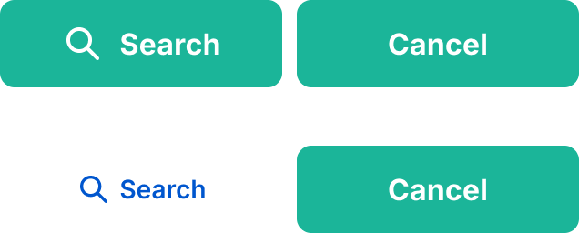


Don’t: use anything other than primary button for your main call to action. Also try to avoid using two high primary buttons in a group.
Align button groups based on content
Button groups are aligned contextually. By default the button groups will be left-aligned to the content, but context is important. If there is an empty state they will be center-aligned and they will be right aligned should they be inside container components such as the dialogs, cards, or notification pop ups.
Respect button hierarchy
Button priority should match the alignment of the paired text. For example, if the text is left-aligned, buttons should be arranged where the more important button is on the left. When the text is right or center-aligned then the most important button will be on the furthermost right.
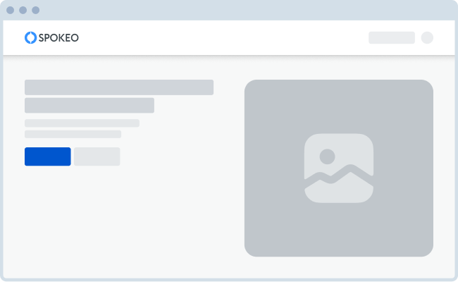
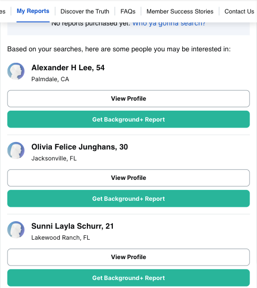
Button group with text on landing page
Example
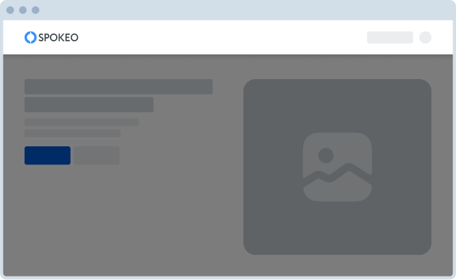

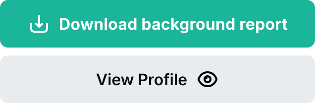
Button group within dialog
Example
Additional Actions
Use a button group to show any additional actions related to the most critical action.

Specifications
Below are a list of standard measurements for our button group.
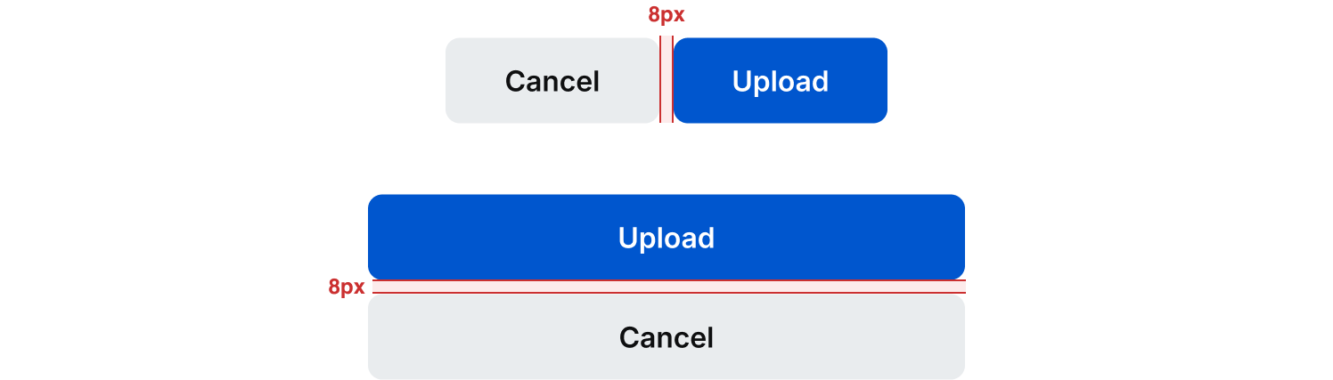
Spacing
Standard spacing between our button groups is 8px.
Minimum and Maximum Widths
Try to set a minimum of 248px for our buttons while in their default position. For our stacked button group, these are typically used for mobile screens which start at our 799px breakpoint. In this instance we typically set the component to fill the space.
There are some instances where we use the stacked version of our button in tablet and desktop breakpoints. In this case, please use discretion when setting your min and max widths so that it utilizes the space efficiently with best UI practices in mind. Below are a couple examples of how we’ve used the stacked button across different breakpoints.

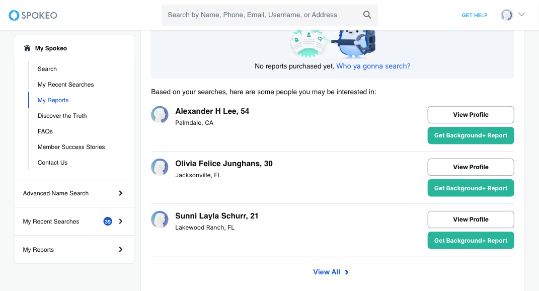
Stacked button group across different breakpoints on our dashboard
Example
Best Practices
For more guidelines, see the button component.

Do: Use the same shapes for buttons in a group. You can still change width and color.

Don’t: Try not to use buttons with different shapes. There are only a few instances this works.

Do: Group buttons logically into sets based on usage and importance.

Don’t: Use a secondary or tertiary button as your main action of the button group. Similarly do not apply an icon to the non-primary action button and not the other.

Don’t: Use inconsistent placement across button groups when using icons.

Don’t: Use two primary buttons in a button group.
Related Links
Stay up to date with the latest UX decisions, patterns, and component updates in our product.

- For more best practices, follow all general button usage guidelines.
- Link button guidelines
- Hyperlink button guidelines
- Icon button guidelines
- Floating Action Button guidelines


Contact Us
Terms
Privacy Policy
Copyright © 2006-2025 Spokeo, Inc.


Button Group
Button groups give users options to perform actions in relation to one another.


Table of Contents
Related Links
Options
Button groups can be customized to fit different layouts and use cases. The group’s orientation, size, and state can be adjusted to ensure clarity, usability, and consistency across the interface.
Orientation
While by default a button group is horizontal, it can also be stacked vertically when space is limited.
Size
Button groups come in two different sizes: medium and small. The medium size is the default and most frequently used. Use the small size with discretion.
Disabled
A button group in a disabled state indicates that the actions are currently unavailable but may become active once certain conditions are met.

Usage
The button group is commonly used in forms and modal dialogs.
Use the recommended option for subsequent actions
The most important action within the button group should be a primary button. The other actions should always be a secondary or link button.

Do: make sure that the primary button is using icons and is the primary call to action.

Don’t: use anything other than primary button for your main call to action. Also try to avoid using two high primary buttons in a group.
Align button groups based on content
Button groups are aligned contextually. By default the button groups will be left-aligned to the content, but context is important. If there is an empty state they will be center-aligned and they will be right aligned should they be inside container components such as the dialogs, cards, or notification pop ups.
Respect button hierarchy
Button priority should match the alignment of the paired text. For example, if the text is left-aligned, buttons should be arranged where the more important button is on the left. When the text is right or center-aligned then the most important button will be on the furthermost right.
Button group with text on landing page
Example
Button group within dialog
Example
Additional Actions
Use a button group to show any additional actions related to the most critical action.
Specifications
Below are a list of standard measurements for our button group.
Spacing
Standard spacing between our button groups is 8px.
Minimum and Maximum Widths
Try to set a minimum of 248px for our buttons while in their default position. For our stacked button group, these are typically used for mobile screens which start at our 799px breakpoint. In this instance we typically set the component to fill the space.
There are some instances where we use the stacked version of our button in tablet and desktop breakpoints. In this case, please use discretion when setting your min and max widths so that it utilizes the space efficiently with best UI practices in mind. Below are a couple examples of how we’ve used the stacked button across different breakpoints.
Stacked button group across different breakpoints on our dashboard
Example
Best Practices
For more guidelines, see the button component.

Do: Use the same shapes for buttons in a group. You can still change width and color.

Don’t: Try not to use buttons with different shapes. There are only a few instances this works.
Do: Group buttons logically into sets based on usage and importance.
Don’t: Use a secondary or tertiary button as your main action of the button group. Similarly do not apply an icon to the non-primary action button and not the other.

Don’t: Use inconsistent placement across button groups when using icons.
Don’t: Use two primary buttons in a button group.
Related Links
Stay up to date with the latest UX decisions, patterns, and component updates in our product.

- For more best practices, follow all general button usage guidelines.
- Link button guidelines
- Hyperlink button guidelines
- Icon button guidelines
- Floating Action Button guidelines

Contact Us
Terms
Privacy Policy
Copyright © 2006-2025 Spokeo, Inc.