

Floating Action Button (FAB)
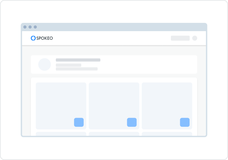
The Floating Action Button (FAB) represents the primary or most common action on the screen. It floats over the content, typically in a sticky way so that content can scroll underneath while it remains static on the page or its placement.

Table of Contents
Anatomy
The FAB uses icons to convey action to a user.

#
Element
1
Icon
2
Container

Usage
The FAB is typically used in dashboard pages, carousels, or long informational pages to help users navigate and perform actions more efficiently.
Use for:
- To represent a primary or common action when it has to be visible all the time on the screen on top of everything.
- Triggering a Modal or a Popover to complete a related task.
- Only if it is the most suitable way to present a screen's high-emphasis action.
Don’t use for:
- There isn't a need for a fixed FAB visible all the time on the screen.
- To replace Icon Button established patterns, such as navigation elements.
States
Default
Icons: spk.color.blueGrey.900
Container: spk.color.white

Hovered
Text and icons: spk.color.blueGrey.900
Container: spk.color.grey.100

Focused - Visible
Text and icons: spk.color.blueGrey.900
Container: spk.color.grey.100
Outline: spk.color.text.link

Active
Text and icons: spk.color.blueGrey.900
Container: spk.color.grey.200

Specifications
Height & Spacing

Best Practices


Do: Use when an action has to be visible at all times in a sticky way where content can scroll underneath.


Don’t: Use FAB for negative and destructive actions like Delete or Remove.
Do: A FAB can be used within a navigation component, such as a navigation rail or navigation drawer.
Don’t: Individual components, such as cards, shouldn’t have their own FAB.
Related Links
Stay up to date with the latest UX decisions, patterns, and component updates in our product.

- For more best practices, follow all general button usage guidelines.
- Link button guidelines
- Hyperlink button guidelines
- Icon button guidelines
- Floating Action Button guidelines


Contact Us
Terms
Privacy Policy
Copyright © 2006-2025 Spokeo, Inc.


Floating Action Button (FAB)
The Floating Action Button (FAB) represents the primary or most common action on the screen. It floats over the content, typically in a sticky way so that content can scroll underneath while it remains static on the page or its placement.

Table of Contents
Anatomy
The FAB uses icons to convey action to a user.
#
Element
1
Icon
2
Container

Usage
The FAB is typically used in dashboard pages, carousels, or long informational pages to help users navigate and perform actions more efficiently.
Use for:
- To represent a primary or common action when it has to be visible all the time on the screen on top of everything.
- Triggering a Modal or a Popover to complete a related task.
- Only if it is the most suitable way to present a screen's high-emphasis action.
Don’t use for:
- There isn't a need for a fixed FAB visible all the time on the screen.
- To replace Icon Button established patterns, such as navigation elements.
States
Default
Icons: spk.color.blueGrey.900
Container: spk.color.white
Hovered
Text and icons: spk.color.blueGrey.900
Container: spk.color.grey.100
Focused - Visible
Text and icons: spk.color.blueGrey.900
Container: spk.color.grey.100
Outline: spk.color.text.link
Active
Text and icons: spk.color.blueGrey.900
Container: spk.color.grey.200
Specifications
Height & Spacing
Best Practices

Do: Use when an action has to be visible at all times in a sticky way where content can scroll underneath.

Don’t: Use FAB for negative and destructive actions like Delete or Remove.
Do: A FAB can be used within a navigation component, such as a navigation rail or navigation drawer.
Don’t: Individual components, such as cards, shouldn’t have their own FAB.
Related Links
Stay up to date with the latest UX decisions, patterns, and component updates in our product.

- For more best practices, follow all general button usage guidelines.
- Link button guidelines
- Hyperlink button guidelines
- Icon button guidelines
- Floating Action Button guidelines

Contact Us
Terms
Privacy Policy
Copyright © 2006-2025 Spokeo, Inc.