

Link Button
Our link button allows users to navigate to different pages or anchor to another location on the page. They are usually shown inline within text but can also appear as standalone links.

Table of Contents
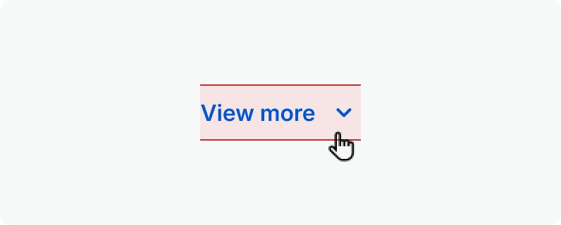
Anatomy
The link button is mainly used as navigational element

View more

1

2

3
4

#
Element
1
Label
2
Leading Icon (optional)
3
Trailing Icon (optional)
4
The selectable area of the link button.

Usage
Use for:
- Navigation, usually inline within or next to a sentence. In some cases, links can support task-related actions but should primarily aid navigation.
- Directing users to another page or section of the same page.
- Jumping to a specific element on the current page.
- Highlighting external or internal URL destinations.
Don’t use for:
- Actions that will change data, change a state, or trigger a high-emphasis action. Use a Button instead.
- In headings, as headings aren't easily recognizable as interactive elements. Headings can act as anchor elements on the page (accompanied by the "link" Icon), but if the heading needs to take users to a different page, add a subtitle next to the heading with an inline Link instead.
States
Default
Text and icons: spk.color.text.link

Hovered
Text and icons: spk.color.text.link.hover

Focused - Visible
Text and icons: spk.color.text.link.focus
Outline: spk.color.text.link

Active
Text and icons: spk.color.text.link.active

Specifications
Height
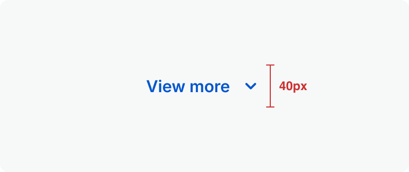
Size:
Medium
Size:
Small
Spacing
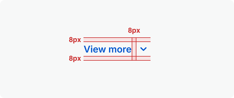
Size:
Medium
Size:
Small
Clickable Area
Size:
Medium
Size:
Small
Related Links
Stay up to date with the latest UX decisions, patterns, and component updates in our product.

- For more best practices, follow all general button usage guidelines.
- Link button guidelines
- Hyperlink button guidelines
- Icon button guidelines
- Floating Action Button guidelines


Contact Us
Terms
Privacy Policy
Copyright © 2006-2025 Spokeo, Inc.


Link Button
Our link button allows users to navigate to different pages or anchor to another location on the page. They are usually shown inline within text but can also appear as standalone links.

Table of Contents
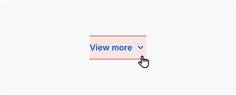
Anatomy
The link button is mainly used as navigational element
View more
1
2
3
4
#
Element
1
Label
2
Leading Icon (optional)
3
Trailing Icon (optional)
4
The selectable area of the link button.

Usage
Use for:
- Navigation, usually inline within or next to a sentence. In some cases, links can support task-related actions but should primarily aid navigation.
- Directing users to another page or section of the same page.
- Jumping to a specific element on the current page.
- Highlighting external or internal URL destinations.
Don’t use for:
- Actions that will change data, change a state, or trigger a high-emphasis action. Use a Button instead.
- In headings, as headings aren't easily recognizable as interactive elements. Headings can act as anchor elements on the page (accompanied by the "link" Icon), but if the heading needs to take users to a different page, add a subtitle next to the heading with an inline Link instead.
States
Default
Text and icons: spk.color.text.link
Hovered
Text and icons: spk.color.text.link.hover
Focused - Visible
Text and icons: spk.color.text.link.focus
Outline: spk.color.text.link
Active
Text and icons: spk.color.text.link.active
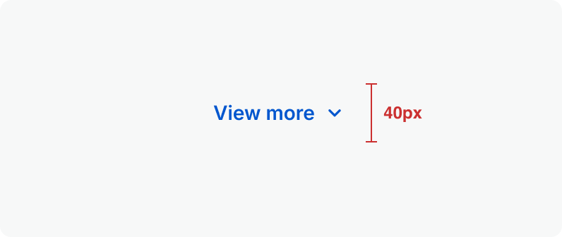
Specifications
Height
Size:
Medium
Size:
Small
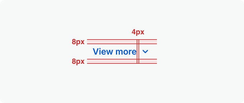
Spacing
Size:
Medium
Size:
Small
Clickable Area
Size:
Medium
Size:
Small
Related Links
Stay up to date with the latest UX decisions, patterns, and component updates in our product.

- For more best practices, follow all general button usage guidelines.
- Link button guidelines
- Hyperlink button guidelines
- Icon button guidelines
- Floating Action Button guidelines

Contact Us
Terms
Privacy Policy
Copyright © 2006-2025 Spokeo, Inc.