

Hyperlink Button
The hyperlink button is mainly used as navigational element within or directly following a paragraph or sentence.

Table of Contents
Related Links
Anatomy

#
Element
1
Link text

Usage
Hyperlinks guide users to other pages, sections on the same page, or external resources. They can appear inline within text, like our privacy policy, or as standalone links, such as those in the footer.
Use for:
- Navigate to a different page within our product.
- Navigate to a different site entirely.
- Anchor to another section on the same page.
- Linking emails and or phone numbers or certain results on our product pages.
Don’t use for:
- Actions that will change data, change a state, or trigger a high-emphasis action. (use Button instead).
- Do not use images as links.
Button Variants
When to Use
Hyperlink
The primary hyperlink is the default variant and is blue. This should be used to call attention to the link and for when the blue color won’t feel too overwhelming in the experience.
Hyperlink
Use the the primary dark theme for backgrounds that are custom, colored or darker. Make sure the colors pass accessibility.
Hyperlink
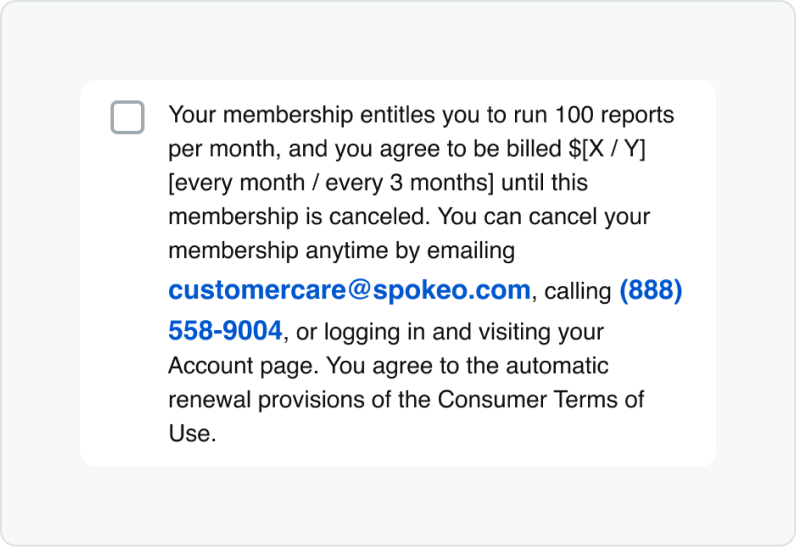
Use the secondary hyperlink when there is several links throughout a large block of text. This will help create a less overwhelming experience for the user. The color should be the same color as that paragraph text.
States
Default
Text and icons: spk.color.text.link
Hyperlink
Hovered
Text and icons: spk.color.text.link.hover
Hyperlink
Focused - Visible
Text and icons: spk.color.text.link.focus
Outline: spk.color.text.link
Hyperlink
Active
Text and icons: spk.color.text.link.active
Hyperlink
Visited
Text and icons: spk.color.text.link.visited
Hyperlink
Specifications
Height
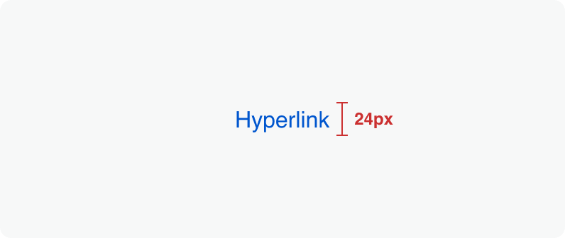
Size:
Medium
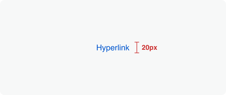
Size:
Small
Clickable areas
The clickable area spans the entirety of the link text.

Size:
Medium

Size:
Small
Best Practices


Do: Use hyperlinks when actions take users to resources or other websites.


Don’t: Use hyperlinks when actions serve as an important call to action or navigation purpose.
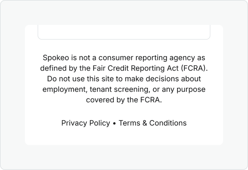
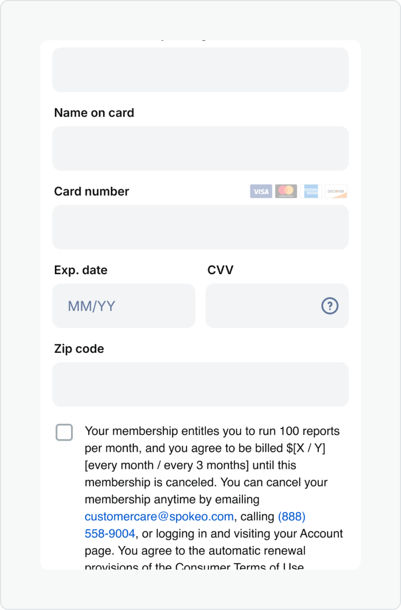
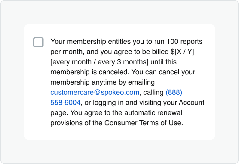
Do: Use hyperlinks in the context of a large block of text such as our disclaimers found in our footer and payment pages.
Don’t: Use a bold font weight on inline hyperlinks as this could confuse users who might think it is for emphasis vs. navigational purposes.
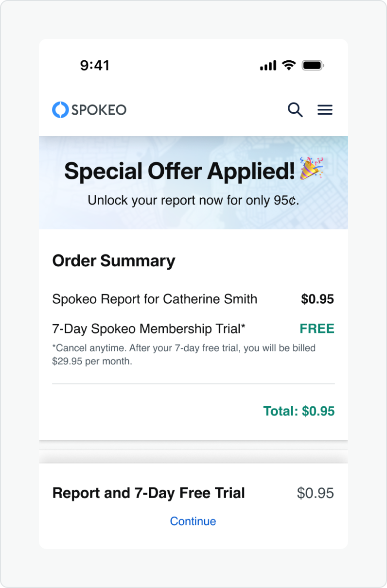
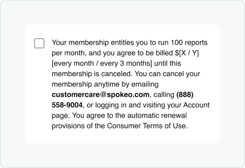
Do: Use bold font weight on things like lists or name profile billboard links.
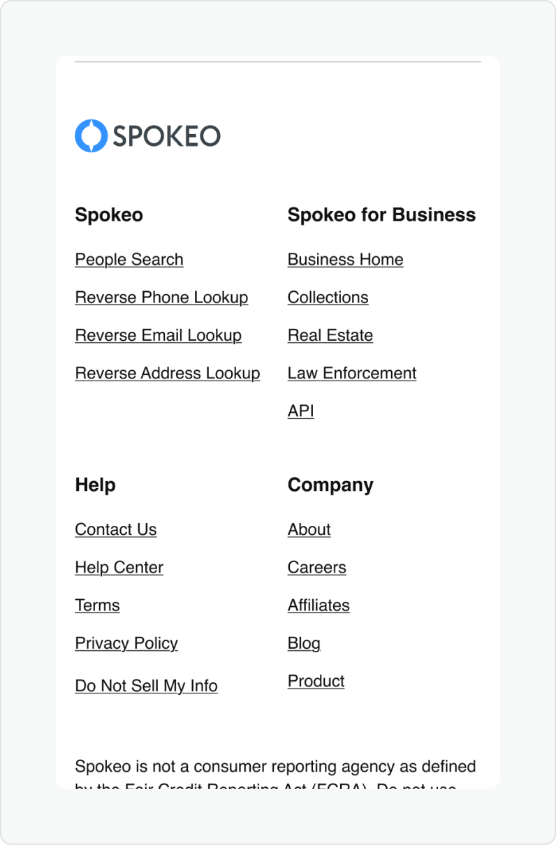
Don’t: Use underline on links that aren’t within a paragraph such as our footer links.
Do: Match link to the text size and font weight of the content the hyperlinks are accompanying.
Don’t: apply multiple text styles on links paired with text, as it can create inconsistency it can make it hard for scannability.
Related Links
Stay up to date with the latest UX decisions, patterns, and component updates in our product.

- For more best practices, follow all general button usage guidelines.
- Link button guidelines
- Hyperlink button guidelines
- Icon button guidelines
- Floating Action Button guidelines


Contact Us
Terms
Privacy Policy
Copyright © 2006-2025 Spokeo, Inc.


Hyperlink Button
The hyperlink button is mainly used as navigational element within or directly following a paragraph or sentence.


Table of Contents
Related Links
Anatomy
#
Element
1
Link text

Usage
Hyperlinks guide users to other pages, sections on the same page, or external resources. They can appear inline within text, like our privacy policy, or as standalone links, such as those in the footer.
Use for:
- Navigate to a different page within our product.
- Navigate to a different site entirely.
- Anchor to another section on the same page.
- Linking emails and or phone numbers or certain results on our product pages.
Don’t use for:
- Actions that will change data, change a state, or trigger a high-emphasis action. (use Button instead).
- Do not use images as links.
Button Variants
When to Use
Hyperlink
The primary hyperlink is the default variant and is blue. This should be used to call attention to the link and for when the blue color won’t feel too overwhelming in the experience.
Hyperlink
Use the the primary dark theme for backgrounds that are custom, colored or darker. Make sure the colors pass accessibility.
Hyperlink
Use the secondary hyperlink when there is several links throughout a large block of text. This will help create a less overwhelming experience for the user. The color should be the same color as that paragraph text.
States
Default
Text and icons: spk.color.text.link
Hyperlink
Hovered
Text and icons: spk.color.text.link.hover
Hyperlink
Focused - Visible
Text and icons: spk.color.text.link.focus
Outline: spk.color.text.link
Hyperlink
Active
Text and icons: spk.color.text.link.active
Hyperlink
Visited
Text and icons: spk.color.text.link.visited
Hyperlink
Specifications
Height
Size:
Medium
Size:
Small
Clickable areas
The clickable area spans the entirety of the link text.
Size:
Medium
Size:
Small
Best Practices

Do: Use hyperlinks when actions take users to resources or other websites.

Don’t: Use hyperlinks when actions serve as an important call to action or navigation purpose.
Do: Use hyperlinks in the context of a large block of text such as our disclaimers found in our footer and payment pages.
Don’t: Use a bold font weight on inline hyperlinks as this could confuse users who might think it is for emphasis vs. navigational purposes.
Do: Use bold font weight on things like lists or name profile billboard links.
Don’t: Use underline on links that aren’t within a paragraph such as our footer links.
Do: Match link to the text size and font weight of the content the hyperlinks are accompanying.
Don’t: Apply multiple text styles on links paired with text, as it can create inconsistency it can make it hard for scannability.
Related Links
Stay up to date with the latest UX decisions, patterns, and component updates in our product.
- For more best practices, follow all general button usage guidelines.
- Link button guidelines
- Hyperlink button guidelines
- Icon button guidelines
- Floating Action Button guidelines

Contact Us
Terms
Privacy Policy
Copyright © 2006-2025 Spokeo, Inc.