

Icon Button
Icon buttons are buttons that contain only an icon, without text. They are used for actions that are easily recognizable by their symbol.

Table of Contents
Anatomy
The anatomy is the same for all of our button variations: Primary Non-Premium, Primary Premium, Secondary (Outline), and Tertiary (Tonal).

#
Element
1
Icon
2
Container

Usage
Use icon buttons when space is limited or when the action is commonly understood by its icon. Make sure to provide a tooltip or accessible label so users understand the button’s purpose.Icon buttons can appear in toolbars, forms, cards, or alongside text buttons in your interface.
Button Variants
Usage

The primary non-premium button is the principal call to action (CTA) on the page. Ideally, primary non-premium buttons should only appear once per screen. This is our main CTA that is used to convert users into paying consumers of the Spokeo site.

The primary premium button is the principal call to action on the page used once a user has converted.

The secondary (outline) button indicates low emphasis and should be used with other buttons, never as the sole option.

The tertiary (tonal) button offers minimal emphasis, perfect for secondary actions that complement primary choices. Use it to provide additional options without overwhelming the user.
States
Primary Non-Premium
Default
Text and icons: spk.color.text.primary.white
Container: spk.cta.primary.teal.default

Hovered
Text and icons: spk.color.text.primary.white
Container: spk.cta.primary.teal.hover

Focused - Visible
Text and icons: spk.color.text.primary.white
Container: spk.cta.primary.teal.focus
Outline: spk.color.text.link

Active
Text and icons: spk.color.text.primary.white
Container: spk.cta.primary.teal.active

Disabled
Text and icons: spk.color.text.primary.white
Container: spk.cta.primary.teal.disabled

Primary Premium
Default
Text and icons: spk.color.text.primary.white
Container: spk.cta.primary.blue.default

Hovered
Text and icons: spk.color.text.primary.white
Container: spk.cta.primary.blue.hover

Focused - Visible
Text and icons: spk.color.text.primary.white
Container: spk.cta.primary.blue.focus
Outline: spk.color.text.link

Active
Text and icons: spk.color.text.primary.white
Container: spk.cta.primary.blue.active

Disabled
Text and icons: spk.color.text.primary.white
Container: spk.cta.primary.blue.disabled

Secondary (Outline)
Default
Text and icons: spk.color.text.primary
Container: spk.cta.secondary.default
Outline: spk.color.grey.500

Hovered
Text and icons: spk.color.text.primary
Container: spk.cta.secondary.hover
Outline: spk.color.grey.600

Focused - Visible
Text and icons: spk.color.text.primary
Container: spk.cta.secondary.focus
Outline: spk.color.grey.600
Outline (focus): spk.color.text.link

Active
Text and icons: spk.color.text.primary
Container: spk.cta.secondary.active
Outline: spk.color.grey.700

Disabled
Text and icons: spk.color.text.primary
Container: spk.cta.secondary.disabled
Outline: spk.color.grey.500

Tertiary (Tonal)
Default
Text and icons: spk.color.text.primary
Container: spk.cta.tertiary.default

Hovered
Text and icons: spk.color.text.primary
Container: spk.cta.tertiary.hover

Focused - Visible
Text and icons: spk.color.text.primary
Container: spk.cta.tertiary.focus
Outline (focus): spk.color.text.link

Active
Text and icons: spk.color.text.primary
Container: spk.cta.tertiary.active

Disabled
Text and icons: spk.color.text.primary
Container: spk.cta.tertiary.disabled

Specifications
Height
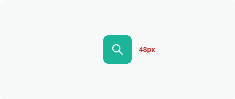
Size:
Medium

Size:
Small
Spacing

Size:
Medium

Size:
Small
Best Practices


Do: Use icons in buttons for clarity when they're relevant to the action.


Don’t: Overide color.
Related Links
Stay up to date with the latest UX decisions, patterns, and component updates in our product.

- For more best practices, follow all general button usage guidelines.
- Link button guidelines
- Hyperlink button guidelines
- Icon button guidelines
- Floating Action Button guidelines


Contact Us
Terms
Privacy Policy
Copyright © 2006-2025 Spokeo, Inc.


Icon Button
Icon buttons are buttons that contain only an icon, without text. They are used for actions that are easily recognizable by their symbol.


Table of Contents
Anatomy
The anatomy is the same for all of our button variations: Primary Non-Premium, Primary Premium, Secondary (Outline), and Tertiary (Tonal).
#
Element
1
Icon
2
Container

Usage
Use icon buttons when space is limited or when the action is commonly understood by its icon. Make sure to provide a tooltip or accessible label so users understand the button’s purpose.Icon buttons can appear in toolbars, forms, cards, or alongside text buttons in your interface.
Button Variants
Usage
The primary non-premium button is the principal call to action (CTA) on the page. Ideally, primary non-premium buttons should only appear once per screen. This is our main CTA that is used to convert users into paying consumers of the Spokeo site.
The primary premium button is the principal call to action on the page used once a user has converted.
The secondary (outline) button indicates low emphasis and should be used with other buttons, never as the sole option.
The tertiary (tonal) button offers minimal emphasis, perfect for secondary actions that complement primary choices. Use it to provide additional options without overwhelming the user.
States
Primary Non-Premium
Default
Text and icons: spk.color.text.primary.white
Container: spk.cta.primary.teal.default
Hovered
Text and icons: spk.color.text.primary.white
Container: spk.cta.primary.teal.hover
Focused - Visible
Text and icons: spk.color.text.primary.white
Container: spk.cta.primary.teal.focus
Outline: spk.color.text.link
Active
Text and icons: spk.color.text.primary.white
Container: spk.cta.primary.teal.active
Disabled
Text and icons: spk.color.text.primary.white
Container: spk.cta.primary.teal.disabled
Primary Premium
Default
Text and icons: spk.color.text.primary.white
Container: spk.cta.primary.blue.default
Hovered
Text and icons: spk.color.text.primary.white
Container: spk.cta.primary.blue.hover
Focused - Visible
Text and icons: spk.color.text.primary.white
Container: spk.cta.primary.blue.focus
Outline: spk.color.text.link
Active
Text and icons: spk.color.text.primary.white
Container: spk.cta.primary.blue.active
Disabled
Text and icons: spk.color.text.primary.white
Container: spk.cta.primary.blue.disabled
Secondary (Outline)
Default
Text and icons: spk.color.text.primary
Container: spk.cta.secondary.default
Outline: spk.color.grey.500
Hovered
Text and icons: spk.color.text.primary
Container: spk.cta.secondary.hover
Outline: spk.color.grey.600
Focused - Visible
Text and icons: spk.color.text.primary
Container: spk.cta.secondary.focus
Outline: spk.color.grey.600
Outline (focus): spk.color.text.link
Active
Text and icons: spk.color.text.primary
Container: spk.cta.secondary.active
Outline: spk.color.grey.700
Disabled
Text and icons: spk.color.text.primary
Container: spk.cta.secondary.disabled
Outline: spk.color.grey.500
Tertiary (Tonal)
Default
Text and icons: spk.color.text.primary
Container: spk.cta.tertiary.default
Hovered
Text and icons: spk.color.text.primary
Container: spk.cta.tertiary.hover
Focused - Visible
Text and icons: spk.color.text.primary
Container: spk.cta.tertiary.focus
Outline (focus): spk.color.text.link
Active
Text and icons: spk.color.text.primary
Container: spk.cta.tertiary.active
Disabled
Text and icons: spk.color.text.primary
Container: spk.cta.tertiary.disabled
Specifications
Height
Size:
Medium
Size:
Small
Spacing
Size:
Medium
Size:
Small
Best Practices

Do: Use icons in buttons for clarity when they're relevant to the action.

Don’t: Overide color.
Related Links
Stay up to date with the latest UX decisions, patterns, and component updates in our product.

- For more best practices, follow all general button usage guidelines.
- Link button guidelines
- Hyperlink button guidelines
- Icon button guidelines
- Floating Action Button guidelines

Contact Us
Terms
Privacy Policy
Copyright © 2006-2025 Spokeo, Inc.