

Illustration Guidelines
Guidelines on how to create and use illustrations that clearly communicate ideas, enhance content, and reflect our brand’s visual voice with consistency and purpose.

Table of Contents
Types of Illustration
Examples
Sizes
Patterns
Shapes
Transparency
Elevation
Accessibility
Best Practices
Principles

Informative
Imagery should educate and inform our users. It should be useful and easy to understand to help convey a clear and consistent story.

Simple
Illustrations should be narrowed down to the most basic essentials to reduce visual clutter and create a primary point of focus for our users.

Authentic
Keep illustrations inclusive and true to recognizable objects so users can relate and connect to our intended narratives.

Balanced
It’s essential to create a balanced design with intentional hierarchy to ensure that the most important elements are effectively communicated.

Clarity
Graphics should be quick and easy to understand to provide with the best possible experience.

Helpful
Illustrations should add context and create a deeper understanding for users as they navigate Spokeo and its products.
Types of Illustration
Hero
Hero illustrations are displayed on our Spokeo homepage and landing pages. They can have a higher level of detail since there is more real estate for storytelling and adding additional context.

Spot Hero
Spot hero illustrations have a medium level of detail. They are used for our landing pages within product subsections.


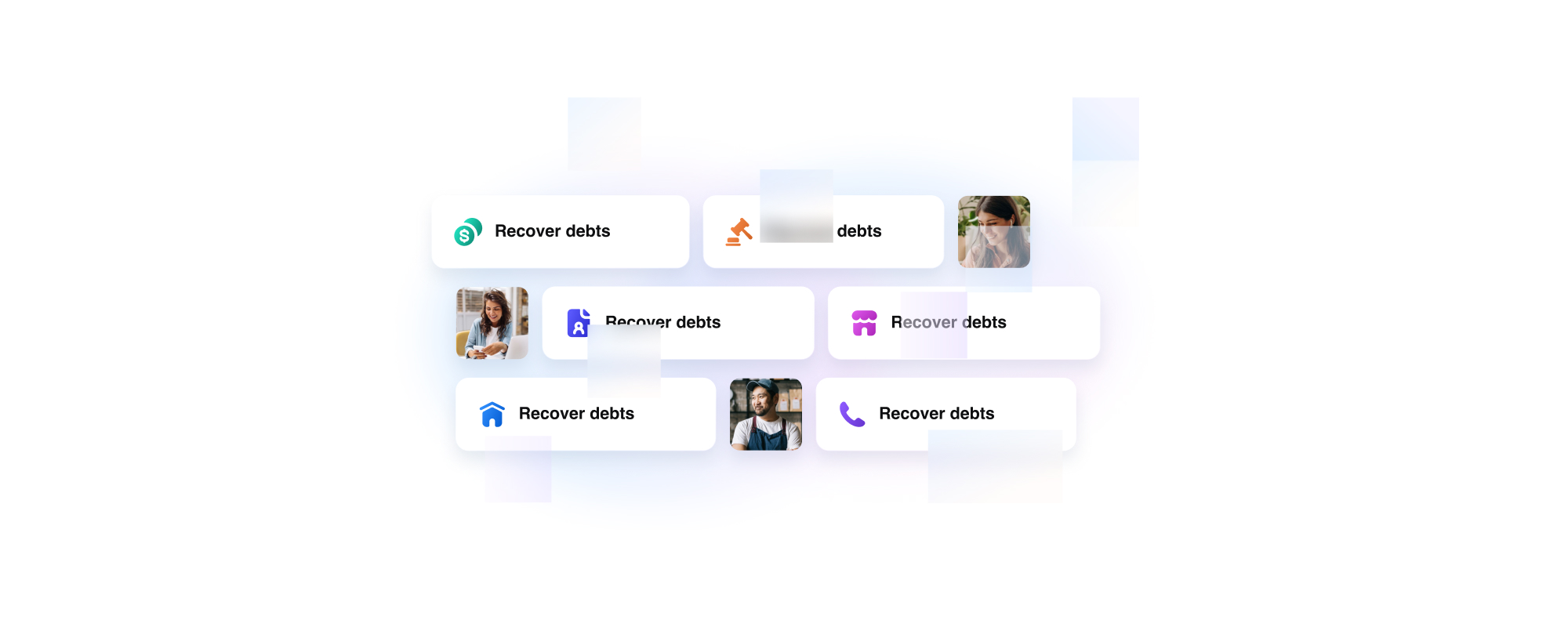
Spot
Spot illustrations are used for smaller UI elements where space is limited. These should contain less detail but remain simple enough to scale and still be legible when displayed in smaller sizes.


Empty and Error States
Empty and error state illustrations can be found within our product dashboard, no result pages, and error pages. No result graphics should remain simple and neutral as not to draw too much attention. Error pages can incorporate Calvin and be more playful so as to lighten the mood.
View Calvin Illustration Guidelines


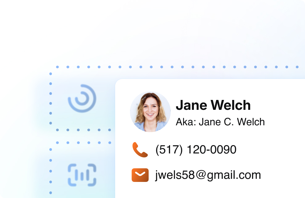
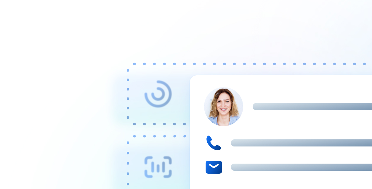
Photo Illustrations
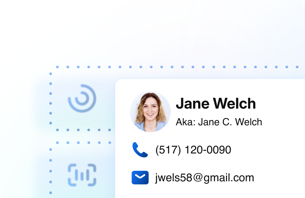
Photo illustrations are illustrations that incorporate photography. Photos can add a relatable and human touch to our illustrations. When incorporating photos into an illustration, strive for an equal balance of photography and content to avoid overwhelming the user.
View Photography Guidelines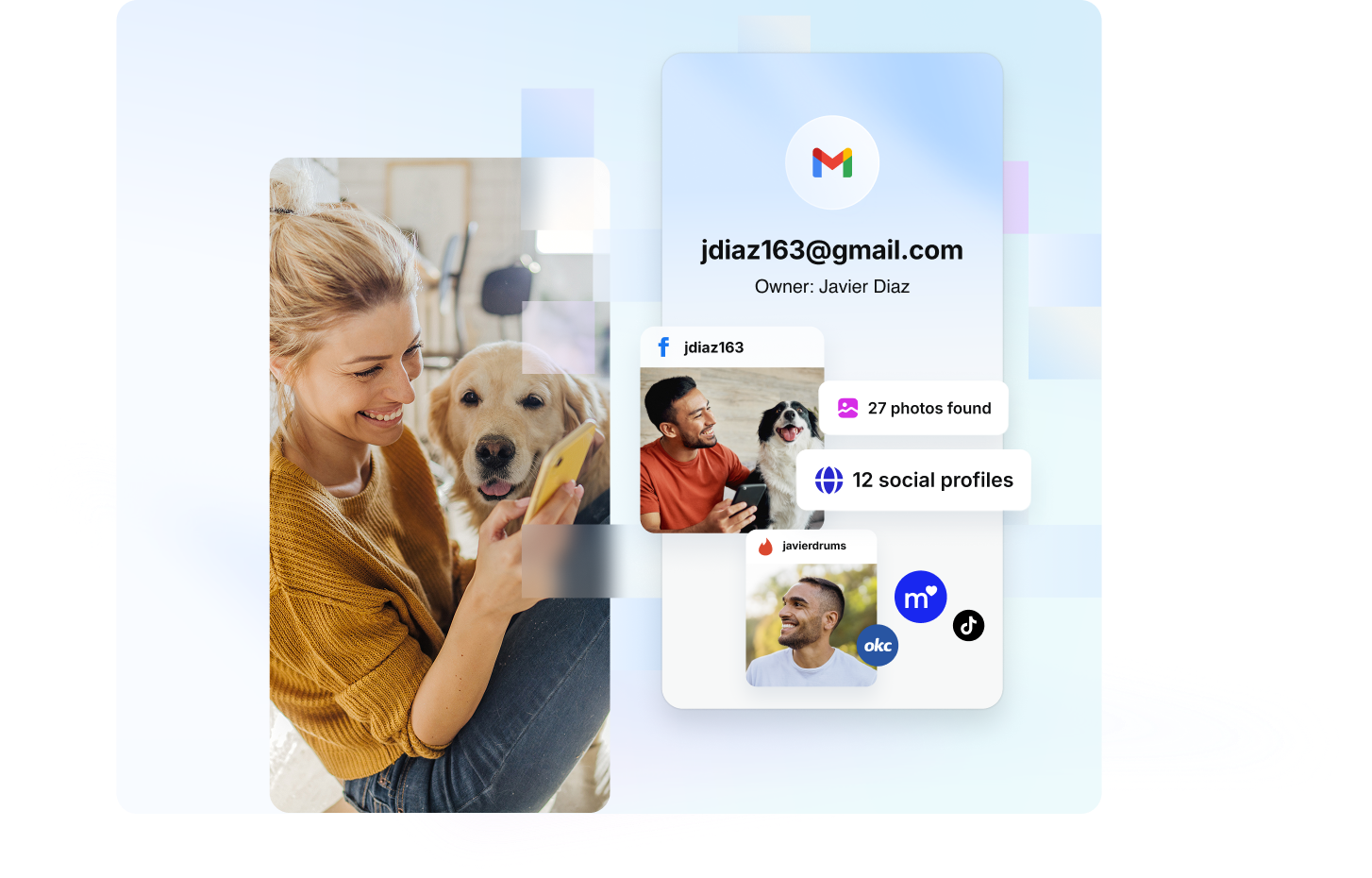

Examples
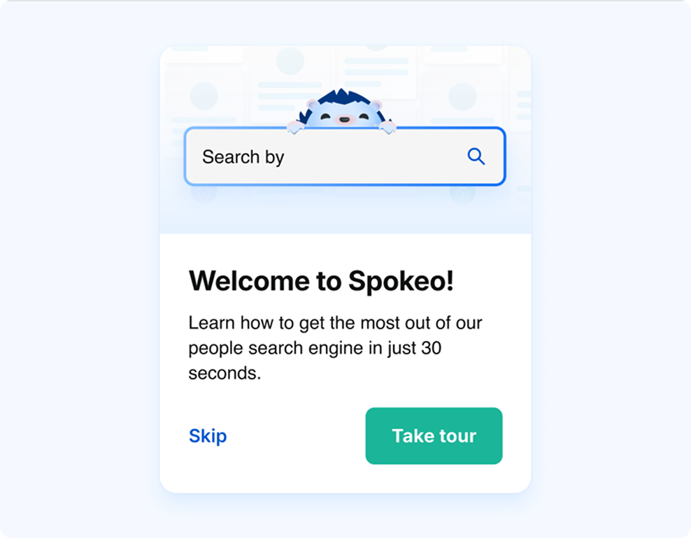
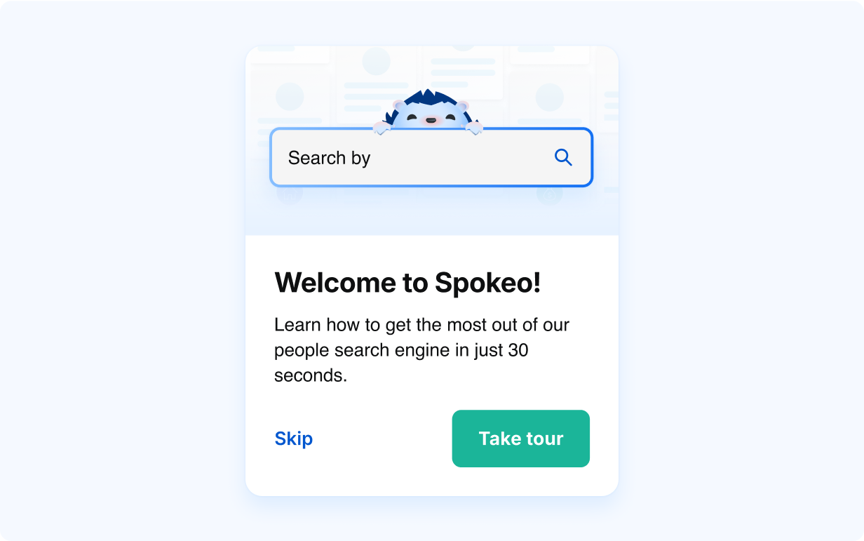
Onboarding
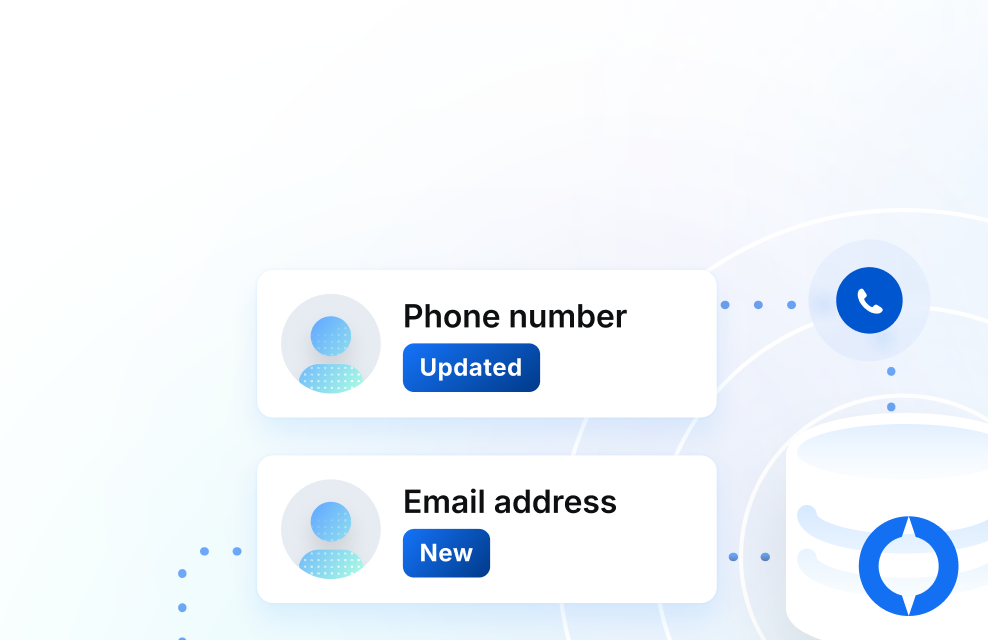
Illustrations can be used within onboarding dialogs to teach users how to interact and use our product.
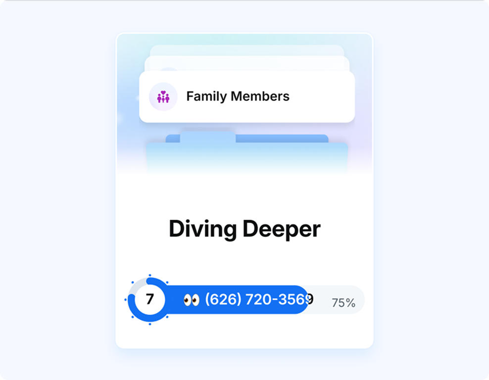
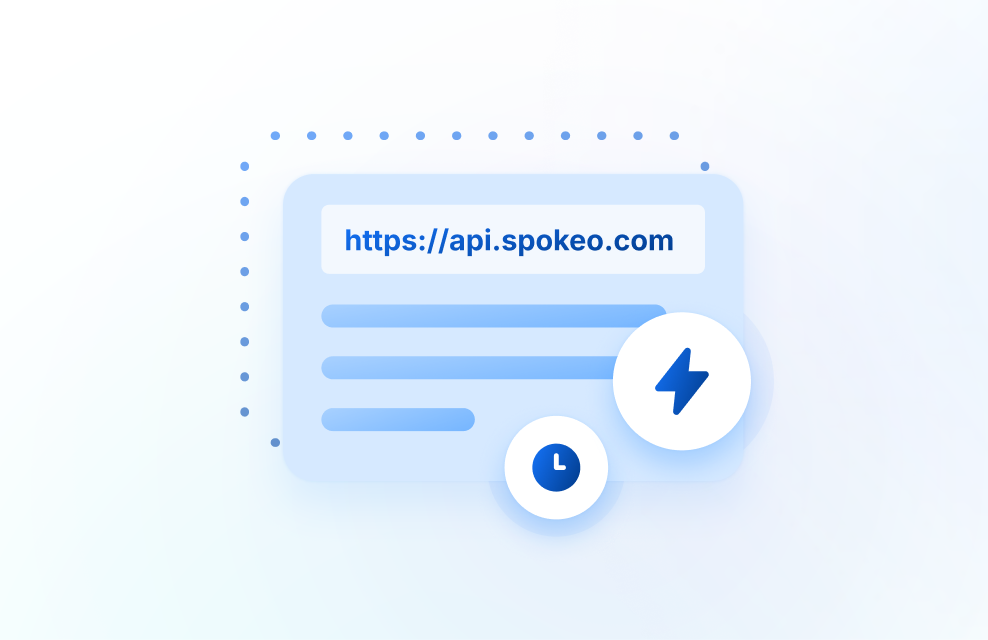
Loading Bar
Illustrations can be turned into simple animations and implemented within our loading bar screens to add excitement and educate users about what types of data Spokeo can provide.
Banner Ads
Banner ads can incorporate both regular and photo illustrations. Illustrations used in banner ads can vary in complexity based on the different sizes the ads will be displayed in.

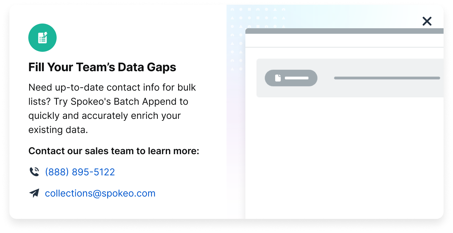
Dialog
Illustrations can be showcased in large dialogs to introduce new product features to our users. Skeleton UI can be an effective way of quickly communicating a high-level product concept to a user.
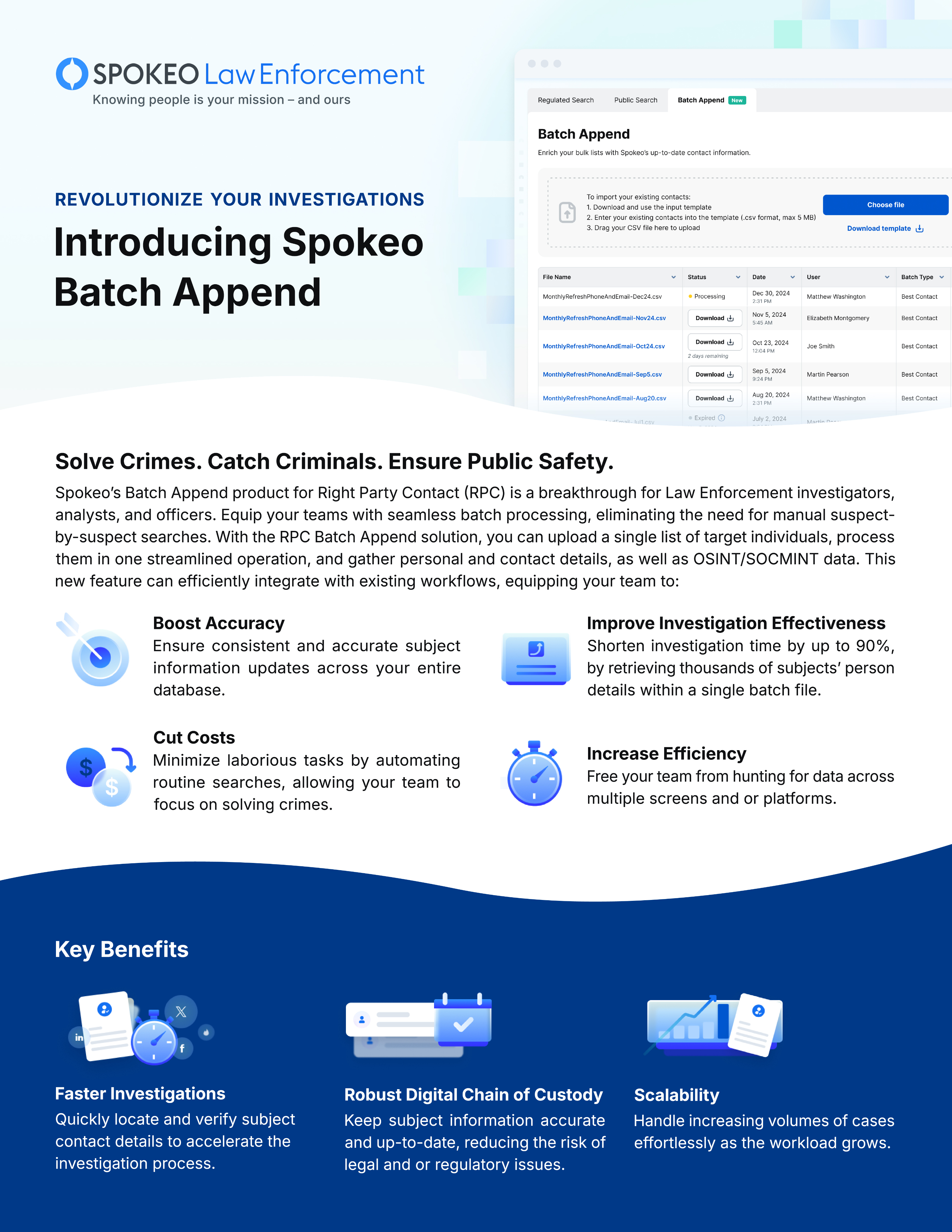
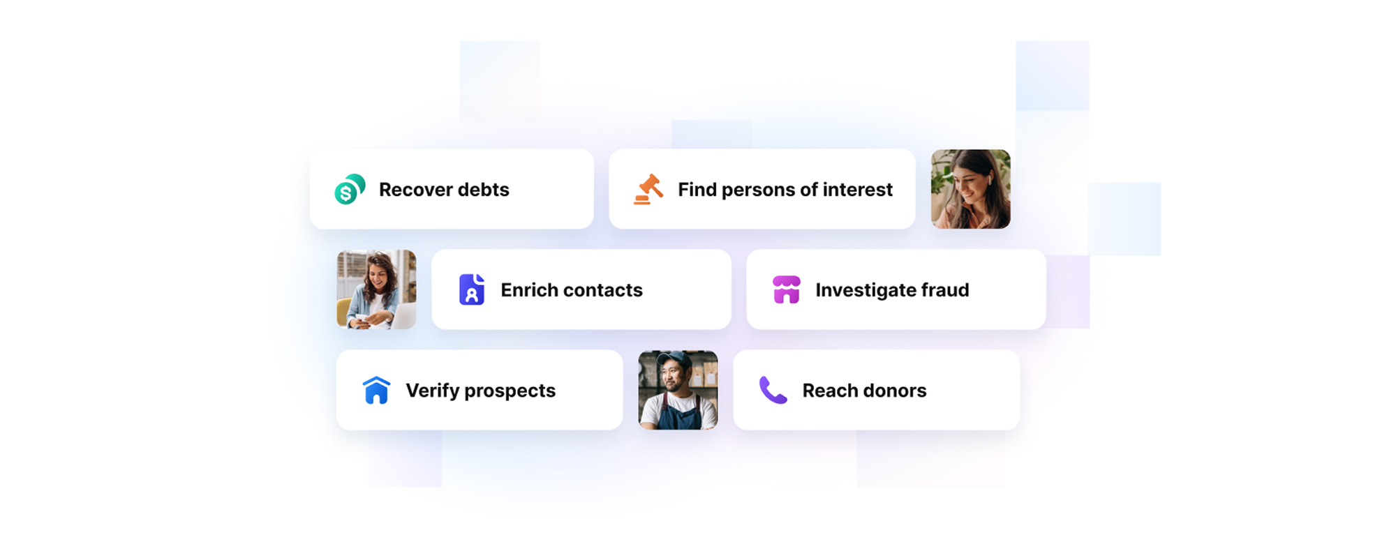
Marketing Materials
Illustrations can be used in marketing materials, one-pagers, and other collateral to convey product benefits in an appealing way.
Sizes
Small
Small illustrations should be kept to a minimal level of detail and are recommended for small cards or dialogs where space is limited.

Medium
Medium illustrations have a medium level of detail and are recommended for larger cards, dialogs, ads, and landing page subsections.
Large
Large illustrations are best suited for hero sections and marketing materials where detail is important.

Small
Suggested sizes for small illustrations range from 40x40px to 160x160px.
40x40
80x80
160x160


40x40

80x80

160x160
Small Spot Graphics in Product Cards
Example
Small Spot Graphics in Payment Pages
Example
Medium
Suggested sizes for medium illustrations range from 200x200px to 280x280px.
200x200
280x280

200x200

280x280
Medium Illustration in Onboarding Dialog
Example

Medium Illustration in Loading Bar
Example
Large
Recommended sizes for large illustrations will vary based on implementation and collateral. Large illustrations can be displayed in square, portrait, and landscape formats. Suggested sizes for large illustrations are 320x320px and up.

Portrait

Landscape
Square

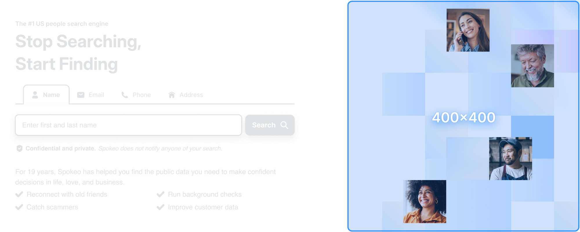
Large Illustration: Homepage
Example
Patterns
Tiles
The Spokeo tile pattern is a supporting illustration element with varying levels of transparency. This pattern can be used throughout different landing pages, ads, and marketing materials to symbolize the uncovering of data.

Colors
The tile pattern can be stylized and themed using different category colors to best represent different Spokeo product features.


Examples
Homepage
Example
Business Illustration
Example
Shapes
Basic Shapes
Spot illustrations are based on simple, basic shapes that can be used as primary building blocks for our illustrations.

Corner Radius
The corner radius for each illustration should scale up accordingly as the overall illustration increases in size.
View Corner Radius Guidelines
4px
Corner Radius

8px
Corner Radius

12px
Corner Radius
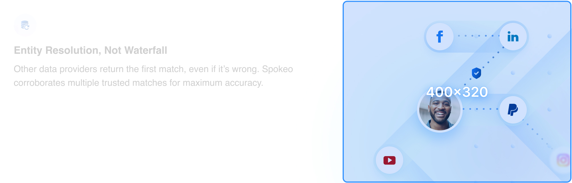
Base Shape With Content
Basic shapes can be combined with skeleton UI, icons, and photographs to best represent varying product features.


Transparency
Usage
Transparency is a theme used within our illustrations to convey search and discovery of valuable information. It can be used to obscure information to create curiosity and anticipation for a user. Transparency in illustrations is most effective in medium and large shapes where the see-through portion of the illustration can be clearly communicated.


Transparency With Photos
Our tile pattern can be combined with photography to obscure and reveal pieces of information. Blur effects can also be animated and applied to photos to create a feeling of searching and finding someone.

Elevation
Sizes, Color, and Usage
We have four types of shadows that can be used within our illustrations. While our in-app UI typically utilizes more subtle shadows, we recommend using medium and large shadows within illustrations to more effectively communicate depth and layering of elements.
View Elevation GuidelinesSmall
Medium
Medium-Inverted
Large
Colors
View Full Color Guidelines
Solid Colors
Spokeo has a full spectrum of saturated colors that can be utilized within our illustrations that reinforce Spokeo’s brand palette.
Background Colors
For backgrounds, we suggest using a subtle color palette to maintain readability of content.
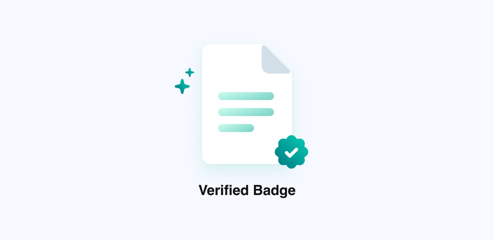
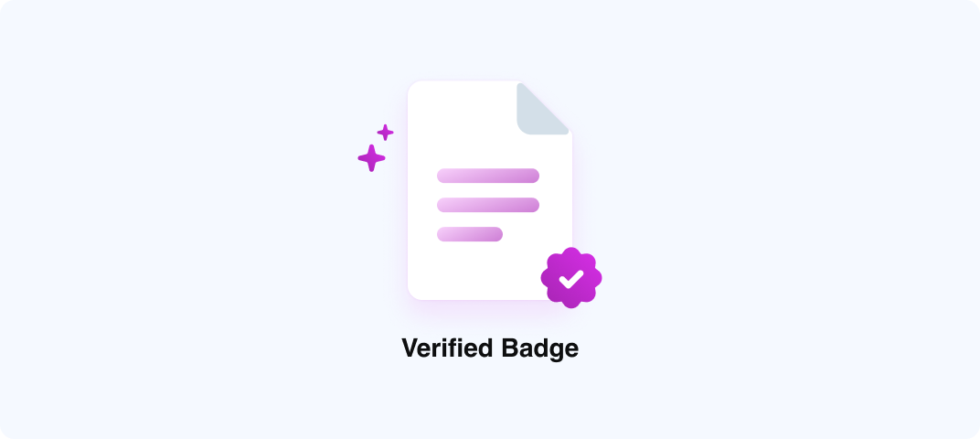
Gradient Colors
Gradient colors can be used to add an extra pop of color and create a richer, added dimension within an illustration.
Gradient Icons and Product Category Colors
Example


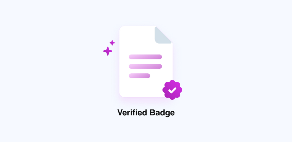
Gradient Badge Illustrations
Example
Gradients in Badges, Icons, and Text
Example
Gradients in Titles and Search Bars
Example
Color Balance
Each illustration should ideally have a balanced combination of neutral and saturated colors.


Too much grey creates a less dynamic and appealing design.


1-3 highlight colors create a well-balanced design.
Too many colors can create a distracting and overwhelming design.
Accessibility
Colors and Accessibility
While illustrations are meant to be more decorative, we still recommend following best practices for accessibility guidelines when communicating content and information within our illustrations.
3:1
Blue 500
4.5:1
Blue 600
3:1
Grey 500
4.5:1
Grey 600
19:1
Grey 1000
Contrast Ratios
We recommend the following contrast ratios when incorporating text into illustrations:
Text Type
Color Contrast Ratio
Large text (14px bold-18px regular and up) and graphics
At least 3:1 against the background
Small text (below 14px)
At least 4.5:1 against the background

Disabled states don’t need to meet contrast requirements.
Best Practices


Do: Use use simplified color palettes for illustrations like skeleton UI


Don’t: Use too many colors for illustrations like skeleton UI

Do: Use a themed color along with our Spokeo blue for tile patterns

Don’t: Use multiple colors to create a tile pattern

Do: Keep a consistent color theme based on the relevant product/feature
Don’t: Rebrand an existing product/feature with new colors

Do: Use transparency consistently and to convey hidden information

Don’t: Change the order of elements on the same plane, causing them to be unevenly blurred
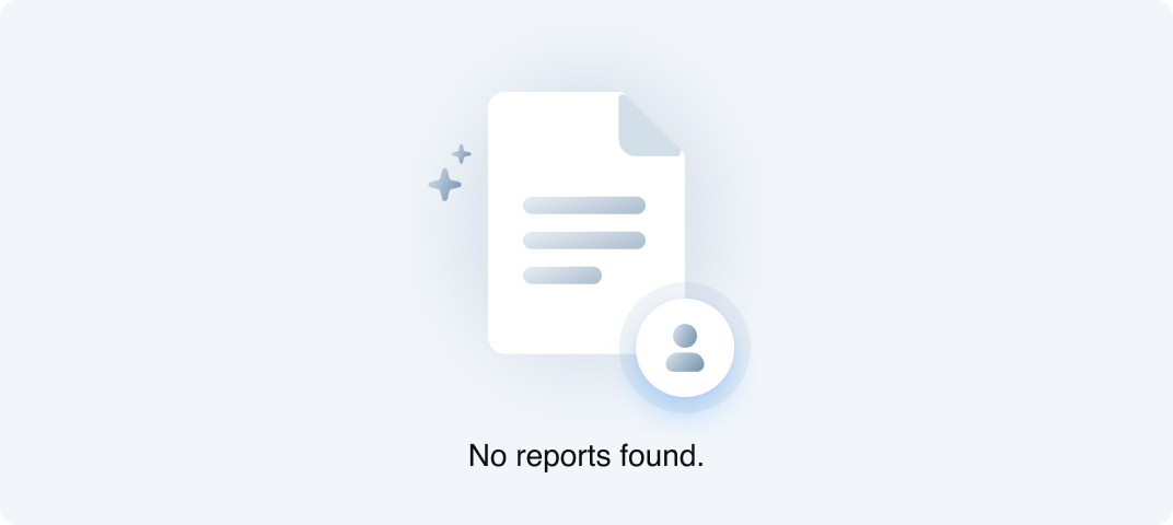
Do: Use a neutral/grey color palette for empty states
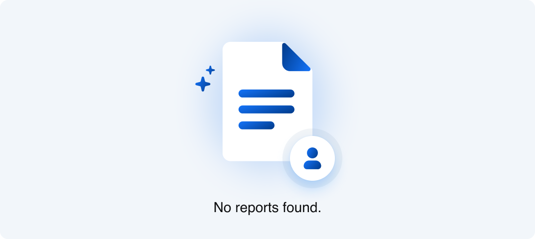
Don’t: Use vibrant colors and gradients for empty states
Do: Keep a consistent color theme based on the relevant product/feature
Don’t: Rebrand an existing product/feature with new colors
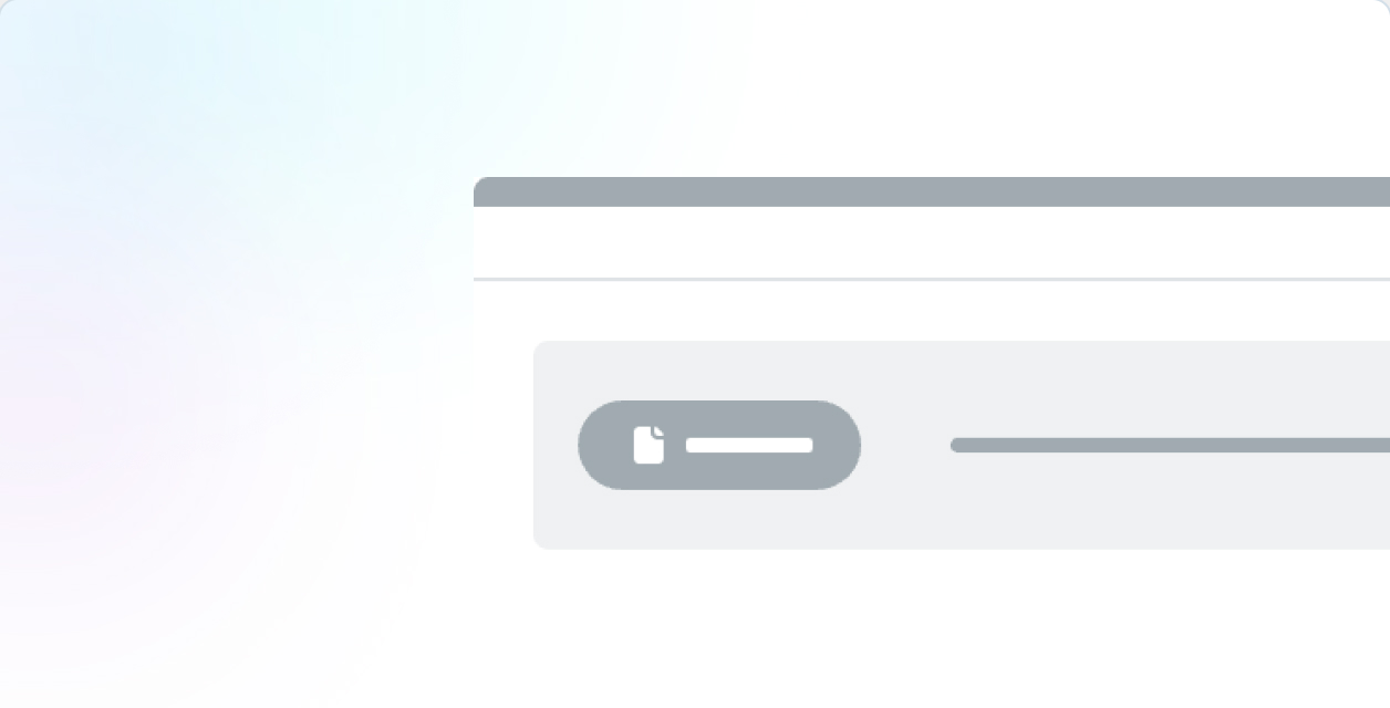
Do: Use skeleton UI in animation to convey a concept or idea
Don’t: Use skeleton UI if there’s space to show actual data and provide additional context
Do: Use tile patterns as a supporting or background element within an illustration
Don’t: Use tile patterns to block essential content or text, decreasing legibility and comprehension

Do: Use tile patterns and photos with consistent 1:1 ratios that can scale by 1x or 2x

Don’t: Use extremely disproportionate scaling of tile patterns to photo squares


Contact Us
Terms
Privacy Policy
Copyright © 2006-2025 Spokeo, Inc.


Illustration Guidelines
Guidelines on how to create and use illustrations that clearly communicate ideas, enhance content, and reflect our brand’s visual voice with consistency and purpose.


Table of Contents
Principles
Informative
Imagery should educate and inform our users. It should be useful and easy to understand to help convey a clear and consistent story.
Simple
Illustrations should be narrowed down to the most basic essentials to reduce visual clutter and create a primary point of focus for our users.
Authentic
Keep illustrations inclusive and true to recognizable objects so users can relate and connect to our intended narratives.
Balanced
It’s essential to create a balanced design with intentional hierarchy to ensure that the most important elements are effectively communicated.
Clarity
Graphics should be quick and easy to understand to provide with the best possible experience.
Helpful
Illustrations should add context and create a deeper understanding for users as they navigate Spokeo and its products.
Types of Illustration
Hero
Hero illustrations are displayed on our Spokeo homepage and landing pages. They can have a higher level of detail since there is more real estate for storytelling and adding additional context.
Spot Hero
Spot hero illustrations have a medium level of detail. They are used for our landing pages within product subsections.
Spot
Spot illustrations are used for smaller UI elements where space is limited. These should contain less detail but remain simple enough to scale and still be legible when displayed in smaller sizes.
Empty and Error States
Empty and error state illustrations can be found within our product dashboard, no result pages, and error pages. No result graphics should remain simple and neutral as not to draw too much attention. Error pages can incorporate Calvin and be more playful so as to lighten the mood.
View Calvin Illustration GuidelinesPhoto Illustrations
Photo illustrations are illustrations that incorporate photography. Photos can add a relatable and human touch to our illustrations. When incorporating photos into an illustration, strive for an equal balance of photography and content to avoid overwhelming the user.
View Photography Guidelines
Examples
Onboarding
Illustrations can be used within onboarding dialogs to teach users how to interact and use our product.
Loading Bar
Illustrations can be turned into simple animations and implemented within our loading bar screens to add excitement and educate users about what types of data Spokeo can provide.
Banner Ads
Banner ads can incorporate both regular and photo illustrations. Illustrations used in banner ads can vary in complexity based on the different sizes the ads will be displayed in.
Dialog
Illustrations can be showcased in large dialogs to introduce new product features to our users. Skeleton UI can be an effective way of quickly communicating a high-level product concept to a user.
Marketing Materials
Illustrations can be used in marketing materials, one-pagers, and other collateral to convey product benefits in an appealing way.
Sizes
Small
Small illustrations should be kept to a minimal level of detail and are recommended for small cards or dialogs where space is limited.
Medium
Medium illustrations have a medium level of detail and are recommended for larger cards, dialogs, ads, and landing page subsections.
Large
Large illustrations are best suited for hero sections and marketing materials where detail is important.
Small
Suggested sizes for small illustrations range from 40x40px to 160x160px.
40x40
80x80
160x160
40x40
80x80
160x160
Small Spot Graphics in Product Cards
Example
Small Spot Graphics in Payment Pages
Example
Medium
Suggested sizes for medium illustrations range from 200x200px to 280x280px.
200x200
280x280
200x200
280x280
Medium Illustration in Onboarding Dialog
Example
Medium Illustration in Loading Bar
Example
Large
Recommended sizes for large illustrations will vary based on implementation and collateral. Large illustrations can be displayed in square, portrait, and landscape formats. Suggested sizes for large illustrations are 320x320px and up.

Portrait

Landscape
Square
Large Illustration: Homepage
Example
Patterns
Tiles
The Spokeo tile pattern is a supporting illustration element with varying levels of transparency. This pattern can be used throughout different landing pages, ads, and marketing materials to symbolize the uncovering of data.
Colors
The tile pattern can be stylized and themed using different category colors to best represent different Spokeo product features.
Examples
Homepage
Example
Business Illustration
Example
Shapes
Basic Shapes
Spot illustrations are based on simple, basic shapes that can be used as primary building blocks for our illustrations.
Corner Radius
The corner radius for each illustration should scale up accordingly as the overall illustration increases in size.
View Corner Radius Guidelines
4px
Corner Radius
8px
Corner Radius
12px
Corner Radius
Base Shape With Content
Basic shapes can be combined with skeleton UI, icons, and photographs to best represent varying product features.
Transparency
Usage
Transparency is a theme used within our illustrations to convey search and discovery of valuable information. It can be used to obscure information to create curiosity and anticipation for a user. Transparency in illustrations is most effective in medium and large shapes where the see-through portion of the illustration can be clearly communicated.
Transparency With Photos
Our tile pattern can be combined with photography to obscure and reveal pieces of information. Blur effects can also be animated and applied to photos to create a feeling of searching and finding someone.
Elevation
Sizes, Color, and Usage
We have four types of shadows that can be used within our illustrations. While our in-app UI typically utilizes more subtle shadows, we recommend using medium and large shadows within illustrations to more effectively communicate depth and layering of elements.
View Elevation GuidelinesSmall
Medium
Medium-Inverted
Large
Colors
View Full Color Guidelines
Solid Colors
Spokeo has a full spectrum of saturated colors that can be utilized within our illustrations that reinforce Spokeo’s brand palette.
Background Colors
For backgrounds, we suggest using a subtle color palette to maintain readability of content.
Gradient Colors
Gradient colors can be used to add an extra pop of color and create a richer, added dimension within an illustration.
Gradient Icons and Product Category Colors
Example
Gradient Badge Illustrations
Example
Gradients in Badges, Icons, and Text
Example
Gradients in Titles and Search Bars
Example
Color Balance
Each illustration should ideally have a balanced combination of neutral and saturated colors.
Too much grey creates a less dynamic and appealing design.
1-3 highlight colors create a well-balanced design.
Too many colors can create a distracting and overwhelming design.
Accessibility
Colors and Accessibility
While illustrations are meant to be more decorative, we still recommend following best practices for accessibility guidelines when communicating content and information within our illustrations.
3:1
Blue 500
4.5:1
Blue 600
3:1
Grey 500
4.5:1
Grey 600
19:1
Grey 1000
Contrast Ratios
We recommend the following contrast ratios when incorporating text into illustrations:
Text Type
Color Contrast Ratio
Large text (14px bold-18px regular and up) and graphics
At least 3:1 against the background
Small text (below 14px)
At least 4.5:1 against the background
Disabled states don’t need to meet contrast requirements.
Best Practices

Do: Use use simplified color palettes for illustrations like skeleton UI

Don’t: Use too many colors for illustrations like skeleton UI
Do: Use a themed color along with our Spokeo blue for tile patterns
Don’t: Use multiple colors to create a tile pattern
Do: Keep a consistent color theme based on the relevant product/feature
Don’t: Rebrand an existing product/feature with new colors
Do: Use transparency consistently and to convey hidden information
Don’t: Change the order of elements on the same plane, causing them to be unevenly blurred
Do: Use a neutral/grey color palette for empty states
Don’t: Use vibrant colors and gradients for empty states

Do: Keep a consistent color theme based on the relevant product/feature

Don’t: Rebrand an existing product/feature with new colors
Do: Use skeleton UI in animation to convey a concept or idea
Don’t: Use skeleton UI if there’s space to show actual data and provide additional context
Do: Use tile patterns as a supporting or background element within an illustration
Don’t: Use tile patterns to block essential content or text, decreasing legibility and comprehension
Do: Use tile patterns and photos with consistent 1:1 ratios that can scale by 1x or 2x
Don’t: Use extremely disproportionate scaling of tile patterns to photo squares

Contact Us
Terms
Privacy Policy
Copyright © 2006-2025 Spokeo, Inc.