

Color
By using the standardized palette below, you will help distinguish our brand and reinforce consistent experiences for our users across products.

Table of Contents
Overview
Neutrals-Greys
spk.color.white
#FFFFFF
spk.color.grey.50
#F7F8F8
spk.color.grey.100
#EFF1F2
spk.color.grey.200
#DFE3E5
spk.color.grey.300
#C0C6CB
spk.color.grey.400
#A0AAB0
spk.color.grey.500
#818D96
spk.color.grey.600
#61717C
spk.color.grey.700
#4E5A63
S
spk.color.grey.800
#3A444A
spk.color.grey.900
#272D32
spk.color.grey.1000
#0E0F10
P
spk.color.black
#000000
Yellow Green
spk.color.yellowGreen.50
#FAFEF5
spk.color.yellowGreen.100
#F5FDEA
spk.color.yellowGreen.200
#ECFAD5
spk.color.yellowGreen.300
#D9F5AB
spk.color.yellowGreen.400
#C5F082
spk.color.yellowGreen.500
#B2EB58
spk.color.yellowGreen.600
#9FE62E
spk.color.yellowGreen.700
#7FB825
P
spk.color.yellowGreen.800
#5F8A1C
spk.color.yellowGreen.900
#405C12
spk.color.yellowGreen.1000
#202E09
Green
spk.color.green.50
#F5FDF8
spk.color.green.100
#EAFCF1
spk.color.green.200
#D5F9E2
spk.color.green.300
#ABF3C5
spk.color.green.400
#81ECA9
spk.color.green.500
#57E68C
spk.color.green.600
#2DE06F
spk.color.green.700
#24B359
P
spk.color.green.800
#15823D
spk.color.green.900
#125A2C
spk.color.green.1000
#092D16
Teal
spk.color.teal.50
#F4FDFC
spk.color.teal.100
#E9FCF9
spk.color.teal.200
#BBF7EC
spk.color.teal.300
#A4F5E6
spk.color.teal.400
#77F2DC
spk.color.teal.500
#4CEDD0
spk.color.teal.600
#22E5C2
spk.color.teal.700
#1BB599
P
spk.color.teal.800
#0C8671
spk.color.teal.900
#0E5C4E
spk.color.teal.1000
#072E27
Blue
spk.color.blue.50
#F5F9FF
spk.color.blue.100
#EDF5FF
spk.color.blue.200
#D6E9FF
spk.color.blue.300
#ADD3FF
spk.color.blue.400
#85BEFF
spk.color.blue.500
#3392FF
spk.color.blue.600
#1370F3
spk.color.blue.700
#0056CE
P
spk.color.blue.800
#0056CE
spk.color.blue.900
#003987
spk.color.blue.1000
#00132D
Purple
spk.color.purple.50
#FCF9FF
spk.color.purple.100
#F9F2FF
spk.color.purple.200
#E3D6FF
spk.color.purple.300
#C7ADFF
spk.color.purple.400
#AC85FF
spk.color.purple.500
#8E59FF
spk.color.purple.600
#7D40FF
spk.color.purple.700
#6534CE
P
spk.color.purple.800
#49239D
spk.color.purple.900
#32186C
spk.color.purple.1000
#1A0A3B
Blue Purple
spk.color.bluePurple.50
#FAF9FF
spk.color.bluePurple.100
#F5F2FF
spk.color.bluePurple.200
#D6D6FF
spk.color.bluePurple.300
#ADADFF
spk.color.bluePurple.400
#8585FF
spk.color.bluePurple.500
#5C5CFF
spk.color.bluePurple.600
#3333FF
spk.color.bluePurple.700
#2929CE
P
spk.color.bluePurple.800
#1F1F9D
spk.color.bluePurple.900
#14146C
spk.color.bluePurple.1000
#0A0A3B
Magenta
spk.color.magenta.50
#FFF7FF
spk.color.magenta.100
#FEF0FF
spk.color.magenta.200
#F7D5FA
spk.color.magenta.300
#EFABF5
spk.color.magenta.400
#E682F0
spk.color.magenta.500
#DE58EB
spk.color.magenta.600
#D62EE6
spk.color.magenta.700
#AB25B8
P
spk.color.magenta.800
#801C8A
spk.color.magenta.900
#56125C
spk.color.magenta.1000
#2B092E
Red
spk.color.red.50
#FFF5F5
spk.color.red.100
#FFECEC
spk.color.red.200
#FED8D8
spk.color.red.300
#FDB1B1
spk.color.red.400
#FC8A8A
spk.color.red.500
#FB6161
spk.color.red.600
#FA3C3C
spk.color.red.700
#CB3030
P
spk.color.red.800
#9C2424
spk.color.red.900
#6C1818
spk.color.red.1000
#3D0C0C
Orange
spk.color.orange.50
#FFF8F4
spk.color.orange.100
#FFF1E9
spk.color.orange.200
#FFE4D4
spk.color.orange.300
#FFC8A8
spk.color.orange.400
#FFAD7D
spk.color.orange.500
#FF9151
spk.color.orange.600
#FF7626
spk.color.orange.700
#CC5E1E
P
spk.color.orange.800
#994717
spk.color.orange.900
#662F0F
spk.color.orange.1000
#331808
Yellow
spk.color.yellow.50
#FFFBEF
spk.color.yellow.100
#FFF8E0
spk.color.yellow.200
#FFF4CC
spk.color.yellow.300
#FFEBA1
spk.color.yellow.400
#FFE173
spk.color.yellow.500
#FFD84A
spk.color.yellow.600
#FFCD1A
spk.color.yellow.700
#D9AA00
P
spk.color.yellow.800
#997B0F
spk.color.yellow.900
#665105
spk.color.yellow.1000
#332903
Blue Grey
spk.color.blueGrey.50
#F9FBFD
spk.color.blueGrey.100
#F3F7FA
spk.color.blueGrey.200
#DEE5ED
spk.color.blueGrey.300
#BDCBDB
spk.color.blueGrey.400
#9CB0C9
spk.color.blueGrey.500
#7B96B7
spk.color.blueGrey.600
#5A7CA5
spk.color.blueGrey.700
#486384
P
spk.color.blueGrey.800
#364A63
spk.color.blueGrey.900
#243242
spk.color.blueGrey.1000
#121921
Brand Colors
Use for primary and secondary elements that communicate the Spokeo brand.


Primary
spk.color.brand.primary
spk.color.blue.500
#3392FF
Secondary
spk.color.brand.secondary
spk.color.grey.900
#272D32
Status Colors
Use to communicate feedback, status, urgency, and important information.
Error
Success
Warning
Information
Neutral
Information
Use to communicate informative UI or progress, such as informational messages.
Information
spk.color.information
spk.color.blue.700
#0056CE
Information Surface
spk.color.information.subtle
spk.color.blueGrey.100
#EDF5FF

Information Message

Notification Message - Information
Information Icon: spk.color.information
Example
Neutral
Use to communicate neutral information and messages.
Neutral
spk.color.neutral
spk.color.grey.700
#4E5A63
Neutral Surface
spk.color.surface.neutral.subtle
spk.color.grey.50
#F7F8F8

Neutral Message
Notification Message - Neutral
Information Icon: spk.color.neutral
Example
Success
Use to communicate a favorable outcome or positive feedback, such as success messages.
Success Default
spk.color.success
spk.color.teal.800
#07826C
Success Surface
spk.color.success.subtle
spk.color.teal.100
#E9FCF9

Success Message
Notification Message - Success
Success Icon: spk.color.success
Example
Label
Input

Field validation is successful.
Input Text Field - Success
Success Text: spk.color.text.success
Example
Warning
Use to communicate caution or prevent a mistake, such as warning messages.
Warning Default
spk.color.warning
spk.color.orange.600
#FF7626
Warning Surface
spk.color.warning.subtle
spk.color.yellow.100
#FFF8E0

Warning Message
Notification Message - Warning
Warning Icon: spk.color.warning
Example
Error
Use to communicate danger or negative feedback, such as error messages.
Error (Default)
spk.color.error
spk.color.red.700
#CB3030
Error Surface
spk.color.error.subtle
spk.color.red.100
#FFECEC

Error Message
Notification Message - Error
Error Icon: spk.color.error
Example
Label

Error message here.
Input Text Field - Error
Error Text: spk.color.text.error
Example
Best Practices

Neutral Message

Warning Message


Don’t: Mix different status colors together
Label
Input

Field validation is successful.
Don’t: Mix different status colors together or misuse status colors that don’t match to their intended usage

Success! Your payment has been processed.
Error! Field required.
Don’t: Misuse status colors that don’t match to their intended usage
Text Colors
Accessibility Guidelines
WCAG 2.0 level AA requires a contrast ratio of at least 4.5:1 for normal text and 3:1 for large text. WCAG 2.1 requires a contrast ratio of at least 3:1 for graphics and user interface components (such as form input borders). WCAG Level AAA requires a contrast ratio of at least 7:1 for normal text and 4.5:1 for large text.
Large text is defined as 14 point (typically 18.66px) and bold or larger, or 18 point (typically 24px) or larger.
Primary Text
Both of Spokeo’s primary and secondary text colors pass WCAG Level AAA guidelines. Primary text, or Grey 1000, has a contrast of 19.18, and should be used for headlines, titles, body copy and the majority of text found within the Spokeo product.
Secondary Text
Secondary text, or Grey 700, has a contrast of 7.07, and should be used for less important or supporting text such as labels and hint text.
Primary Text
spk.color.text.primary
spk.color.grey.1000
Contrast: 19.18
#0E0F10
Secondary Text
spk.color.text.secondary
spk.color.grey.700
Contrast: 7.07
#4E5A63
Knowing people is your business — and ours.
Find the right person, quickly. Track down hard-to-find people and get up-to-date contact details, at your fingertips.
Landing Page Text
Title and Description: spk.color.text.primary
Example
Enter a full name
Hint text copy here.
Input Text Field - Default
Placeholder Text: spk.color.text.secondary
Example
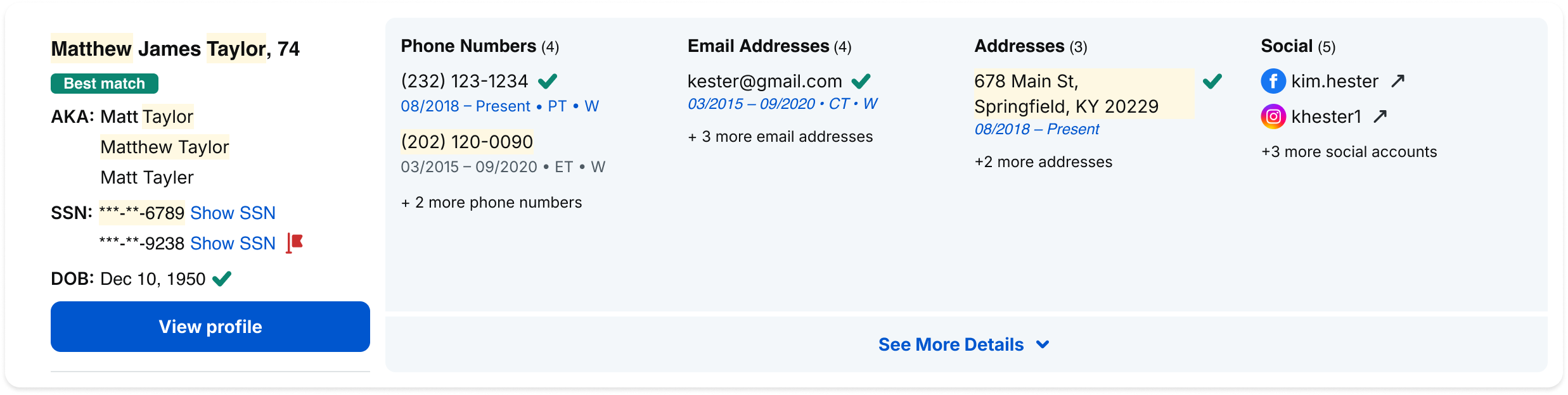
Link Text
Use link text to indicate clickable and interactive content within the Spokeo UI.
Link Text
spk.color.text.link
spk.color.blue.700
Contrast: 6.51
#0056CE
Name Profile Links
spk.color.text.link
Example
View more
View more

Hyperlink/Link Text
spk.color.text.link
Example
View the entire Typography Foundation Guideline here
Best Practices
Don’t: Use link text color for text that is not actionable
Don’t: Use secondary text color for primary text including titles and descriptions
Knowing people is your business — and ours.
Find the right person, quickly. Track down hard-to-find people and get up-to-date contact details, at your fingertips.
Don’t: Use secondary text color for primary text including titles and descriptions
Enter a first and last name
Hint text copy here.

Don’t: Use primary text color for hint or helper text
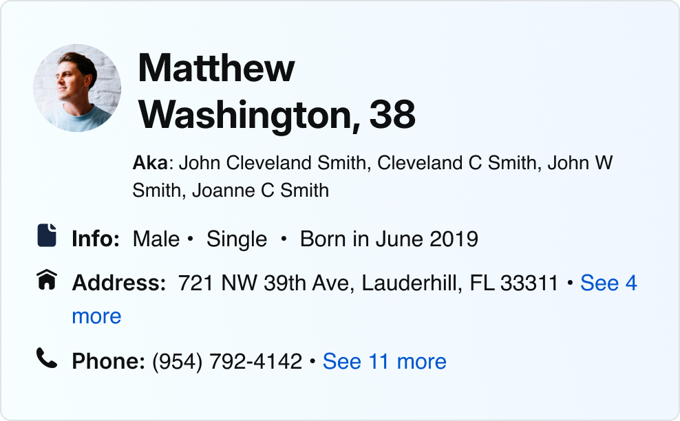
Surface Colors
To see our full guidelines for elevation and surface, go here
Primary and Secondary
Primary Surface
spk.color.surface.
primary
spk.color.white
#FFFFFF
Secondary Surface
spk.color.surface.secondary
spk.color.grey.50
#F7F8F8
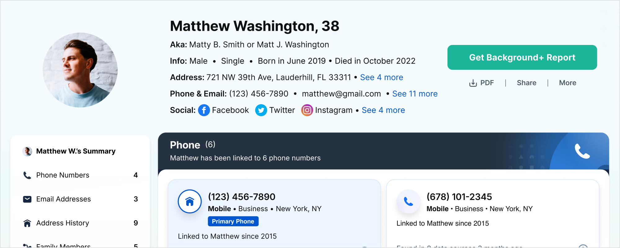
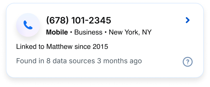
Spokeo Business - Search Results List
Example
Gradients
Light Blue Gradient
spk.color.gradient.lightblue
Linear Gradient
#F3FBFF, Opacity 100%, Stop 0%
#F4FBFF, Opacity 100%, Stop 100%
Name Profile - Billboard Background
Example

Billboard Background Asset
Example
Light Blue Purple Gradient
spk.color.gradient.lightbluepurple
Radial Gradient
#A4A8FD, Opacity 20%, Stop 0%
#ADADFF, Opacity 0%, Stop 100%
Linear Gradient
#EDF5FF, Opacity 100%, Stop 0%
#F9F2FF, Opacity 100%, Stop 100%
Name Profile - Nested Icon Background
Example
Related
To see the application of color to our illustrations, visit the Illustration Library


Contact Us
Terms
Privacy Policy
Copyright © 2006-2025 Spokeo, Inc.


Color
By using the standardized palette below, you will help distinguish our brand and reinforce consistent experiences for our users across products.


Table of Contents
Overview
Neutrals-Greys
spk.color.white
#FFFFFF
spk.color.grey.50
#F7F8F8
spk.color.grey.100
#EFF1F2
spk.color.grey.200
#DFE3E5
spk.color.grey.300
#C0C6CB
spk.color.grey.400
#A0AAB0
spk.color.grey.500
#818D96
spk.color.grey.600
#61717C
spk.color.grey.700
#4E5A63
S
spk.color.grey.800
#3A444A
spk.color.grey.900
#272D32
spk.color.grey.1000
#0E0F10
P
spk.color.black
#000000
Yellow Green
spk.color.yellowGreen.50
#FAFEF5
spk.color.yellowGreen.100
#F5FDEA
spk.color.yellowGreen.200
#ECFAD5
spk.color.yellowGreen.300
#D9F5AB
spk.color.yellowGreen.400
#C5F082
spk.color.yellowGreen.500
#B2EB58
spk.color.yellowGreen.600
#9FE62E
spk.color.yellowGreen.700
#7FB825
P
spk.color.yellowGreen.800
#5F8A1C
spk.color.yellowGreen.900
#405C12
spk.color.yellowGreen.1000
#202E09
Green
spk.color.green.50
#F5FDF8
spk.color.green.100
#EAFCF1
spk.color.green.200
#D5F9E2
spk.color.green.300
#ABF3C5
spk.color.green.400
#81ECA9
spk.color.green.500
#57E68C
spk.color.green.600
#2DE06F
spk.color.green.700
#24B359
P
spk.color.green.800
#15823D
spk.color.green.900
#125A2C
spk.color.green.1000
#092D16
Teal
spk.color.teal.50
#F4FDFC
spk.color.teal.100
#E9FCF9
spk.color.teal.200
#BBF7EC
spk.color.teal.300
#A4F5E6
spk.color.teal.400
#77F2DC
spk.color.teal.500
#4CEDD0
spk.color.teal.600
#22E5C2
spk.color.teal.700
#1BB599
P
spk.color.teal.800
#0C8671
spk.color.teal.900
#0E5C4E
spk.color.teal.1000
#072E27
Blue
spk.color.blue.50
#F5F9FF
spk.color.blue.100
#EDF5FF
spk.color.blue.200
#D6E9FF
spk.color.blue.300
#ADD3FF
spk.color.blue.400
#85BEFF
spk.color.blue.500
#3392FF
spk.color.blue.600
#1370F3
spk.color.blue.700
#0056CE
P
spk.color.blue.800
#0056CE
spk.color.blue.900
#003987
spk.color.blue.1000
#00132D
Purple
spk.color.purple.50
#FCF9FF
spk.color.purple.100
#F9F2FF
spk.color.purple.200
#E3D6FF
spk.color.purple.300
#C7ADFF
spk.color.purple.400
#AC85FF
spk.color.purple.500
#8E59FF
spk.color.purple.600
#7D40FF
spk.color.purple.700
#6534CE
P
spk.color.purple.800
#49239D
spk.color.purple.900
#32186C
spk.color.purple.1000
#1A0A3B
Blue Purple
spk.color.bluePurple.50
#FAF9FF
spk.color.bluePurple.100
#F5F2FF
spk.color.bluePurple.200
#D6D6FF
spk.color.bluePurple.300
#ADADFF
spk.color.bluePurple.400
#8585FF
spk.color.bluePurple.500
#5C5CFF
spk.color.bluePurple.600
#3333FF
spk.color.bluePurple.700
#2929CE
P
spk.color.bluePurple.800
#1F1F9D
spk.color.bluePurple.900
#14146C
spk.color.bluePurple.1000
#0A0A3B
Magenta
spk.color.magenta.50
#FFF7FF
spk.color.magenta.100
#FEF0FF
spk.color.magenta.200
#F7D5FA
spk.color.magenta.300
#EFABF5
spk.color.magenta.400
#E682F0
spk.color.magenta.500
#DE58EB
spk.color.magenta.600
#D62EE6
spk.color.magenta.700
#AB25B8
P
spk.color.magenta.800
#801C8A
spk.color.magenta.900
#56125C
spk.color.magenta.1000
#2B092E
Red
spk.color.red.50
#FFF5F5
spk.color.red.100
#FFECEC
spk.color.red.200
#FED8D8
spk.color.red.300
#FDB1B1
spk.color.red.400
#FC8A8A
spk.color.red.500
#FB6161
spk.color.red.600
#FA3C3C
spk.color.red.700
#CB3030
P
spk.color.red.800
#9C2424
spk.color.red.900
#6C1818
spk.color.red.1000
#3D0C0C
Orange
spk.color.orange.50
#FFF8F4
spk.color.orange.100
#FFF1E9
spk.color.orange.200
#FFE4D4
spk.color.orange.300
#FFC8A8
spk.color.orange.400
#FFAD7D
spk.color.orange.500
#FF9151
spk.color.orange.600
#FF7626
spk.color.orange.700
#CC5E1E
P
spk.color.orange.800
#994717
spk.color.orange.900
#662F0F
spk.color.orange.1000
#331808
Yellow
spk.color.yellow.50
#FFFBEF
spk.color.yellow.100
#FFF8E0
spk.color.yellow.200
#FFF4CC
spk.color.yellow.300
#FFEBA1
spk.color.yellow.400
#FFE173
spk.color.yellow.500
#FFD84A
spk.color.yellow.600
#FFCD1A
spk.color.yellow.700
#D9AA00
P
spk.color.yellow.800
#997B0F
spk.color.yellow.900
#665105
spk.color.yellow.1000
#332903
Blue Grey
spk.color.blueGrey.50
#F9FBFD
spk.color.blueGrey.100
#F3F7FA
spk.color.blueGrey.200
#DEE5ED
spk.color.blueGrey.300
#BDCBDB
spk.color.blueGrey.400
#9CB0C9
spk.color.blueGrey.500
#7B96B7
spk.color.blueGrey.600
#5A7CA5
spk.color.blueGrey.700
#486384
P
spk.color.blueGrey.800
#364A63
spk.color.blueGrey.900
#243242
spk.color.blueGrey.1000
#121921
Brand Colors
Use for primary and secondary elements that communicate the Spokeo brand.


Primary
spk.color.brand.primary
spk.color.blue.500
#3392FF
Secondary
spk.color.brand.secondary
spk.color.grey.900
#272D32
Status Colors
Use to communicate feedback, status, urgency, and important information.
Error
Success
Warning
Information
Neutral
Information
Use to communicate informative UI or progress, such as informational messages.
Information
spk.color.information
spk.color.blue.700
#0056CE
Information Surface
spk.color.information.subtle
spk.color.blueGrey.100
#EDF5FF
Information Message

Notification Message - Information
Information Icon: spk.color.information
Example
Neutral
Use to communicate neutral information and messages.
Neutral
spk.color.neutral
spk.color.grey.700
#4E5A63
Neutral Surface
spk.color.surface.neutral.subtle
spk.color.grey.50
#F7F8F8
Neutral Message
Notification Message - Neutral
Information Icon: spk.color.neutral
Example
Success
Use to communicate a favorable outcome or positive feedback, such as success messages.
Success Default
spk.color.success
spk.color.teal.800
#07826C
Success Surface
spk.color.success.subtle
spk.color.teal.100
#E9FCF9
Success Message
Notification Message - Success
Success Icon: spk.color.success
Example
Label
Input
Field validation is successful.
Input Text Field - Success
Success Text: spk.color.text.success
Example
Warning
Use to communicate caution or prevent a mistake, such as warning messages.
Warning Default
spk.color.warning
spk.color.orange.600
#FF7626
Warning Surface
spk.color.warning.subtle
spk.color.yellow.100
#FFF8E0
Warning Message
Notification Message - Warning
Warning Icon: spk.color.warning
Example
Error
Use to communicate danger or negative feedback, such as error messages.
Error (Default)
spk.color.error
spk.color.red.700
#CB3030
Error Surface
spk.color.error.subtle
spk.color.red.100
#FFECEC
Error Message
Notification Message - Error
Error Icon: spk.color.error
Example
Label
Error message here.
Input Text Field - Error
Error Text: spk.color.text.error
Example
Best Practices
Neutral Message
Warning Message

Don’t: Mix different status colors together
Label
Input
Field validation is successful.
Don’t: Mix different status colors together or misuse status colors that don’t match to their intended usage
Success! Your payment has been processed.
Error! Field required.
Don’t: Misuse status colors that don’t match to their intended usage
Text Colors
Accessibility Guidelines
WCAG 2.0 level AA requires a contrast ratio of at least 4.5:1 for normal text and 3:1 for large text. WCAG 2.1 requires a contrast ratio of at least 3:1 for graphics and user interface components (such as form input borders). WCAG Level AAA requires a contrast ratio of at least 7:1 for normal text and 4.5:1 for large text.
Large text is defined as 14 point (typically 18.66px) and bold or larger, or 18 point (typically 24px) or larger.
Primary Text
Both of Spokeo’s primary and secondary text colors pass WCAG Level AAA guidelines. Primary text, or Grey 1000, has a contrast of 19.18, and should be used for headlines, titles, body copy and the majority of text found within the Spokeo product.
Secondary Text
Secondary text, or Grey 700, has a contrast of 7.07, and should be used for less important or supporting text such as labels and hint text.
Primary Text
spk.color.text.primary
spk.color.grey.1000
Contrast: 19.18
#0E0F10
Secondary Text
spk.color.text.secondary
spk.color.grey.700
Contrast: 7.07
#4E5A63
Knowing people is your business — and ours.
Find the right person, quickly. Track down hard-to-find people and get up-to-date contact details, at your fingertips.
Landing Page Text
Title and Description: spk.color.text.primary
Example
Enter a full name
Hint text copy here.
Input Text Field - Default
Placeholder Text: spk.color.text.secondary
Example
Link Text
Use link text to indicate clickable and interactive content within the Spokeo UI.
Link Text
spk.color.text.link
spk.color.blue.700
Contrast: 6.51
#0056CE
Name Profile Links
spk.color.text.link
Example
View more
View more
Hyperlink/Link Text
spk.color.text.link
Example
View the entire Typography Foundation Guideline here
Best Practices
Don’t: Use link text color for text that is not actionable

Don’t: Use secondary text color for primary text including titles and descriptions
Knowing people is your business — and ours.
Find the right person, quickly. Track down hard-to-find people and get up-to-date contact details, at your fingertips.
Don’t: Use secondary text color for primary text including titles and descriptions
Enter a first and last name
Hint text copy here.
Don’t: Use primary text color for hint or helper text
Surface Colors
To see our full guidelines for elevation and surface, go here
Primary and Secondary
Primary Surface
spk.color.surface.
primary
spk.color.white
#FFFFFF
Secondary Surface
spk.color.surface.secondary
spk.color.grey.50
#F7F8F8
Spokeo Business - Search Results List
Example
Gradients
Light Blue Gradient
spk.color.gradient.lightblue
Linear Gradient
#F3FBFF, Opacity 100%, Stop 0%
#F4FBFF, Opacity 100%, Stop 100%
Name Profile - Billboard Background
Example
Billboard Background Asset
Example
Light Blue Purple Gradient
spk.color.gradient.lightbluepurple
Radial Gradient
#A4A8FD, Opacity 20%, Stop 0%
#ADADFF, Opacity 0%, Stop 100%
Linear Gradient
#EDF5FF, Opacity 100%, Stop 0%
#F9F2FF, Opacity 100%, Stop 100%
Name Profile - Nested Icon Background
Example
Related
To see the application of color to our illustrations, visit the Illustration Library

Contact Us
Terms
Privacy Policy
Copyright © 2006-2025 Spokeo, Inc.