

Corner Radius
Spokeo uses a corner radius scale to define shapes for various components, UI elements, and illustrations.

Table of Contents
Overview
Corner Radius Shapes
Spokeo uses a 4px base for its corner radius scale, ranging from 0-24px, up to a completely full radius.
0px
4px
8px
12px
16px
24px
Full
Usage
4px
4px corner radius is primarily used for smaller elements like badges and focus states.
Best Match
4
Best Match
Best Match
Badges
Example: spk.radius.4x
View more

4
Link Button Focus State
Example: spk.radius.4x
8px
8px corner radius is primarily used for elements like buttons, form fields, search bars, and cards.
8

Button

Button
Button
Buttons
Example: spk.radius.8x
Card number


8
Search by name, email, phone or address

Form Fields and Search Bars
Example: spk.radius.8x
Date Picker
Example: spk.radius.8x
Cards
Example: spk.radius.8x

Cards With Asymmetric Radius
Example: spk.radius.8x.top, spk.radius.8x.bottom
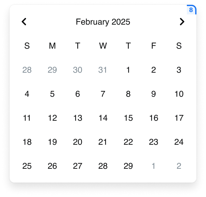
12px
12px corner radius is primarily used for elements like dialogs.
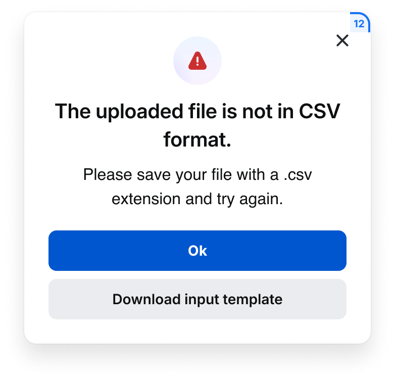
Dialogs
Example: spk.radius.12px
16-24px
16-24px corner radius is primarily used for illustrations and graphics.
Illustration
Example: spk.radius.16px, spk.radius.24px
Best Practices
John Smith
Search


Do: Use the same corner radius for form fields and buttons
John Smith
Search


Don’t: Mix and match form fields and buttons with a different corner radius
Special Offer
Special Offer
Special Offer
Do: Use a full corner radius for marketing purposes
1
1
1
Do: Use a full corner radius for number badges

Filter tag

Filter tag
Filter tag
Do: Use a full corner radius for filter tags
Button
Button
Button
Don’t: Use a full corner radius for buttons
Don’t: Mix and match cards with a different corner radius
Do: Use an asymmetric corner radius if there is a photo or graphic present
Don’t: Use an asymmetric corner radius if there is no photo or graphic present
Tokens
Symmetric
Collection
System Token
Usage
Value
Radius
spk.radius.0px
Background containers
0px
Radius
spk.radius.4x
Badges, focused states
4px
Radius
spk.radius.8x
Cards, buttons, form fields, search bar, dropdowns
8px
Radius
spk.radius.12x
Cards, dialogs
12px
Radius
spk.radius.16x
Large cards and graphics
16px
Radius
spk.radius.24x
Illustrations and graphics
24px
Radius
spk.radius.full
Filter tags, avatars, nested icons, number badges
9999px
Asymmetric
Collection
System Token
Usage
Value
Radius
spk.radius.8px.top
Cards, dialogs
8px (8,8,0,0)
Radius
spk.radius.8px.bottom
Cards, dialogs
8px (0,0,8,8)
Radius
spk.radius.8px.left
Cards, dialogs
8px (8,0,0,8)
Radius
spk.radius.8px.right
Cards, dialogs
8px (0,8,8,0)


Contact Us
Terms
Privacy Policy
Copyright © 2006-2025 Spokeo, Inc.


Corner Radius
Spokeo uses a corner radius scale to define shapes for various components, UI elements, and illustrations.


Table of Contents
Overview
Corner Radius Shapes
Spokeo uses a 4px base for its corner radius scale, ranging from 0-24px, up to a completely full radius.
0px
4px
8px
12px
16px
24px
Full
Usage
4px
4px corner radius is primarily used for smaller elements like badges and focus states.
Best Match
4
Best Match
Best Match
Badges
Example: spk.radius.4x
View more
4
Link Button Focus State
Example: spk.radius.4x
8px
8px corner radius is primarily used for elements like buttons, form fields, search bars, and cards.
8

Button
Button
Button
Buttons
Example: spk.radius.8x
Card number
8
Search by name, email, phone or address
Form Fields and Search Bars
Example: spk.radius.8x
Date Picker
Example: spk.radius.8x
Cards
Example: spk.radius.8x
Cards With Asymmetric Radius
Example: spk.radius.8x.top, spk.radius.8x.bottom
12px
12px corner radius is primarily used for elements like dialogs.
Dialogs
Example: spk.radius.12px
16-24px
16-24px corner radius is primarily used for illustrations and graphics.
Illustration
Example: spk.radius.16px, spk.radius.24px
Best Practices
John Smith
Search

Do: Use the same corner radius for form fields and buttons
John Smith
Search

Don’t: Mix and match form fields and buttons with a different corner radius
Special Offer
Special Offer
Special Offer

Do: Use a full corner radius for marketing purposes
1
1
1
Do: Use a full corner radius for number badges

Filter tag
Filter tag
Filter tag
Do: Use a full corner radius for filter tags
Button
Button
Button

Don’t: Use a full corner radius for buttons
Don’t: Mix and match cards with a different corner radius
Do: Use an asymmetric corner radius if there is a photo or graphic present
Don’t: Use an asymmetric corner radius if there is no photo or graphic present
Tokens
Symmetric
Collection
System Token
Usage
Value
Radius
spk.radius.0px
Background containers
0px
Radius
spk.radius.4x
Badges, focused states
4px
Radius
spk.radius.8x
Cards, buttons, form fields, search bar, dropdowns
8px
Radius
spk.radius.12x
Cards, dialogs
12px
Radius
spk.radius.16x
Large cards and graphics
16px
Radius
spk.radius.24x
Illustrations and graphics
24px
Radius
spk.radius.full
Filter tags, avatars, nested icons, number badges
9999px
Asymmetric
Collection
System Token
Usage
Value
Radius
spk.radius.8px.top
Cards, dialogs
8px (8,8,0,0)
Radius
spk.radius.8px.bottom
Cards, dialogs
8px (0,0,8,8)
Radius
spk.radius.8px.left
Cards, dialogs
8px (8,0,0,8)
Radius
spk.radius.8px.right
Cards, dialogs
8px (0,8,8,0)

Contact Us
Terms
Privacy Policy
Copyright © 2006-2025 Spokeo, Inc.