

Elevation
Spokeo uses elevation styles to create distance between an object and the surface behind it. Separation can be applied in different colors and can be bidirectional.

Table of Contents
Overview
Shadow Styles
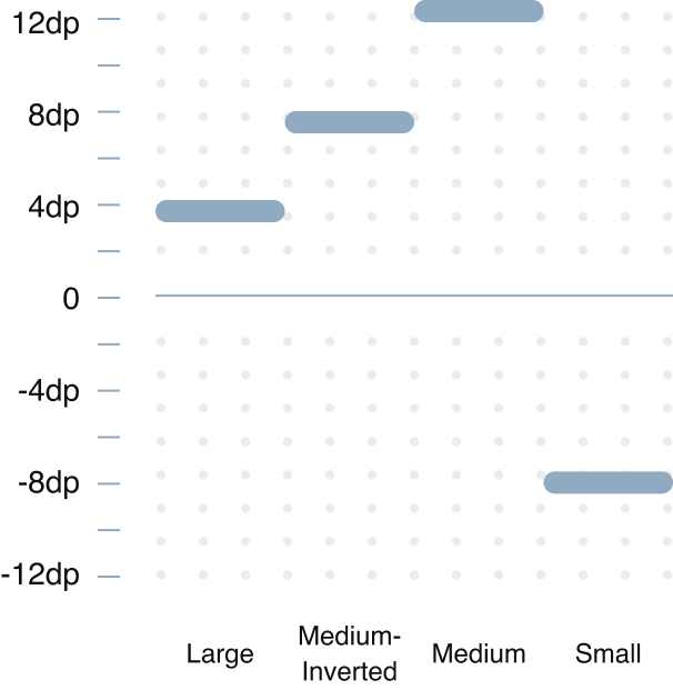
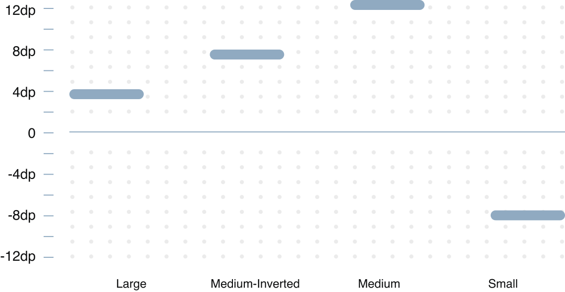
Spokeo uses a 4px base for its blur, ranging from 4px - 24px. The y-axis ranges from −8 to 12px. The opacity is fixed at 12%.
Small
Medium
Medium-Inverted
Large
Grey
Small
spk.shadow.small.grey
Blur:
4px
Y-Axis:
2px
Opacity:
12%
Blur:
2px
Y-Axis:
0px
Opacity:
12%
Medium
spk.shadow.medium.grey
Blur:
16px
Y-Axis:
8px
Opacity:
12%
Blur:
2px
Y-Axis:
0px
Opacity:
12%
Medium-Inverted
spk.shadow.medium.inverted.grey
Blur:
16px
Y-Axis:
−8px
Opacity:
12%
Blur:
2px
Y-Axis:
0px
Opacity:
12%
Large
spk.shadow.large.grey
Blur:
24px
Y-Axis:
12px
Opacity:
12%
Blur:
2px
Y-Axis:
0px
Opacity:
12%
Blue
Small
spk.shadow.small.blue
Blur:
4px
Y-Axis:
2px
Opacity:
12%
Blur:
2px
Y-Axis:
0px
Opacity:
12%
Medium
spk.shadow.medium.blue
Blur:
16px
Y-Axis:
8px
Opacity:
12%
Blur:
2px
Y-Axis:
0px
Opacity:
12%
Medium-Inverted
spk.shadow.medium.inverted.blue
Blur:
16px
Y-Axis:
−8px
Opacity:
12%
Blur:
2px
Y-Axis:
0px
Opacity:
12%
Large
spk.shadow.large.blue
Blur:
24px
Y-Axis:
12px
Opacity:
12%
Blur:
2px
Y-Axis:
0px
Opacity:
12%
Teal
Medium
spk.shadow.medium.teal
Blur:
16px
Y-Axis:
8px
Opacity:
12%
Blur:
2px
Y-Axis:
0px
Opacity:
12%

Usage
Sizes
Elevation creates visual hierarchy and communicates the relative importance and interactive state of UI elements by simulating depth.
Depicting Elevation
Elevation can be illustrated through shadows or various visual hints, like surface fills that show a subtle tone difference or delicate scrims.
Surface-Container
Surface-Container
Default-Grey/Medium
Multiple Surface Containers
Two overlapping surfaces with the same tonal values separated via shadow
Background
Surface-Container
Background and Surface Containers
Two overlapping surfaces with distinct tonal values
Surface-Container
Overlay
Surface-Container
Multiple Surface Containers With Overlay
Two overlapping surfaces with the same tonal values separated via overlay
Best Practices


Do: Use a 1px border when the card element is at the lowest level of elevation
Username Matches for “mart7”
Results derived from Matthew’s email: mart7@aol.com


Do: Use small grey shadows for cards on neutral surfaces
Username Matches for “mart7”
Results derived from Matthew’s email: mart7@aol.com


Don’t: Use large shadows for cards that are in close proximity. They will cast shadows on top of nearby elements
Username Matches for “mart7”
Results derived from Matthew’s email: mart7@aol.com
Don’t: Mix and match shadows within the same section container


Do: Use a medium shadow for global header

Button
Do: Use a medium shadow for button hover states
Button
Don’t: Use a medium-inverted shadow for button hover states

Button
Do: Pair teal shadows with teal-colored buttons
Button
Don’t: Pair blue shadows with teal-colored buttons
Do: Use an inverted shadow on bottom sticky menus and lists

Do: Use blue shadows against blue-themed surface colors
Don’t: Use blue shadows against non-blue-themed surface colors
Do: Use large shadows for dropdown menus

Do: Use a large shadow for dialogs
Don’t: Use large shadows for lower elevation elements
Tokens
Shadows
Size
Color
System Token
Usage
Value
Small
Grey
spk.shadow.small.grey
Cards
0px
Medium
Grey
spk.shadow.medium.grey
Buttons, list, view, hover
4px
Medium-inverted
Grey
spk.shadow.medium.inverted.grey
Bottom sticky menu
8px
Large
Grey
spk.shadow.large.grey
Dropdown, overlay, marketing promos
12px
Small
Blue
spk.shadow.small.blue
Cards
0px
Medium
Blue
spk.shadow.medium.blue
List, view, hover
4px
Medium-inverted
Blue
spk.shadow.medium.inverted.blue
Bottom sticky menu
8px
Large
Blue
spk.shadow.large.blue
Dropdown, overlay, marketing promos
12px
Medium
Teal
spk.shadow.medium.teal
Primary buttons
4px
Related
Stay up to date with the latest UX decisions, patterns, and component updates in our product.


Contact Us
Terms
Privacy Policy
Copyright © 2006-2025 Spokeo, Inc.


Elevation
Spokeo uses elevation styles to create distance between an object and the surface behind it. Separation can be applied in different colors and can be bidirectional.


Table of Contents
Overview
Shadow Styles
Spokeo uses a 4px base for its blur, ranging from 4px - 24px. The y-axis ranges from −8 to 12px. The opacity is fixed at 12%.
Small
Medium
Medium-Inverted
Large
Grey
Small
spk.shadow.small.grey
Blur:
4px
Y-Axis:
2px
Opacity:
12%
Blur:
2px
Y-Axis:
0px
Opacity:
12%
Medium
spk.shadow.medium.grey
Blur:
16px
Y-Axis:
8px
Opacity:
12%
Blur:
2px
Y-Axis:
0px
Opacity:
12%
Medium-Inverted
spk.shadow.medium.inverted.grey
Blur:
16px
Y-Axis:
−8px
Opacity:
12%
Blur:
2px
Y-Axis:
0px
Opacity:
12%
Large
spk.shadow.large.grey
Blur:
24px
Y-Axis:
12px
Opacity:
12%
Blur:
2px
Y-Axis:
0px
Opacity:
12%
Blue
Small
spk.shadow.small.blue
Blur:
4px
Y-Axis:
2px
Opacity:
12%
Blur:
2px
Y-Axis:
0px
Opacity:
12%
Medium
spk.shadow.medium.blue
Blur:
16px
Y-Axis:
8px
Opacity:
12%
Blur:
2px
Y-Axis:
0px
Opacity:
12%
Medium-Inverted
spk.shadow.medium.inverted.blue
Blur:
16px
Y-Axis:
−8px
Opacity:
12%
Blur:
2px
Y-Axis:
0px
Opacity:
12%
Large
spk.shadow.large.blue
Blur:
24px
Y-Axis:
12px
Opacity:
12%
Blur:
2px
Y-Axis:
0px
Opacity:
12%
Teal
Medium
spk.shadow.medium.teal
Blur:
16px
Y-Axis:
8px
Opacity:
12%
Blur:
2px
Y-Axis:
0px
Opacity:
12%
Small
spk.shadow.small.blue
Blur:
4px
Y-Axis:
2px
Opacity:
12%
Blur:
2px
Y-Axis:
0px
Opacity:
12%

Usage
Sizes
Elevation creates visual hierarchy and communicates the relative importance and interactive state of UI elements by simulating depth.
Depicting Elevation
Elevation can be illustrated through shadows or various visual hints, like surface fills that show a subtle tone difference or delicate scrims.
Surface-Container
Surface-Container
Default-Grey/Medium
Multiple Surface Containers
Two overlapping surfaces with the same tonal values separated via shadow
Background
Surface-Container
Background and Surface Containers
Two overlapping surfaces with distinct tonal values
Surface-Container
Overlay
Surface-Container
Multiple Surface Containers With Overlay
Two overlapping surfaces with the same tonal values separated via overlay
Best Practices

Do: Use a 1px border when the card element is at the lowest level of elevation
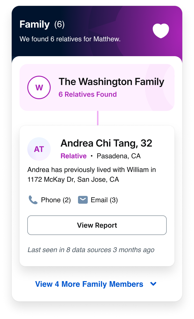
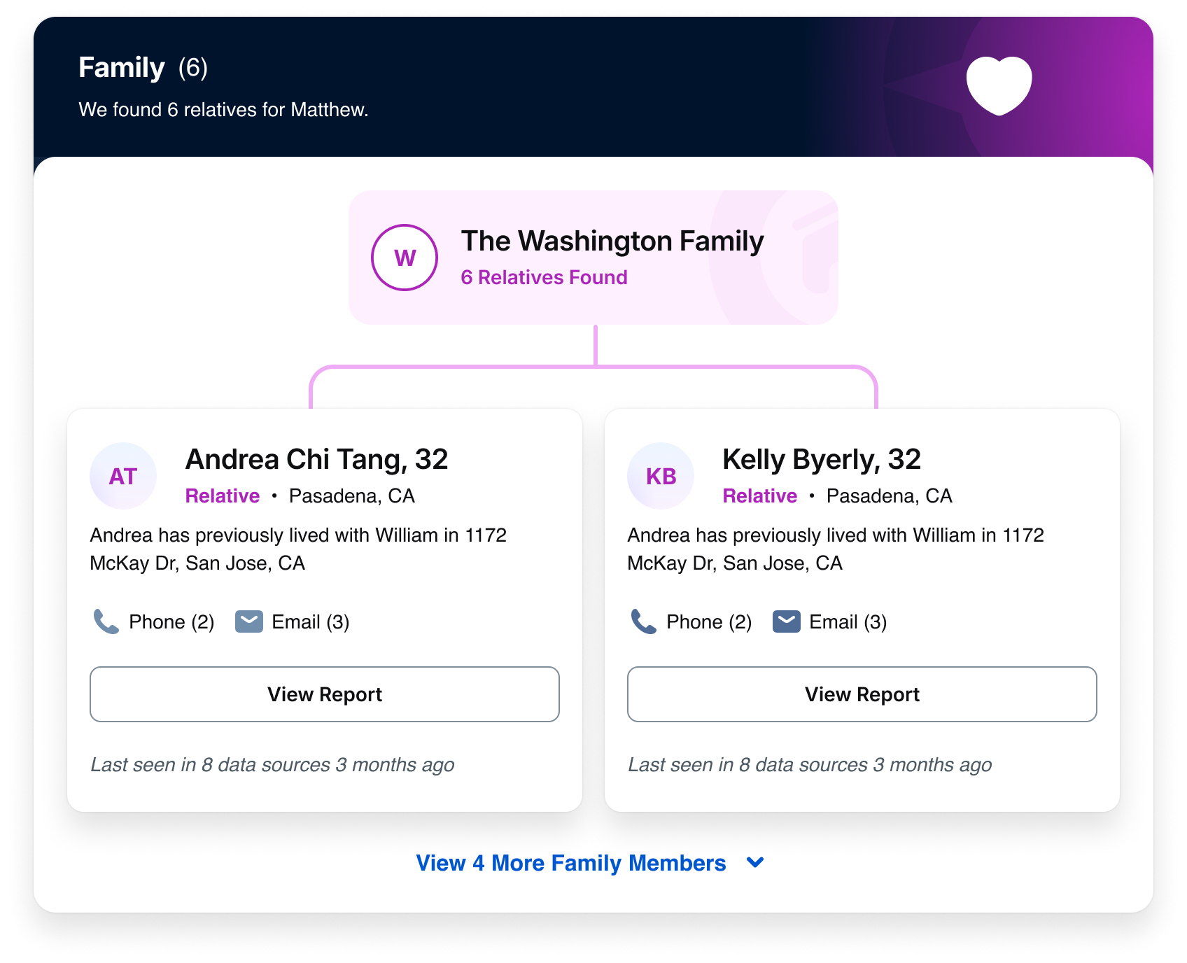
Username Matches for “mart7”
Results derived from Matthew’s email: mart7@aol.com
Do: Use small grey shadows for cards on neutral surfaces
Username Matches for “mart7”
Results derived from Matthew’s email: mart7@aol.com

Don’t: Use large shadows for cards that are in close proximity. They will cast shadows on top of nearby elements
Username Matches for “mart7”
Results derived from Matthew’s email: mart7@aol.com
Don’t: Mix and match shadows within the same section container
Do: Use a medium shadow for global header
Button

Do: Use a medium shadow for button hover states
Button

Don’t: Use a medium-inverted shadow for button hover states
Button
Do: Pair teal shadows with teal-colored buttons
Button
Don’t: Pair blue shadows with teal-colored buttons
Do: Use an inverted shadow on bottom sticky menus and lists
Do: Use blue shadows against blue-themed surface colors
Don’t: Use blue shadows against non-blue-themed surface colors
Do: Use large shadows for dropdown menus

Do: Use a large shadow for dialogs
Don’t: Use large shadows for lower elevation elements
Tokens
Shadows
Size
Color
System Token
Usage
Value
Small
Grey
spk.shadow.small.grey
Cards
0px
Medium
Grey
spk.shadow.medium.grey
Buttons, list, view, hover
4px
Medium-inverted
Grey
spk.shadow.medium.inverted.grey
Bottom sticky menu
8px
Large
Grey
spk.shadow.large.grey
Dropdown, overlay, marketing promos
12px
Small
Blue
spk.shadow.small.blue
Cards
0px
Medium
Blue
spk.shadow.medium.blue
List, view, hover
4px
Medium-inverted
Blue
spk.shadow.medium.inverted.blue
Bottom sticky menu
8px
Large
Blue
spk.shadow.large.blue
Dropdown, overlay, marketing promos
12px
Medium
Teal
spk.shadow.medium.teal
Primary buttons
4px
Related
Stay up to date with the latest UX decisions, patterns, and component updates in our product.

Contact Us
Terms
Privacy Policy
Copyright © 2006-2025 Spokeo, Inc.