

Iconography
Use these principles to select, create, and apply icons consistently across product and brand, helping us maintain a cohesive visual language.

Table of Contents
Anatomy
Sizing
Naming
Styles
Status Icons
Creating Icons
Best Practices
Anatomy
Spokeo’s icon sizing guidelines are based on a 4px grid system.
Icon Template
Icons should be designed for readability and clarity, even at small sizes. Create icons on a 24×24px grid, using a 2px stroke and a 2px safe area.
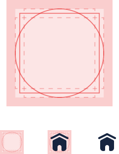
Icon color:
Level 700 - 800 (minimum contrast: 3)
Stroke:
2px
Corners:
Rounded
Pixel grid:
24x24px
Circle (diameter):
20px
Square:
18x18px
Rectangle (horizontal):
20x16px
Rectangle (vertical):
16x20px
Sizing
Spokeo’s icon sizing guidelines are based on a 4px grid system.
Button Variants
Usage


12x12px: Use with Small Body copy


16x16px: Use with Small Body copy


20x20px: Use with Small Body copy


24x24px: Standard sizing


28x28px: More prominent icons


32x32px: More prominent icons


40x40px: Primarily for nested icons


48x48px: Nested icons, graphics


56x56px: Nested icons, graphics
How to Scale
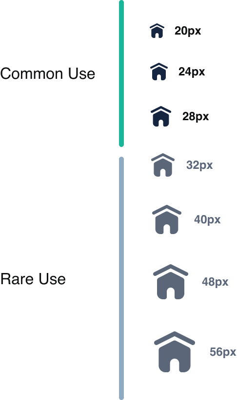
To scale an icon, press "K" (Scale) on the keyboard and resize by dragging the corner of the box. Only use approved icon sizes: 20, 24, 28, 32, 40, 48, and 56px.
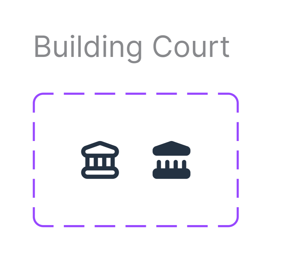
Naming
When creating icons, use the correct naming conventions. We use camelCase for icon names (e.g., “iconName”). If the name is a single word, use all lowercase.
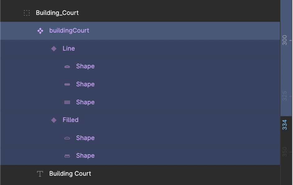
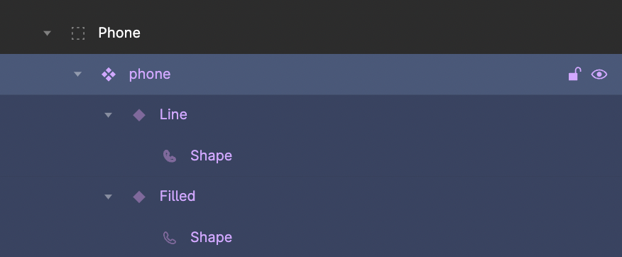
On the artboard, use the original names (e.g., “Building Court”) so they’re easier to scan.

Styles
Spokeo uses multiple icon styles based on hierarchy, state (default/hover/selected), and the surrounding background or environment colors.
Solid
Use for primary list items, selected and hover states, and illustrations.


Basic icon color: Blue-Grey 900
Other Icon colors: Level 700-800
(minimum contrast: 3)
Outline
Use for secondary list items, default states, cards, and illustrations.


Basic icon color: Blue-Grey 900
Other Icon colors:
Status Icons
Don’t merge the status icon with the main icon, so we can apply different colors to the status icon.
Some icons may include a small status indicator. Additional status indicators can be created as needed, but they must remain consistent with existing status icon styles.
Simple Icon With Status Template
- Use a shape in the template to subtract the area for the status icon.
- Place the status icon.
- Flatten the subtraction.
- Update the shape and add rounded edges, if needed.
Important: Do not combine the status icon with the main icon, so the status color can be updated independently.


Status Icons Example
Status icons should not be used as standalone icons.
We have 10 status types: Add, Remove, Edit, Check, Upload, Download, Search, View, Favorite, and Locked.


Icon size:
8x8px
Creating Icons
To create more icons we can use additional sets. First use Universal, then Bootsy and if there is no icons we can use Streamline Flex and Streamline Bold.
When adding a new icon, place it in the icon set (internal use only) and update the Design System changelog in Confluence (internal use only). Include the icon category, file name, and Figma link in the update.
Export new icons as SVG and upload them to the icon set Google Drive folder (internal use only).
Using the Universal Icon Set
Spokeo icons are based on the Universal icon set, so no changes are needed. Simply create a new component.
Using the Bootsy Icon Set
Sizing
When using the Bootsy icon set, only select icons that are not already represented in our icon library. Review each icon’s anatomy and style to ensure it matches our icon system, and update as needed.
Bootsy Icon Usage
Only use Bootsy for icons that are not already in our icon library. Review and adjust styling as needed to match our icon system before adding the icon to the set.

Naming
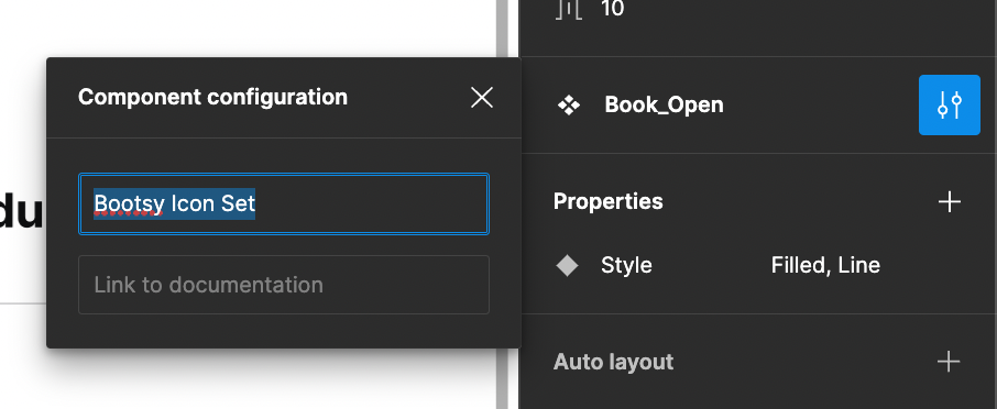
When using the Bootsy icon set, add the icon set name to the Component Configuration description and place the icon under the “From Bootsy” category on the artboard.
Using the Streamline Icon Set
Sizing
When using the Streamline icon set, note that Streamline icons do not include a built-in safe area. Place the 20px Streamline icon inside a 24px box to create the required 2px safe area.
Streamline Icon Usage
To match our icon system, first place the 20px Streamline icon inside a 24px container. Once it’s updated, scale it to the required size.

Naming
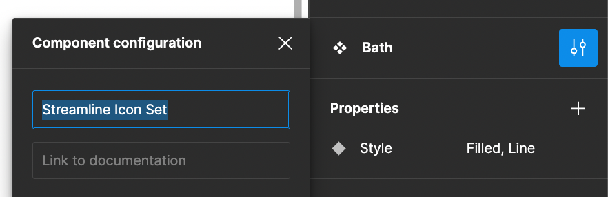
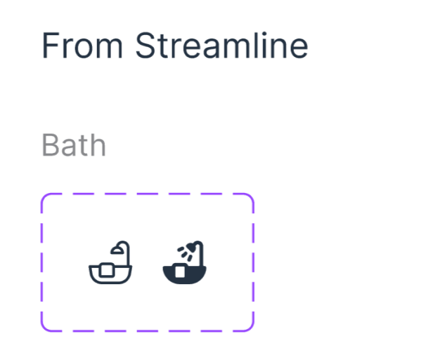
When using the Streamline icon set, add the icon set name to the Component Configuration description and place the icon under the “From Streamline” category on the artboard.
Best Practices
Spokeo provides a purposeful set of icons sizes and styles.

Phone (2)


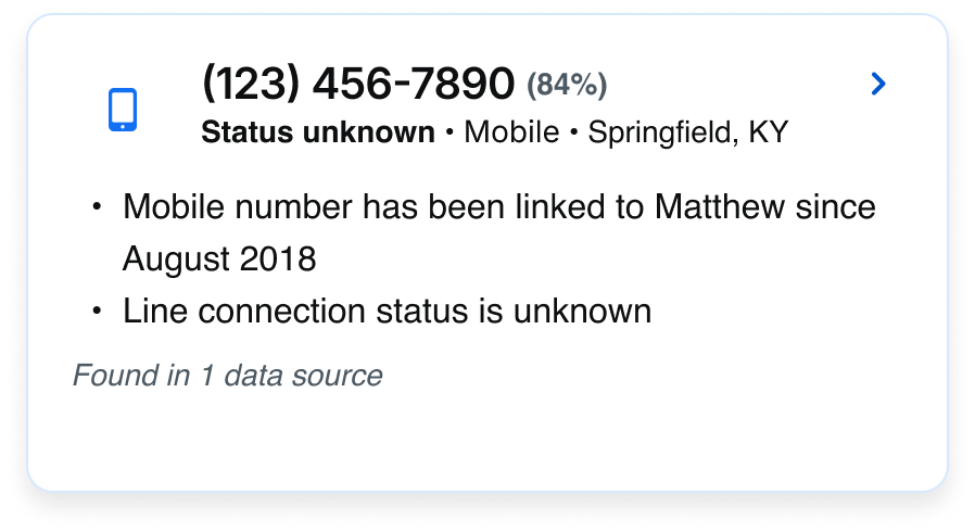
Do: Pair supporting/secondary text with simple icons

Young Adults
Home Decor
Young Adults
Do: Use simple icons for listing information
View All Results

Do: Use simple icons for link buttons


Don’t: Pair a simple icon with the primary card title


Contact Us
Terms
Privacy Policy
Copyright © 2006-2025 Spokeo, Inc.


Iconography
Use these principles to select, create, and apply icons consistently across product and brand, helping us maintain a cohesive visual language.


Table of Contents
Anatomy
Spokeo’s icon sizing guidelines are based on a 4px grid system.
Icon Template
Icons should be designed for readability and clarity, even at small sizes. Create icons on a 24×24px grid, using a 2px stroke and a 2px safe area.
Icon color:
Level 700 - 800 (minimum contrast: 3)
Stroke:
2px
Corners:
Rounded
Pixel grid:
24x24px
Circle (diameter):
20px
Square:
18x18px
Rectangle (horizontal):
20x16px
Rectangle (vertical):
16x20px
Sizing
Spokeo’s icon sizing guidelines are based on a 4px grid system.
Button Variants
Usage
12x12px: Use with Small Body copy
16x16px: Use with Small Body copy
20x20px: Use with Small Body copy
24x24px: Standard sizing
28x28px: More prominent icons
32x32px: More prominent icons
40x40px: Primarily for nested icons
48x48px: Nested icons, graphics
56x56px: Nested icons, graphics
How to Scale
To scale an icon, press "K" (Scale) on the keyboard and resize by dragging the corner of the box. Only use approved icon sizes: 20, 24, 28, 32, 40, 48, and 56px.


20px
24px


28px


32px


40px


48px


56px
Common Use
Rare Use
Naming
When creating icons, use the correct naming conventions. We use camelCase for icon names (e.g., “iconName”). If the name is a single word, use all lowercase.
On the artboard, use the original names (e.g., “Building Court”) so they’re easier to scan.
Styles
Spokeo uses multiple icon styles based on hierarchy, state (default/hover/selected), and the surrounding background or environment colors.
Solid
Use for primary list items, selected and hover states, and illustrations.
Basic icon color: Blue-Grey 900
Other icon colors: Level 700-800 (minimum contrast: 3)
Outline
Use for secondary list items, default states, cards, and illustrations.
Basic icon color: Blue-Grey 900
Other icon colors: Level 700-800 (minimum contrast: 3)
Status Icons
Don’t merge the status icon with the main icon, so we can apply different colors to the status icon.
Some icons may include a small status indicator. Additional status indicators can be created as needed, but they must remain consistent with existing status icon styles.
Simple Icon With Status Template
- Use a shape in the template to subtract the area for the status icon.
- Place the status icon.
- Flatten the subtraction.
- Update the shape and add rounded edges, if needed.
Important: Do not combine the status icon with the main icon, so the status color can be updated independently.
Status Icons Example
Status icons should not be used as standalone icons.
We have 10 status types: Add, Remove, Edit, Check, Upload, Download, Search, View, Favorite, and Locked.
Icon size:
8x8px
Creating Icons
To create new icons, start with Universal, then Bootsy. If an icon isn’t available, use Streamline Flex or Streamline Bold.
When adding a new icon, place it in the icon set (internal use only) and update the Design System changelog in Confluence (internal use only). Include the icon category, file name, and Figma link in the update.
Export new icons as SVG and upload them to the icon set Google Drive folder (internal use only).
Using the Universal Icon Set
Spokeo icons are based on the Universal icon set, so no changes are needed. Simply create a new component.
Using the Bootsy Icon Set
Sizing
When using the Bootsy icon set, only select icons that are not already represented in our icon library. Review each icon’s anatomy and style to ensure it matches our icon system, and update as needed.
Bootsy Icon Usage
Only use Bootsy for icons that are not already in our icon library. Review and adjust styling as needed to match our icon system before adding the icon to the set.
Naming
When using the Bootsy icon set, add the icon set name to the Component Configuration description and place the icon under the “From Bootsy” category on the artboard.
Using the Streamline Icon Set
Sizing
When using the Streamline icon set, note that Streamline icons do not include a built-in safe area. Place the 20px Streamline icon inside a 24px box to create the required 2px safe area.
Streamline Icon Usage
To match our icon system, first place the 20px Streamline icon inside a 24px container. Once it’s updated, scale it to the required size.
Naming
When using the Streamline icon set, add the icon set name to the Component Configuration description and place the icon under the “From Streamline” category on the artboard.
Best Practices
Spokeo provides a purposeful set of icons sizes and styles.
Phone (2)

Do: Pair supporting/secondary text with simple icons
Young Adults
Home Decor
Young Adults
Do: Use simple icons for listing information
View All Results

Do: Use simple icons for link buttons

Don’t: Pair a simple icon with the primary card title

Contact Us
Terms
Privacy Policy
Copyright © 2006-2025 Spokeo, Inc.