

Typography
Using the typography guidelines outlined below will enhance our brand identity and ensure a cohesive experience for users across all products.

Table of Contents
Font Stack
Inter
Inter is a variable font family carefully crafted and designed for computer screens.
Inter features a tall x-height to aid in readability of mixed-case and lowercase text. Several OpenType features are provided as well, like contextual alternates that adjusts punctuation depending on the shape of surrounding glyphs, slashed zero for when you need to disambiguate "0" from "o", tabular numbers, etc.
Inter
Inter
Inter
Inter is the default font that should be used as the header/display font throughout all of Spokeo’s brand, product, and marketing. In the event that Inter is unavailable, such as native apps and emails, follow the font stack below.
OS
Font Family
Chrome OS & Android
Inter
Roboto (fallback)
Windows
Inter
Arial (fallback)
MacOS & iOS
Inter
Helvetica (fallback)
Helvetica
Helvetica is one of the most famous and popular typefaces in the world. It lends an air of lucid efficiency to any typographic message with its clean, no-nonsense shapes. The original typeface was called Neue Haas Grotesk, and was designed in 1957 by Max Miedinger for the Haas'sche Schriftgiesserei (Haas Type Foundry) in Switzerland. In 1960 the name was changed to Helvetica (an adaptation of “Helvetia", the Latin name for Switzerland).
Helvetica
Helvetica
Helvetica
Arial
Arial was designed for Monotype in 1982 by Robin Nicholas and Patricia Saunders. A contemporary sans serif design, Arial contains more humanist characteristics than many of its predecessors and as such is more in tune with the mood of the last decades of the twentieth century. The overall treatment of curves is softer and fuller than in most industrial-style sans serif faces. Terminal strokes are cut on the diagonal, which helps to give the face a less mechanical appearance.
Arial
Arial
Arial
Roboto
Roboto has a dual nature. It has a mechanical skeleton and the forms are largely geometric. At the same time, the font features friendly and open curves. While some grotesks distort their letterforms to force a rigid rhythm, Roboto doesn’t compromise, allowing letters to be settled into their natural width. This makes for a more natural reading rhythm more commonly found in humanist and serif types.
Download Roboto

Roboto
Roboto
Roboto
Roles
Display
There are nine display styles: Xlarge, Large, Medium, Small, Xsmall, 2Xsmall, 3Xsmall, 4Xsmall, and 5Xsmall. Display styles are used to create a sense of hierarchy on the page. As the largest text on the screen, display styles are reserved for short, important text or numerals.
Display XLarge
Bold
/Semi Bold
/Regular
Display Large Bold
/Semi Bold
/Regular
Display Medium Bold
/Semi Bold
/Regular
Display Small Bold
/Semi Bold
/Regular
Display XSmall Bold
/Semi Bold
/Regular
Display 2XSmall Bold
/Semi Bold
/Regular
Display 3XSmall Bold
/ Display 3XSmall Bold
/Semi Bold
/Regular
Display 4XSmall Bold
/Display 4XSmall Bold
/Semi Bold
/Regular
Display 5XSmall Bold
/Display 5XSmall Bold
/Semi Bold
/Regular
Body
There are four display styles: Large, Medium, Small, and Xsmall. Body styles are used for longer passages of text.
Body Large Bold
/Regular
/Italic
Body Medium Bold
/Regular
/Italic
Body Small Bold
/Regular
/Italic
Body XSmall Bold
/Regular
/Italic
Modular Scale
Our scale is modeled after the intervals in a minor third scale (1.200).
It starts with a base font size of 16 and scales by multiplying 1.200 at each interval. We’ve rounded up or down to the nearest interval of 4 as closely as possible.
When pairing font sizes together, aim to provide impactful contrast between sizes and avoid small differences.
Weight
Weight
Value
Usage Guidelines
Tokens
Regular
400
Paragraphs, descriptions, long text
spk.font.weight.regular
Semibold
600
Titles, content emphasis
spk.font.weight.semibold
Bold
700
Titles, content emphasis
spk.font.weight.bold
Size & Line Height
Line height scales incrementally based on each font size. Display style type sizes are multiplied by 1.3 and rounded to the nearest interval of 4. Body style type sizes are multiplied by 1.45 and rounded to the nearest interval of 4. This method ensures all type styles align with our 4px baseline grid.
Typestyle
Size
Line Height
(Scale)
Letter Spacing
Token
Usage
Display XLarge
40px
48px
−0.2px
spk.font.display.xlarge
Hero headers
Display Large
32px
38px
−0.2px
spk.font.display.large
Section headers
Display Medium
28px
34px
−0.2px
spk.font.display.medium
Small headers
Display Small
24px
28px
−0.2px
spk.font.display.small
Nested headers
Display XSmall
20px
24px
−0.2px
spk.font.display.xsmall
Nested headers
Display 2XSmall
18px
24px
0px
spk.font.display.2xsmall
Nested headers
Display 3XSmall
16px
20px
0px
spk.font.display.3xsmall
Nested headers
Display 4XSmall
14px
20px
0.1px
spk.font.display.4xsmall
Nested headers
Display 5XSmall
12px
16px
0.2px
spk.font.display.5xsmall
Nested headers
Body Large
18px
24px (1.45)
0px
spk.font.body.large
Large descriptions
Body Medium
16px
24px (1.45)
0px
spk.font.body.medium
*Default body text
Body Small
14px
20px (1.45)
0px
spk.font.body.small
Small body text
Body XSmall
12px
16px (1.33)
0px
spk.font.body.xsmall
Captions, disclaimers, tags
Line Length
For paragraphs and long-form text, use a maximum content width of 800px to allow for a max of about 80-100 characters. Otherwise, it can be difficult for users to scan and read text.
800px max width
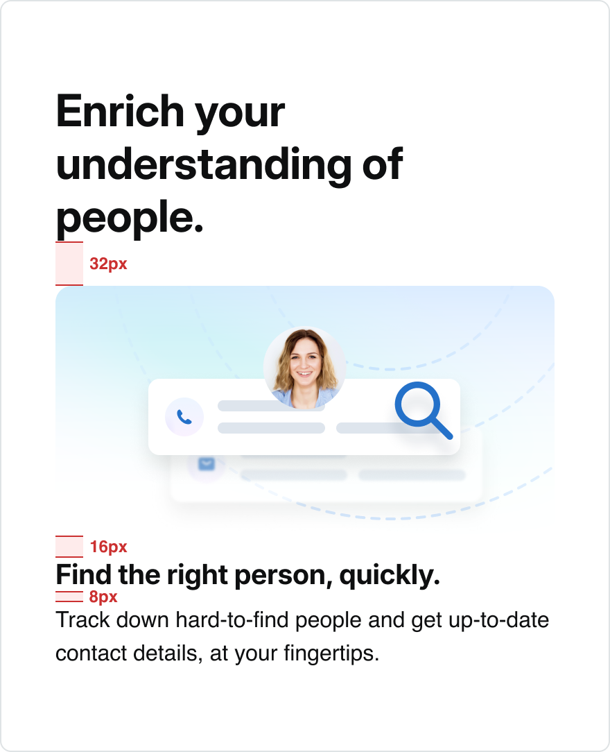
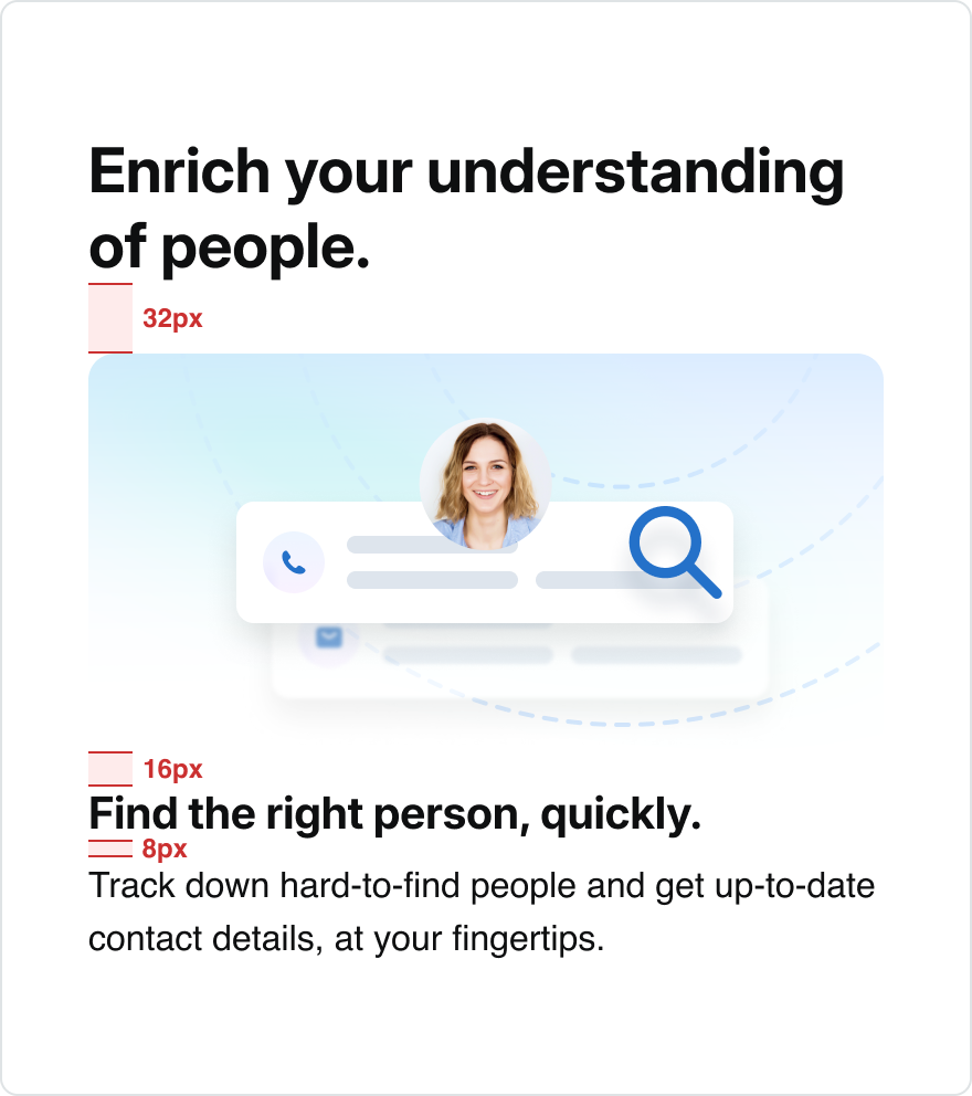
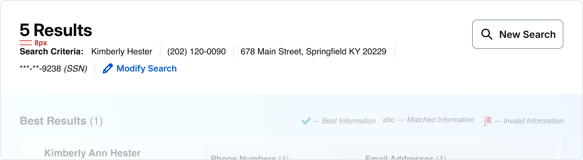
Knowing people is your business — and ours. Find anyone. Contact information, background, social media, connections, properties, and assets. All linked together in one platform. Find the right person, quickly. Track down hard-to-find people and get up-to-date contact details, at your fingertips. Take informed action with unique data. Target your communications, customize your messages, and speed up negotiations.
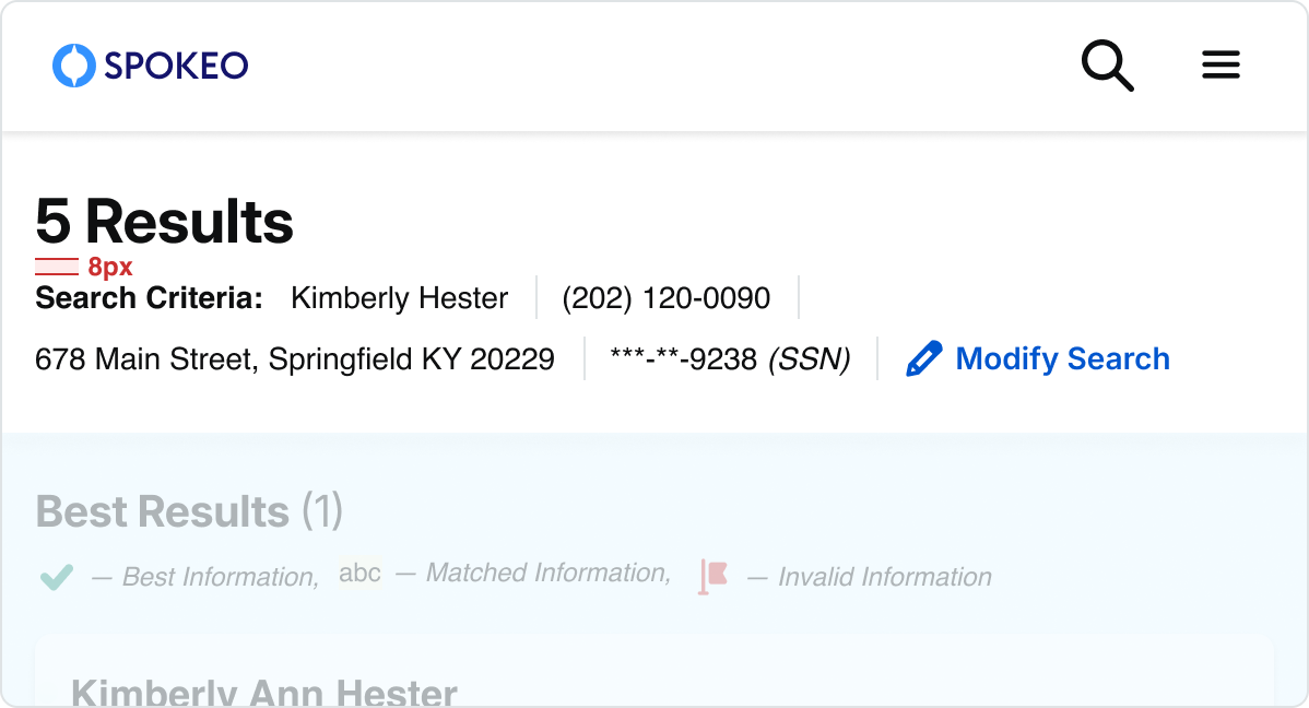
Content can be center-aligned for landing pages, hero sections, and sub-sections. If the content is center-aligned: When the viewport is resized and the content has reached the max-width, the container will continue to expand with even margins on either side.
even margins
Knowing people is your business — and ours. Find anyone. Contact information, background, social media, connections, properties, and assets. All linked together in one platform. Find the right person, quickly. Track down hard-to-find people and get up-to-date contact details, at your fingertips. Take informed action with unique data. Target your communications, customize your messages, and speed up negotiations.
even margins
Text should be left-aligned by default. For mobile screen sizes (599px and below), all titles and descriptions should be left-aligned. If the content is left-aligned: When the viewport is resized and the content has reached the max-width, the container will continue to expand with additional white space on the right side.
Knowing people is your business — and ours. Find anyone. Contact information, background, social media, connections, properties, and assets. All linked together in one platform. Find the right person, quickly. Track down hard-to-find people and get up-to-date contact details, at your fingertips. Take informed action with unique data. Target your communications, customize your messages, and speed up negotiations.
additional spacing
Hierarchy
Sample Pairings
For paragraphs and long-form text, use a maximum content width of 800px to allow for a max of about 80-100 characters. Otherwise, it can be difficult for users to scan and read text.
Display XLarge
Knowing people is your business — and ours.
Find the right person, quickly. Track down hard-to-find people and get up-to-date contact details, at your fingertips. Take informed action with unique data.
Breakpoint:
Desktop
Title:
Display XLarge (40)
Description:
Body Large (18)
Display Large
Knowing people is your business — and ours.
Find the right person, quickly. Take informed action with unique data.
Breakpoint:
Mobile
Title:
Display Large (32)
Description:
Body Small (14)
Knowing people is your business — and ours.
Find the right person, quickly. Track down hard-to-find people and get up-to-date contact details, at your fingertips.
Breakpoint:
Mobile
Title:
Display Large (32)
Description:
Body Small (14)
Display Medium
Knowing people is your business — and ours.
Find the right person, quickly. Take informed action with unique data.
Breakpoint:
Mobile
Title:
Display Large (32)
Description:
Body Small (14)
Knowing people is your business — and ours.
Find the right person, quickly. Track down hard-to-find people and get up-to-date contact details, at your fingertips.
Breakpoint:
Mobile
Title:
Display Medium (28)
Description:
Body Small (14)
Display Small
Knowing people is your business — and ours.
Find the right person, quickly. Track down hard-to-find people and get up-to-date contact details, at your fingertips. Take informed action with unique data. Target your communications, customize your messages, and speed up negotiations.
Breakpoint:
Mobile
Title:
Display Small (24)
Description:
Body Small (14)
Hero
See recommended display and body pairings with spacing guidelines below.
Desktop:
Landing Page
Window width:
1440px - 600px
H1:
Display XLarge (40)
Button:
Medium
Description:
Body Large (18)
Top/bottom padding:
80px
Mobile:
Landing Page
Window width:
599px and below
H1:
Display Large (32)
Button:
Medium
Description:
Body Large (16)
Top/bottom padding:
60px
Simple Section
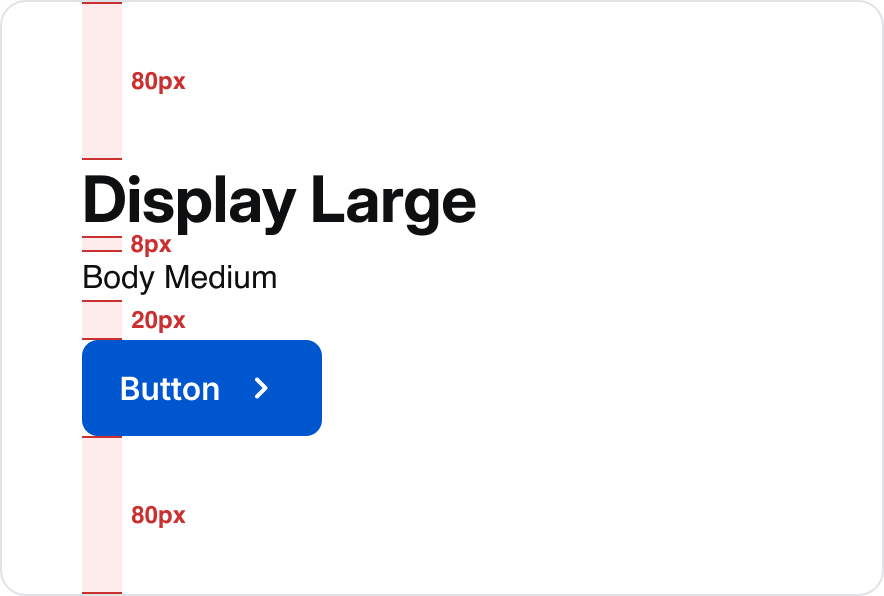
Desktop:
Landing Page
Window width:
1440px - 600px
H1:
Display XLarge (40)
Button:
Medium
Description:
Body Large (18)
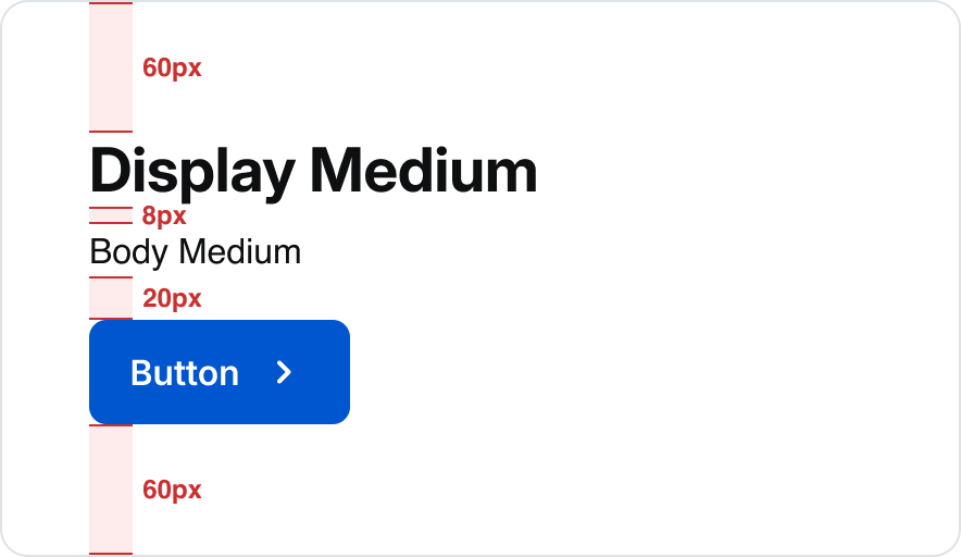
Mobile:
Landing Page
Window width:
599px and below
H1:
Display Medium (28)
Button:
Medium
Description:
Body Medium (16)
Section With Subsection
Desktop:
Landing Page
Window width:
1440px - 600px
H1:
Display XLarge (40)
Description:
Body Medium (16)
Subsection Title:
Body Large (18)
Subsction Description:
80px
Button:
80px
Mobile:
Landing Page
Window width:
599px and below
H1:
Display Medium (28)
Description:
Body Medium (16)
Subsection Title:
Display XSmall (20)
Subsection Description:
Body Medium (16)
Button:
Medium
Billboard
See recommended display and body pairings with spacing guidelines below.
Desktop:
Name Profile Examples
Window width:
1440px - 600px
H1:
Display Medium (28)
Description:
Body Medium (16)
Top/bottom padding:
32px
Mobile:
Name Profile Examples
Window width:
599px and below
H1:
Display Medium (28)
Description:
Body Medium (16) / Body Small (14)
Top/bottom Padding:
32px
Sample Pairings
Desktop:
B2B Search Results List View
Window width:
1440px - 600px
H1:
Display Medium (28)
Description:
Body Medium (14)
Mobile:
B2B Search Results List View
Window width:
599px and below
H1:
Display Medium (28)
Description:
Body Medium (14)
Desktop:
B2B Account-Desktop
Window width:
1440px - 600px
H1:
Display Medium (28)
Description:
Body Small (14)
B2B Account-Desktop
Window width:
599px and below
H1:
Display Small (24)
Description:
Body Small (14)
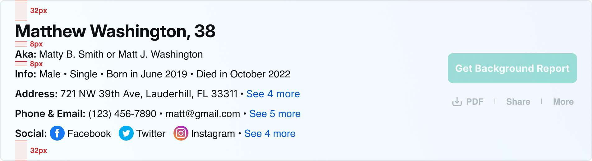
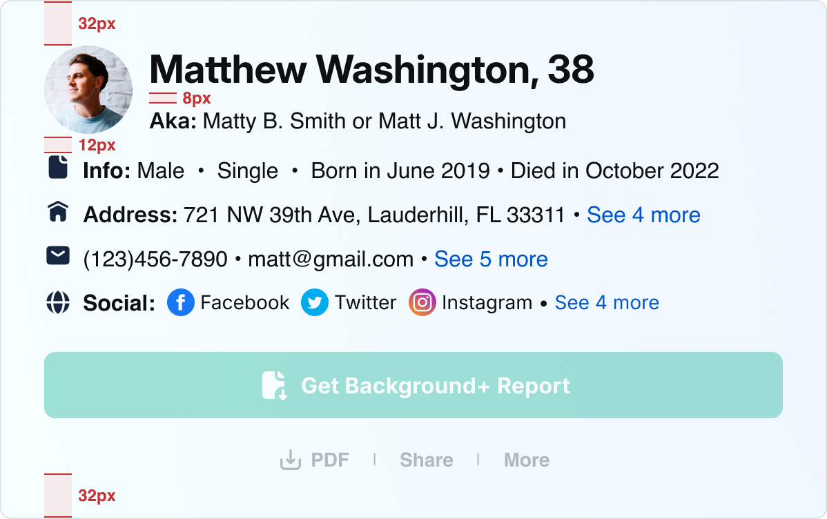
Icons & Text
Size Pairings
For paragraphs and long-form text, use a maximum content width of 800px to allow for a maximum of about 80-100 characters. Otherwise, it can be difficult for users to scan and read text.

Text

Text
24x24px icon
8px
24px
Medium:
24px Icon
Body Medium:
16px font/24px line height
24x24px Icon:
no padding

Text

Text

2
2

2
2
8px
24px
24x24px icon
Medium:
24px Icon
Body Medium:
16px font/24px line height
20x20px Icon:
2px top/bottom/left/right padding
Text
Text
20x20px icon
4px
20px
Small:
20px Icon
Body Small:
14px font/20px line height
20x20px Icon:
no padding
Accessibility & Contrast
Accessibility Guidelines
Spokeo follows WCAG (Web Content Accessibility Guidelines) to ensure text and UI elements remain readable and accessible for all users. Color contrast should always be evaluated against the background, including in states such as hover, focus, and disabled.
Primary Text
Primary text (titles, key information, primary UI labels) must meet a minimum contrast ratio of 19.18:1.
Secondary Text
Secondary text (supporting copy, placeholder text, supplemental labels) must meet a minimum contrast ratio of 7.07:1.
Primary Text
spk.color.text.primary
spk.color.grey.1000
Contrast: 19.18:1
#0E0F10
Secondary Text
spk.color.text.secondary
spk.color.grey.700
Contrast: 7.07:1
#4E5A63
Knowing people is your business — and ours.
Find the right person, quickly. Track down hard-to-find people and get up-to-date contact details, at your fingertips.
Landing Page Text
Title and description: spk.color.text.primary
Enter a full name
Hint text copy here.
Input Text Field - Default
Placeholder Text: spk.color.text.secondary
Link Text
spk.color.text.link
spk.color.blue.800
Contrast: 6.51
#0056CE
Link Text
Use link text to indicate clickable and interactive content within the Spokeo UI.
Name Profile Links
spk.color.text.link


Search
View more

Button/Link Text
spk.color.text.link
Best Practices
The quick brown fox jumps over the lazy dog.
Top Alignment
Top align the text and icon to accommodate text wrapping on smaller screens.

What is Spokeo?
48x48px icon
40px min
height
Knowing people is your business — and ours. Find anyone.
Top Alignment With Minimum Height
Apply a minimum height that matches the size of the icon in order to keep text aligned in both single and multi-line cases.
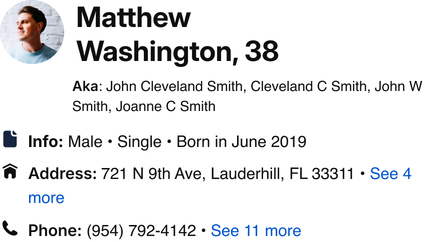
Address


Do: Pair an icon size with its corresponding line height and font size.
Address


Don’t: Pair an icon size with a mismatched line height and font size.
The quick brown fox jumps over the lazy dog. The quick brown fox jumps over the lazy dog.
Do: Top-align icons with long-form text.
The quick brown fox jumps over the lazy dog. The quick brown fox jumps over the lazy dog.
Don’t: Center-align icons with long-form text.
Knowing people is your business — and ours. Find the right person, quickly. Track down hard-to-find people and get up-to-date contact details, at your fingertips. Take informed action with unique data. Target your communications, customize your messages, and speed up negotiations.
Do: Use Body Large, Medium (Default), or Small for long-form text.
Knowing people is your business — and ours. Find the right person, quickly. Track down hard-to-find people and get up-to-date contact details, at your fingertips. Take informed action with unique data. Target your communications, customize your messages, and speed up negotiations.
Don’t: Use Body XSmall for long-form text. Use it sparingly for disclaimers or lower-priority content.
Knowing people is your business — and ours.
Find the right person, quickly. Track down hard-to-find people and get up-to-date contact details, at your fingertips. Take informed action with unique data. Target your communications, customize your messages, and speed up negotiations.
Do: Use Grey 1000/Text Primary for titles and descriptions.
Knowing people is your business — and ours.
Find the right person, quickly. Track down hard-to-find people and get up-to-date contact details, at your fingertips. Take informed action with unique data. Target your communications, customize your messages, and speed up negotiations.
Don’t: Use Grey 700/Text Secondary for titles and descriptions.
Enter a Name
Hint text copy here.
Do: Use Grey 700/Text Secondary for hint text.
Enter a Name
Hint text copy here.
Don’t: Use Grey 1000/Text Primary for hint text as it may be mistaken for text that has been inputted by the user.
Tokens
Typestyle
Size
Line
Height
Letter Spacing
Downgrade?
Usage
Token
Body XSmall
12px
16px
0px
No
Captions, disclaimers, tags
spk.font.body.xsmall
Body Small
14px
20px
0px
No
Small body text
spk.font.body.small
Body Medium
16px
24px
0px
No
Default body text
spk.font.body.medium
Body Large
18px
24px
0px
No
Large descriptions
spk.font.body.large
Display 5XSmall
12px
16px
2%
No
Headers, buttons, links, badges, form field labels
spk.font.display.5xsmall
Display 4XSmall
14px
20px
1%
No
Headers, buttons, links, badges, form field labels
spk.font.display.4xsmall
Display 3XSmall
16px
20px
0
No
Headers, buttons, links, badges, form field labels
spk.font.display.3xsmall
Display 2XSmall
18px
24px
0
No
headers, buttons, links, badges, form field labels
spk.font.display.2xsmall
Display XSmall
20px
24px
−0.2px
No
Nested headers
spk.font.display.xsmall
Display Small
24px
28px
−0.2px
No
Nested headers
spk.font.display.small
Display Medium
28px
34px
−0.2px
No
Small headers, in app headers
spk.font.display.medium
Display Large
32px
38px
−0.2px
No
Section headers
spk.font.display.large
Display XLarge
40px
48px
−0.2px
No
Hero headers
spk.font.display.xlarge
Collection
Role
System Token
Core/Reference Token
Value
Text
Primary Text
spk.color.text.primary
spk.color.grey.1000
#0E0F10
Text
Secondary Text
spk.color.text.secondary
spk.color.grey.700
#4E5A63
Text
Error Text
spk.color.text.error
spk.color.red.700
#CB3030
Text
Link Text
spk.color.text.link
spk.color.bluePurple.700
#2929CE
Text
Link Text Active
spk.color.text.link.active
spk.color.bluePurple.800
#1F1F9D
Text
Placeholder Text
spk.color.text.placeholder
spk.color.grey.700
#4E5A63


Contact Us
Terms
Privacy Policy
Copyright © 2006-2025 Spokeo, Inc.


Typography
Using the typography guidelines outlined below will enhance our brand identity and ensure a cohesive experience for users across all products.


Table of Contents
Font Stack
Inter
Inter is a variable font family carefully crafted and designed for computer screens.
Inter features a tall x-height to aid in readability of mixed-case and lowercase text. Several OpenType features are provided as well, like contextual alternates that adjusts punctuation depending on the shape of surrounding glyphs, slashed zero for when you need to disambiguate "0" from "o", tabular numbers, etc.
Inter
Inter
Inter
Inter is the default font that should be used as the header/display font throughout all of Spokeo’s brand, product, and marketing. In the event that Inter is unavailable, such as native apps and emails, follow the font stack below.
OS
Font Family
Chrome OS & Android
Inter
Roboto (fallback)
Windows
Inter
Arial (fallback)
MacOS & iOS
Inter
Helvetica (fallback)
Helvetica
Helvetica is one of the most famous and popular typefaces in the world. It lends an air of lucid efficiency to any typographic message with its clean, no-nonsense shapes. The original typeface was called Neue Haas Grotesk, and was designed in 1957 by Max Miedinger for the Haas'sche Schriftgiesserei (Haas Type Foundry) in Switzerland. In 1960 the name was changed to Helvetica (an adaptation of “Helvetia", the Latin name for Switzerland).
Download Helvetica
Helvetica
Helvetica
Helvetica
Arial
Arial was designed for Monotype in 1982 by Robin Nicholas and Patricia Saunders. A contemporary sans serif design, Arial contains more humanist characteristics than many of its predecessors and as such is more in tune with the mood of the last decades of the twentieth century. The overall treatment of curves is softer and fuller than in most industrial-style sans serif faces. Terminal strokes are cut on the diagonal, which helps to give the face a less mechanical appearance.
Download Arial
Arial
Arial
Arial
Roboto
Roboto has a dual nature. It has a mechanical skeleton and the forms are largely geometric. At the same time, the font features friendly and open curves. While some grotesks distort their letterforms to force a rigid rhythm, Roboto doesn’t compromise, allowing letters to be settled into their natural width. This makes for a more natural reading rhythm more commonly found in humanist and serif types.
Roboto
Roboto
Roboto
Roles
Display
There are nine display styles: Xlarge, Large, Medium, Small, Xsmall, 2Xsmall, 3Xsmall, 4Xsmall, and 5Xsmall. Display styles are used to create a sense of hierarchy on the page. As the largest text on the screen, display styles are reserved for short, important text or numerals.
Display XLarge Bold
/Semi Bold
/Regular
Display Large Bold
/Semi Bold
/Regular
Display Medium Bold
/Semi Bold
/Regular
Display Small Bold
/Semi Bold
/Regular
Display XSmall Bold
/Semi Bold
/Regular
Display 2XSmall Bold
/Semi Bold
/Regular
Display 3XSmall Bold
/ Display 3XSmall Bold
/Semi Bold
/Regular
Display 4XSmall Bold
/Display 4XSmall Bold
/Semi Bold
/Regular
Display 5XSmall Bold
/Display 5XSmall Bold
/Semi Bold
/Regular
Body
There are four display styles: Large, Medium, Small, and Xsmall. Body styles are used for longer passages of text.
Body Large Bold
/Regular
/Italic
Body Medium Bold
/Regular
/Italic
Body Small Bold
/Regular
/Italic
Body XSmall Bold
/Regular
/Italic
Modular Scale
Our scale is modeled after the intervals in a minor third scale (1.200).
It starts with a base font size of 16 and scales by multiplying 1.200 at each interval. We’ve rounded up or down to the nearest interval of 4 as closely as possible.
When pairing font sizes together, aim to provide impactful contrast between sizes and avoid small differences.
Weight
Weight
Value
Usage Guidelines
Tokens
Regular
400
Paragraphs, descriptions, long text
spk.font.weight.regular
Semibold
600
Titles, content emphasis
spk.font.weight.semibold
Bold
700
Titles, content emphasis
spk.font.weight.bold
Size & Line Height
Line height scales incrementally based on each font size. Display style type sizes are multiplied by 1.3 and rounded to the nearest interval of 4. Body style type sizes are multiplied by 1.45 and rounded to the nearest interval of 4. This method ensures all type styles align with our 4px baseline grid.
Typestyle
Size
Line Height
(Scale)
Letter Spacing
Token
Usage
Display XLarge
40px
48px
−0.2px
spk.font.display.xlarge
Hero headers
Display Large
32px
38px
−0.2px
spk.font.display.large
Section headers
Display Medium
28px
34px
−0.2px
spk.font.display.medium
Small headers
Display Small
24px
28px
−0.2px
spk.font.display.small
Nested headers
Display XSmall
20px
24px
−0.2px
spk.font.display.xsmall
Nested headers
Display 2XSmall
18px
24px
0px
spk.font.display.2xsmall
Nested headers
Display 3XSmall
16px
20px
0px
spk.font.display.3xsmall
Nested headers
Display 4XSmall
14px
20px
0.1px
spk.font.display.4xsmall
Nested headers
Display 5XSmall
12px
16px
0.2px
spk.font.display.5xsmall
Nested headers
Body Large
18px
24px (1.45)
0px
spk.font.body.large
Large descriptions
Body Medium
16px
24px (1.45)
0px
spk.font.body.medium
*Default body text
Body Small
14px
20px (1.45)
0px
spk.font.body.small
Small body text
Body XSmall
12px
16px (1.33)
0px
spk.font.body.xsmall
Captions, disclaimers, tags
Line Length
For paragraphs and long-form text, use a maximum content width of 800px to allow for a max of about 80-100 characters. Otherwise, it can be difficult for users to scan and read text.
800px max width
Knowing people is your business — and ours. Find anyone. Contact information, background, social media, connections, properties, and assets. All linked together in one platform. Find the right person, quickly. Track down hard-to-find people and get up-to-date contact details, at your fingertips. Take informed action with unique data. Target your communications, customize your messages, and speed up negotiations.
Content can be center-aligned for landing pages, hero sections, and sub-sections. If the content is center-aligned: When the viewport is resized and the content has reached the max-width, the container will continue to expand with even margins on either side.
even
margins
Knowing people is your business — and ours. Find anyone. Contact information, background, social media, connections, properties, and assets. All linked together in one platform. Find the right person, quickly. Track down hard-to-find people and get up-to-date contact details, at your fingertips. Take informed action with unique data. Target your communications, customize your messages, and speed up negotiations.
even
margins
Text should be left-aligned by default. For mobile screen sizes (599px and below), all titles and descriptions should be left-aligned. If the content is left-aligned: When the viewport is resized and the content has reached the max-width, the container will continue to expand with additional white space on the right side.
Knowing people is your business — and ours. Find anyone. Contact information, background, social media, connections, properties, and assets. All linked together in one platform. Find the right person, quickly. Track down hard-to-find people and get up-to-date contact details, at your fingertips. Take informed action with unique data. Target your communications, customize your messages, and speed up negotiations.
additional spacing
Hierarchy
Sample Pairings
For paragraphs and long-form text, use a maximum content width of 800px to allow for a max of about 80-100 characters. Otherwise, it can be difficult for users to scan and read text.
Display XLarge
Knowing people is your business — and ours.
Find the right person, quickly. Track down hard-to-find people and get up-to-date contact details, at your fingertips. Take informed action with unique data.
Breakpoint:
Desktop
Title:
Display XLarge (40)
Description:
Body Large (18)
Display Large
Knowing people is your business — and ours.
Find the right person, quickly. Take informed action with unique data.
Breakpoint:
Desktop
Title:
Display Large (32)
Description:
Body Medium (16)
Knowing people is your business — and ours.
Find the right person, quickly. Track down hard-to-find people and get up-to-date contact details, at your fingertips.
Breakpoint:
Desktop
Title:
Display XLarge (40)
Description:
Body Large (18)
Display Medium
Knowing people is your business — and ours.
Find the right person, quickly. Take informed action with unique data.
Breakpoint:
Desktop
Title:
Display Medium (28)
Description:
Body Medium (16)
Knowing people is your business — and ours.
Find the right person, quickly. Track down hard-to-find people and get up-to-date contact details, at your fingertips.
Breakpoint:
Desktop
Title:
Display XLarge (40)
Description:
Body Large (18)
Display Small
Knowing people is your business — and ours.
Find the right person, quickly. Track down hard-to-find people and get up-to-date contact details, at your fingertips. Take informed action with unique data. Target your communications, customize your messages, and speed up negotiations.
Breakpoint:
Desktop
Title:
Display XLarge (40)
Description:
Body Large (18)
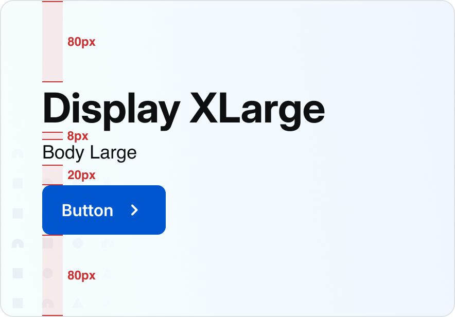
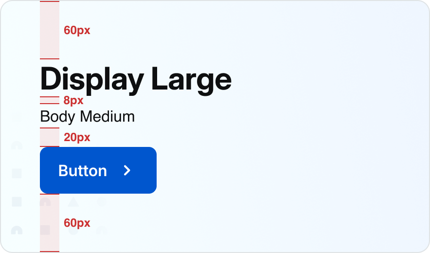
Hero
See recommended display and body pairings with spacing guidelines below.
Desktop:
Landing Page
Window width:
1440px - 600px
H1:
Display XLarge (40)
Button:
Medium
Description:
Body Large (18)
Top/bottom padding:
80px
Mobile:
Landing Page
Window width:
599px and below
H1:
Display Large (32)
Button:
Medium
Description:
Body Large (16)
Top/bottom padding:
60px
Simple Section
Desktop:
Landing Page
Window width:
1440px - 600px
H1:
Display Large (32)
Button:
Medium
Description:
Body Medium (16)
Mobile:
Landing Page
Window width:
599px and below
H1:
Display Medium (28)
Button:
Medium
Description:
Body Medium (16)
Section With Subsection
Desktop:
Landing Page
Window width:
1440px - 600px
H1:
Display Large (32)
Description:
Body Medium (16)
Subsection Title:
Display XSmall (20)
Subsction Description:
Body Medium (16)
Button:
Medium
Mobile:
Landing Page
Window width:
599px and below
H1:
Display Medium (28)
Description:
Body Medium (16)
Subsection Title:
Display XSmall (20)
Subsection Description:
Body Medium (16)
Button:
Medium
Billboard
See recommended display and body pairings with spacing guidelines below.
Desktop:
Name Profile Examples
Window width:
1440px - 600px
H1:
Display Medium (28)
Description:
Body Medium (16)
Top/bottom padding:
32px
Mobile:
Name Profile Examples
Window width:
599px and below
H1:
Display Medium (28)
Description:
Body Medium (16) / Body Small (14)
Top/bottom Padding:
32px
Sample Pairings
Desktop:
B2B Search Results List View
Window width:
1440px - 600px
H1:
Display Medium (28)
Description:
Body Medium (14)
Mobile:
B2B Search Results List View
Window width:
599px and below
H1:
Display Medium (28)
Description:
Body Medium (14)
Desktop:
B2B Account-Desktop
Window width:
1440px - 600px
H1:
Display Medium (28)
Description:
Body Small (14)
Desktop:
B2B Account-Desktop
Window width:
1440px - 600px
H1:
Display XLarge (40)
Description:
Body Large (18)
Icons & Text
Size Pairings
For paragraphs and long-form text, use a maximum content width of 800px to allow for a maximum of about 80-100 characters. Otherwise, it can be difficult for users to scan and read text.
Text
Text
24x24px icon
8px
24px
Medium:
24px Icon
Body Medium:
16px font/24px line height
24x24px Icon:
no padding
Text
Text
2
2
2
2
8px
24px
24x24px icon
Medium:
24px Icon
Body Medium:
16px font/24px line height
20x20px Icon:
2px top/bottom/left/right padding
Text
Text
20x20px icon
4px
20px
Small:
20px Icon
Body Small:
14px font/20px line height
20x20px Icon:
no padding
Accessibility & Contrast
Accessibility Guidelines
Spokeo follows WCAG (Web Content Accessibility Guidelines) to ensure text and UI elements remain readable and accessible for all users. Color contrast should always be evaluated against the background, including in states such as hover, focus, and disabled.
Primary Text
Primary text (titles, key information, primary UI labels) must meet a minimum contrast ratio of 19.18:1.
Secondary Text
Secondary text (supporting copy, placeholder text, supplemental labels) must meet a minimum contrast ratio of 7.07:1.
Primary Text
spk.color.text.primary
spk.color.grey.1000
Contrast: 19.18:1
#0E0F10
Secondary Text
spk.color.text.secondary
spk.color.grey.700
Contrast: 7.07:1
#4E5A63
Knowing people is your business — and ours.
Find the right person, quickly. Track down hard-to-find people and get up-to-date contact details, at your fingertips.
Landing Page Text
Title and description: spk.color.text.primary
Enter a full name
Hint text copy here.
Input Text Field - Default
Placeholder Text: spk.color.text.secondary
Link Text
spk.color.text.link
spk.color.blue.800
Contrast: 6.51
#0056CE
Link Text
Use link text to indicate clickable and interactive content within the Spokeo UI.
Name Profile Links
spk.color.text.link
Search
View more
Button/Link Text
spk.color.text.link
Best Practices
The quick brown fox jumps over the lazy dog.
Top Alignment
Top align the text and icon to accommodate text wrapping on smaller screens.
What is Spokeo?
48x48px icon
40px min
height
Knowing people is your business — and ours. Find anyone.
Top Alignment With Minimum Height
Apply a minimum height that matches the size of the icon in order to keep text aligned in both single and multi-line cases.
Address

Do: Pair an icon size with its corresponding line height and font size.
Address

Don’t: Pair an icon size with a mismatched line height and font size.
The quick brown fox jumps over the lazy dog. The quick brown fox jumps over the lazy dog.
Do: Top-align icons with long-form text.
The quick brown fox jumps over the lazy dog. The quick brown fox jumps over the lazy dog.
Don’t: Center-align icons with long-form text.
Knowing people is your business — and ours. Find the right person, quickly. Track down hard-to-find people and get up-to-date contact details, at your fingertips. Take informed action with unique data. Target your communications, customize your messages, and speed up negotiations.
Do: Use Body Large, Medium (Default), or Small for long-form text.
Knowing people is your business — and ours. Find the right person, quickly. Track down hard-to-find people and get up-to-date contact details, at your fingertips. Take informed action with unique data. Target your communications, customize your messages, and speed up negotiations.
Don’t: Use Body XSmall for long-form text. Use it sparingly for disclaimers or lower-priority content.
Knowing people is your business — and ours.
Find the right person, quickly. Track down hard-to-find people and get up-to-date contact details, at your fingertips. Take informed action with unique data. Target your communications, customize your messages, and speed up negotiations.
Do: Use Grey 1000/Text Primary for titles and descriptions.
Knowing people is your business — and ours.
Find the right person, quickly. Track down hard-to-find people and get up-to-date contact details, at your fingertips. Take informed action with unique data. Target your communications, customize your messages, and speed up negotiations.
Don’t: Use Grey 700/Text Secondary for titles and descriptions.
Enter a Name
Hint text copy here.
Do: Use Grey 700/Text Secondary for hint text.
Enter a Name
Hint text copy here.
Don’t: Use Grey 1000/Text Primary for hint text as it may be mistaken for text that has been inputted by the user.
Tokens
Typestyle
Size
Line
Height
Letter Spacing
Downgrade?
Usage
Token
Body XSmall
12px
16px
0px
No
Captions, disclaimers, tags
spk.font.body.xsmall
Body Small
14px
20px
0px
No
Small body text
spk.font.body.small
Body Medium
16px
24px
0px
No
Default body text
spk.font.body.medium
Body Large
18px
24px
0px
No
Large descriptions
spk.font.body.large
Display 5XSmall
12px
16px
2%
No
Headers, buttons, links, badges, form field labels
spk.font.display.5xsmall
Display 4XSmall
14px
20px
1%
No
Headers, buttons, links, badges, form field labels
spk.font.display.4xsmall
Display 3XSmall
16px
20px
0
No
Headers, buttons, links, badges, form field labels
spk.font.display.3xsmall
Display 2XSmall
18px
24px
0
No
headers, buttons, links, badges, form field labels
spk.font.display.2xsmall
Display XSmall
20px
24px
−0.2px
No
Nested headers
spk.font.display.xsmall
Display Small
24px
28px
−0.2px
No
Nested headers
spk.font.display.small
Display Medium
28px
34px
−0.2px
No
Small headers, in app headers
spk.font.display.medium
Display Large
32px
38px
−0.2px
No
Section headers
spk.font.display.large
Display XLarge
40px
48px
−0.2px
No
Hero headers
spk.font.display.xlarge
Collection
Role
System Token
Core/Reference Token
Value
Text
Primary Text
spk.color.text.primary
spk.color.grey.1000
#0E0F10
Text
Secondary Text
spk.color.text.secondary
spk.color.grey.700
#4E5A63
Text
Error Text
spk.color.text.error
spk.color.red.700
#CB3030
Text
Link Text
spk.color.text.link
spk.color.bluePurple.700
#2929CE
Text
Link Text Active
spk.color.text.link.active
spk.color.bluePurple.800
#1F1F9D
Text
Placeholder Text
spk.color.text.placeholder
spk.color.grey.700
#4E5A63

Contact Us
Terms
Privacy Policy
Copyright © 2006-2025 Spokeo, Inc.