

Fonts
Below are the figma fonts and text styles we use within our product.
Font Stack
For a full explanation of our typography rules and guidelines, please go here.
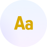
Inter
Inter is a variable font family carefully crafted & designed for computer screens.
Inter features a tall x-height to aid in readability of mixed-case and lower-case text. Several OpenType features are provided as well, like contextual alternates that adjusts punctuation depending on the shape of surrounding glyphs, slashed zero for when you need to disambiguate "0" from "o", tabular numbers, etc.
Inter
Inter
Inter
Inter is the default font that should be used as the header/display font throughout all of Spokeo’s brand, product, and marketing. In the event that Inter is unavailable, such as native apps and emails, follow the font stack below.
OS
Font Family
Chrome OS & Android
Inter
Arial (fallback)
Windows
Inter
Arial (fallback)
MacOS & iOS
Inter
Helvetica (fallback)
Helvetica
Helvetica is one of the most famous and popular typefaces in the world. It lends an air of lucid efficiency to any typographic message with its clean, no-nonsense shapes. The original typeface was called Neue Haas Grotesk, and was designed in 1957 by Max Miedinger for the Haas'sche Schriftgiesserei (Haas Type Foundry) in Switzerland. In 1960 the name was changed to Helvetica (an adaptation of Helvetia", the Latin name for Switzerland).
Helvetica
Helvetica
Helvetica
Arial
Arial was designed for Monotype in 1982 by Robin Nicholas and Patricia Saunders. A contemporary sans serif design, Arial contains more humanist characteristics than many of its predecessors and as such is more in tune with the mood of the last decades of the twentieth century. The overall treatment of curves is softer and fuller than in most industrial style sans serif faces. Terminal strokes are cut on the diagonal which helps to give the face a less mechanical appearance.
Arial
Arial
Arial


Contact Us
Terms
Privacy Policy
Copyright © 2006-2025 Spokeo, Inc.


Fonts
Below are the figma fonts and text styles we use within our product.
Font Stack
For a full explanation of our typography rules and guidelines, please go here.
Inter
Inter is a variable font family carefully crafted & designed for computer screens.
Inter features a tall x-height to aid in readability of mixed-case and lower-case text. Several OpenType features are provided as well, like contextual alternates that adjusts punctuation depending on the shape of surrounding glyphs, slashed zero for when you need to disambiguate "0" from "o", tabular numbers, etc.
Inter
Inter
Inter
Inter is the default font that should be used as the header/display font throughout all of Spokeo’s brand, product, and marketing. In the event that Inter is unavailable, such as native apps and emails, follow the font stack below.
OS
Font Family
Chrome OS & Android
Inter
Arial (fallback)
Windows
Inter
Arial (fallback)
MacOS & iOS
Inter
Helvetica (fallback)
Helvetica
Helvetica is one of the most famous and popular typefaces in the world. It lends an air of lucid efficiency to any typographic message with its clean, no-nonsense shapes. The original typeface was called Neue Haas Grotesk, and was designed in 1957 by Max Miedinger for the Haas'sche Schriftgiesserei (Haas Type Foundry) in Switzerland. In 1960 the name was changed to Helvetica (an adaptation of Helvetia", the Latin name for Switzerland).
Helvetica
Helvetica
Helvetica
Arial
Arial was designed for Monotype in 1982 by Robin Nicholas and Patricia Saunders. A contemporary sans serif design, Arial contains more humanist characteristics than many of its predecessors and as such is more in tune with the mood of the last decades of the twentieth century. The overall treatment of curves is softer and fuller than in most industrial style sans serif faces. Terminal strokes are cut on the diagonal which helps to give the face a less mechanical appearance.
Arial
Arial
Arial

Contact Us
Terms
Privacy Policy
Copyright © 2006-2025 Spokeo, Inc.