

Logos Guidelines
Our primary logo combines the Spokeo wordmark with our Compass, symbolizing how we guide people to their “true north” in search. It’s a mark of trust, transparency, and confidence in the information we provide, empowering people to know more.

Table of Contents
Primary Logo
Status Colors
Text Colors
Size & Clearance
Logo Alignment
Logo Don’ts
Overview
Use the logo libraries provided below. They include a pre-approved set of logos for use within our product.
You can access our logos in two ways:
- Download our logos from the logo library (internal use only)
- Use our logo component (internal use only)
Primary Logo
The Spokeo logo is a visual expression of our brand, values, and commitment to making the world more transparent. It should only be used in the Spokeo Blue and Spokeo Grey color combination, or in white.
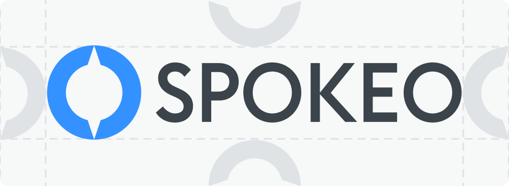
Spokeo Logo Anatomy


Primary Logo
Wordmark
Compass
(logomark)


Secondary Logos
Primary logos should always be used whenever possible. Use the secondary logos below only when a design challenge cannot be solved with the primary logo.
Spokeo Tagline


Vertical Lockup
Only use the vertical lockup when greater emphasis is needed on the Compass, such as for conferences, events, or swag items.


Social Avatar
Contained logomarks are available in blue, neutral, and white for use as social avatars on external platforms such as Facebook, LinkedIn, and Slack.

Blue Standard
Blue Logo on
spk.color.grey.50
Blue Standard
Blue Logo on
spk.color.grey.white
Blue Standard
Blue Logo on
Gradient

White
White Logo on
spk.color.blue.600
Logo Color
Primary Color Usage
The Spokeo logo is available in four approved color treatments: a full primary color option, a primary negative option, and two mono-color options. Mono-color logos should only be used for limited print applications or when the logo needs to visually recede within the layout. Always ensure the logo has sufficient contrast against its background.

Primary Color Logo
Compass
spk.color.brand.primary
spk.color.blue.600
HEX #3392FF
CMYK 80, 43, 0, 0
RGB 51, 146, 255
Wordmark
spk.color.brand.secondary
spk.color.grey.800
HEX #3A444A
CMYK 22, 8, 0, 71
RGB 58, 68, 74

Primary Negative Logo
Compass
spk.color.brand.primary
spk.color.blue.600
HEX #3392FF
CMYK 80, 43, 0, 0
RGB 51, 146, 255
Wordmark
spk.color.white
HEX #FFFFFF
CMYK 0, 0, 0, 0
RGB 255, 255, 255
Other Color Usage
In some cases, especially in print, the number of colors available for printing may be limited. In those situations, use the approved 1-color logos shown below. The 1-color logo is available in black for light backgrounds and white for dark backgrounds.


Primary Black Logo
1-Color Logo
spk.color.grey.1000
HEX #0E0F10
CMYK 13, 6, 0, 94
RGB 14, 15, 16


Primary White Logo
1-Color Logo
spk.color.white
HEX #FFFFFF
CMYK 0, 0, 0, 0
RGB 255, 255, 255
Size and Clearance
Minimum Size
Spokeo logos must be no smaller than 1/4″ high in print or 25px on screen. If the logo includes a tagline or strapline, we recommend a minimum size of 1/2″ high in print or 36px on screen. Vertically stacked logos should be no smaller than 1″ high in print or 50px on screen. Using the logo below these minimums may result in reduced legibility.


Primary Logo
Digital min size: 25 pixels high
Print min size: 1/4″ high


Primary Logo + Tagline
Digital min size: 36 pixels high
Print min size: 1/2″ high


Vertically Stacked
Digital min size: 50 pixels high
Print min size: 1″ high
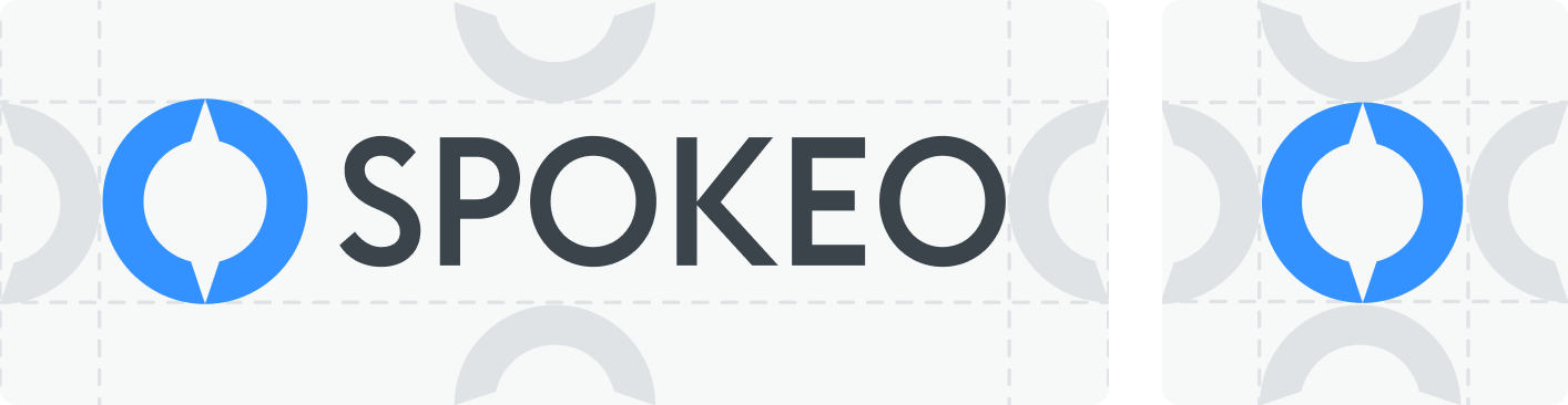
Minimum Clearance
Wherever the logo is used, be sure to maintain clear space around it equal to at least half the width of the Compass.

Logo Alignment
Full Logo Alignment
When using full logos in a horizontal row, bottom-align them to the baseline of the wordmark. When stacking logos in a vertical column, center-align the symbols or left-align using the leftmost ascenders in the wordmark.


Logomark-Only Alignment
Whether placed in a horizontal row or stacked vertically, logomark-only symbols should always be center-aligned.


Logo Don’ts
Our logo is the most important element of our brand. Maintaining its recognition while supporting creativity is essential to protecting brand integrity. Below is a list of common “logo crimes” that should never be applied to any Spokeo logo.


Don’t: Apply outlines to the logo

Don’t: Combine logos

Don’t: Skew, distort, or tilt the logo

Don’t: Color block the logo

Don’t: Apply drop shadows to the logo

Don’t: Crop the logo

Don’t: Apply unapproved colors and gradients

Don’t: Use the old logo

Don’t: Reorder the logo or remove the logomark


Don’t: Use the logo on complex backgrounds

Don’t: Fill the logo with photos or patterns


Don’t: Use backgrounds lacking contrast
Related
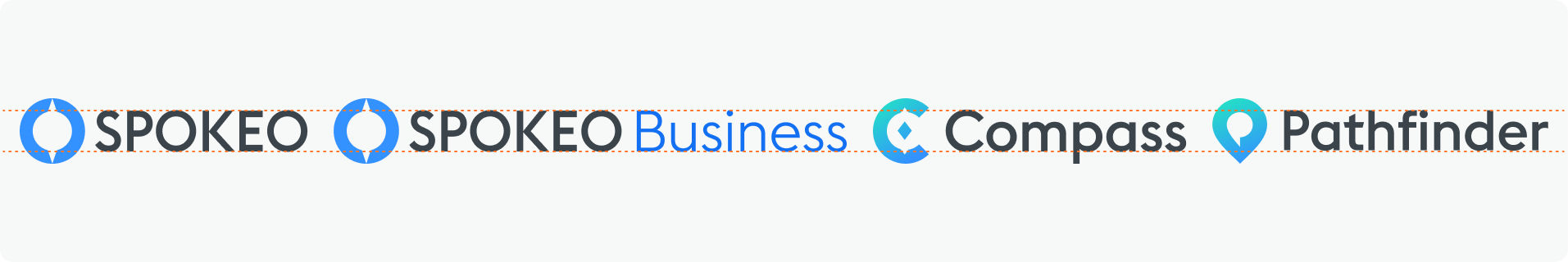
Spokeo has several initiatives under our brand. Our most recent products include B2B people search offerings: Spokeo for Business and Spokeo for Law Enforcement. We also offer an API that companies can use to easily integrate our people intelligence data into their workflows and applications.
View other Spokeo product logos


Contact Us
Terms
Privacy Policy
Copyright © 2006-2025 Spokeo, Inc.


Logo Guidelines
Our primary logo combines the Spokeo wordmark with our Compass, symbolizing how we guide people to their “true north” in search. It’s a mark of trust, transparency, and confidence in the information we provide, empowering people to know more.


Table of Contents
Overview
Use the logo libraries provided below. They include a pre-approved set of logos for use within our product.
You can access our logos in two ways:
- Download our logos from the logo library (internal use only)
- Use our logo component (internal use only)
Primary Logo
The Spokeo logo is a visual expression of our brand, values, and commitment to making the world more transparent. It should only be used in the Spokeo Blue and Spokeo Grey color combination, or in white.
Spokeo Logo Anatomy

Primary Logo
Wordmark
Compass
(logomark)


Secondary Logos
Primary logos should always be used whenever possible. Use the secondary logos below only when a design challenge cannot be solved with the primary logo.
Spokeo Tagline
Vertical Lockup
Only use the vertical lockup when greater emphasis is needed on the Compass, such as for conferences, events, or swag items.
Social Avatar
Contained logomarks are available in blue, neutral, and white for use as social avatars on external platforms such as Facebook, LinkedIn, and Slack.
Blue Standard
Blue Logo on
spk.color.grey.50
Blue Standard
Blue Logo on
spk.color.grey.white
Blue Standard
Blue Logo on
Gradient
White
White Logo on
spk.color.blue.600
Logo Color
Primary Color Usage
The Spokeo logo is available in four approved color treatments: a full primary color option, a primary negative option, and two mono-color options. Mono-color logos should only be used for limited print applications or when the logo needs to visually recede within the layout. Always ensure the logo has sufficient contrast against its background.
Primary Color Logo
Compass
spk.color.brand.primary
spk.color.blue.600
HEX #3392FF
CMYK 80, 43, 0, 0
RGB 51, 146, 255
Wordmark
spk.color.brand.secondary
spk.color.grey.800
HEX #3A444A
CMYK 22, 8, 0, 71
RGB 58, 68, 74
Primary Negative Logo
Compass
spk.color.brand.primary
spk.color.blue.600
HEX #3392FF
CMYK 80, 43, 0, 0
RGB 51, 146, 255
Wordmark
spk.color.white
HEX #FFFFFF
CMYK 0, 0, 0, 0
RGB 255, 255, 255
Other Color Usage
In some cases, especially in print, the number of colors available for printing may be limited. In those situations, use the approved 1-color logos shown below. The 1-color logo is available in black for light backgrounds and white for dark backgrounds.
Primary Black Logo
1-Color Logo
spk.color.grey.1000
HEX #0E0F10
CMYK 13, 6, 0, 94
RGB 14, 15, 16

Primary White Logo
1-Color Logo
spk.color.white
HEX #FFFFFF
CMYK 0, 0, 0, 0
RGB 255, 255, 255
Size and Clearance
Minimum Size
Spokeo logos must be no smaller than 1/4″ high in print or 25px on screen. If the logo includes a tagline or strapline, we recommend a minimum size of 1/2″ high in print or 36px on screen. Vertically stacked logos should be no smaller than 1″ high in print or 50px on screen. Using the logo below these minimums may result in reduced legibility.

Primary Logo
Digital min size: 25 pixels high
Print min size: 1/4″ high

Primary Logo + Tagline
Digital min size: 36 pixels high
Print min size: 1/2″ high
Vertically Stacked
Digital min size: 50 pixels high
Print min size: 1″ high
Minimum Clearance
Wherever the logo is used, be sure to maintain clear space around it equal to at least half the width of the Compass.
Logo Alignment
Full Logo Alignment
When using full logos in a horizontal row, bottom-align them to the baseline of the wordmark. When stacking logos in a vertical column, center-align the symbols or left-align using the leftmost ascenders in the wordmark.
Logomark-Only Alignment
Whether placed in a horizontal row or stacked vertically, logomark-only symbols should always be center-aligned.
Logo Don’ts
Our logo is the most important element of our brand. Maintaining its recognition while supporting creativity is essential to protecting brand integrity. Below is a list of common “logo crimes” that should never be applied to any Spokeo logo.

Don’t: Apply outlines to the logo
Don’t: Combine logos
Don’t: Skew, distort, or tilt the logo
Don’t: Color block the logo

Don’t: Apply drop shadows to the logo
Don’t: Crop the logo
Don’t: Apply unapproved colors and gradients
Don’t: Use the old logo
Don’t: Reorder the logo or remove the logomark
Don’t: Use the logo on complex backgrounds
Don’t: Fill the logo with photos or patterns
Don’t: Use backgrounds lacking contrast
Related
- Spokeo has several initiatives under our brand. Our most recent products include B2B people search offerings: Spokeo for Business and Spokeo for Law Enforcement. We also offer an API that companies can use to easily integrate our people intelligence data into their workflows and applications. View other Spokeo product logos

Contact Us
Terms
Privacy Policy
Copyright © 2006-2025 Spokeo, Inc.