

Grid
Our responsive grid is comprised of columns, margins, and gutters, which adjust according to the viewport size.

Table of Contents
Anatomy
Column
Columns are used to align content and will grow or shrink based on container size.
Gutter
Gutters are used to create between columns. They are a fixed width and do not adjust based on container size.
Margin
Margins are used to create space between outer columns within a container.
Behavior
Fluid
By default, content will fill the entire width of the container.

Fluid
Fixed
You can give a layout a fixed size and apply center, left, or right alignment.
Center Aligned


Fixed

Flexible
Flexible
Left Aligned

Fixed

Flexible
Right Aligned
Fixed
Flexible
Hybrid
You can combine both fluid and fixed containers within a single page.
Fluid

Fixed
Flexible
Flexible
Reflow
Optimize and reorganize the flow of page elements based on window size to allow more content to be displayed above the fold.

Usage
1440px
12 Columns • 120px Margins
MARGIN
120
24
24
24
24
24
24
24
24
24
24
24
MARGIN
120
Breakpoint: 1440px
Margin: 120px max (Fluid)
Gutter: 24px
Columns: 12
12 Columns • 60px Margins
MARGIN
60
24
24
24
24
24
24
24
24
24
24
24
MARGIN
60
Breakpoint: 1440px
Margin: 60px max (Fluid)
Gutter: 24px
Columns: 12
992px
12 Columns • 32px Margins
32
24
24
24
24
24
24
24
24
24
24
24
32
Breakpoint: 992px
Margin: 32px min (Fluid)
Gutter: 24px
Columns: 12
991-800px
6 Columns • 32px Margins
32
24
24
24
24
24
32
Breakpoint: 991-800px
Margin: 32px
Gutter: 24px
Columns: 6
799-600px
6 Columns • 32px Margins
32
24
24
24
24
24
32
Breakpoint: 799-600px
Margin: 32px
Gutter: 24px
Columns: 6
599-375px
6 Columns • 16px Margins
16
16
16
16
16
16
16
Breakpoint: 599-375px
Margin: 16px
Gutter: 16px
Columns: 6
6 Columns • 0px Margins
16
16
16
16
16
Breakpoint: 599-375px
Margin: 0px
Gutter: 16px
Columns: 6
Content
As the layout grid changes at different breakpoints, the content adapts to the new grid size.
Large: 992px+
3 column design
1
4
7
10
2
5
8
11
3
6
9
12
Fluid
2 column design
1
3
5
7
9
11
2
4
6
8
10
12
1 column design
1
2
3
4
5
6
7
8
9
10
11
12
Medium: 800-991px
3 column design
1
4
7
10
2
5
8
11
3
6
9
12
2 column design
1
3
5
7
9
11
2
4
6
8
10
12
1 column design
1
2
3
4
5
6
7
8
9
10
11
12
Small: 600-799px
2 column design
1
3
5
7
9
11
2
4
6
8
10
12
1 column design
1
2
3
4
5
6
7
8
9
10
11
12
XSmall: 0-599px
2 column design
1
3
5
7
9
11
2
4
6
8
10
12
1 column design
1
2
3
4
5
6
7
8
9
10
11
12
1
Header

2
Side Panel


16px margin
3
Responsive Body

#
Element
Width
1
Header
Fluid
2
Side Panel
280px fixed
3
Responsive Body
Follows the grid based on the width of the body
Screen Regions
In general, UI layouts often include navigational elements such as a header and a sidebar.
The header has a fluid width that fills the screen. The side panel is only visible at device widths above 991px and itself has fixed width of 280px. The responsive body’s width is fluid and uses a grid based on its own width, not the viewport. There is a 24px margin between the sidebar and the responsive body.
Side rail grids
Some pages will require different grids and margins for side navigation that will live outside of the main content area. Side navigation can be collapsed and expanded to push the grid and margins so that all content remains visible.
Collapsed
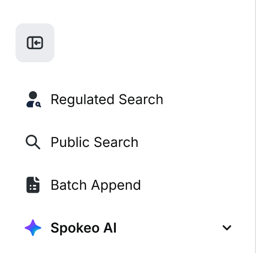
Expanded
Tokens
Grid
Breakpoint
Size
Columns
Margin
Gutter
Side Panel
Body
System Token
XSmall
0-599px
6
0px/
16px
16px
Hidden
Fluid
spk.breakpoint.xsmall
Small
600-799px
6
32px
24px
Hidden
Fluid
spk.breakpoint.small
Medium
800-991px
6
32px
24px
Hidden
Fluid
spk.breakpoint.medium
Large
992px+
12
Fluid
24px
Visible
1200px/
1376px
max-width
spk.breakpoint.large
Related
Stay up to date with the latest UX decisions, patterns, and component updates in our product.


Contact Us
Terms
Privacy Policy
Copyright © 2006-2025 Spokeo, Inc.


Grid
Our responsive grid is comprised of columns, margins, and gutters, which adjust according to the viewport size.


Table of Contents
Anatomy
Column
Columns are used to align content and will grow or shrink based on container size.
Gutter
Gutters are used to create between columns. They are a fixed width and do not adjust based on container size.
Margin
Margins are used to create space between outer columns within a container.
Behavior
Fluid
By default, content will fill the entire width of the container.

Fluid
Fixed
You can give a layout a fixed size and apply center, left, or right alignment.
Center Aligned

Fixed

Flexible

Flexible
Left Aligned

Fixed

Flexible
Right Aligned
Fixed
Flexible
Hybrid
You can combine both fluid and fixed containers within a single page.

Fluid
Fixed
Flexible
Flexible
Reflow
Optimize and reorganize the flow of page elements based on window size to allow more content to be displayed above the fold.
Usage
1440px
12 Columns • 120px Margins
MARGIN
120
24
24
24
24
24
24
24
24
24
24
24
MARGIN
120
Breakpoint: 1440px
Margin: 120px max (Fluid)
Gutter: 24px
Columns: 12
12 Columns • 60px Margins
MARGIN
60
24
24
24
24
24
24
24
24
24
24
24
MARGIN
60
Breakpoint: 1440px
Margin: 60px max (Fluid)
Gutter: 24px
Columns: 12
992px
12 Columns • 32px Margins
32
24
24
24
24
24
24
24
24
24
24
24
32
Breakpoint: 992px
Margin: 32px min (Fluid)
Gutter: 24px
Columns: 12
991-800px
6 Columns • 32px Margins
32
24
24
24
24
24
32
Breakpoint: 991-800px
Margin: 32px
Gutter: 24px
Columns: 6
799-600px
6 Columns • 32px Margins
32
24
24
24
24
24
32
Breakpoint: 799-600px
Margin: 32px
Gutter: 24px
Columns: 6
599-375px
6 Columns • 16px Margins
16
16
16
16
16
16
16
Breakpoint: 599-375px
Margin: 16px
Gutter: 16px
Columns: 6
6 Columns • 0px Margins
16
16
16
16
16
Breakpoint: 599-375px
Margin: 0px
Gutter: 16px
Columns: 6
Content
As the layout grid changes at different breakpoints, the content adapts to the new grid size.
Large: 992px+
3 column design
1
4
7
10
2
5
8
11
3
6
9
12
Fluid
2 column design
1
3
5
7
9
11
2
4
6
8
10
12
1 column design
1
2
3
4
5
6
7
8
9
10
11
12
Medium: 800-991px
3 column design
1
4
7
10
2
5
8
11
3
6
9
12
2 column design
1
3
5
7
9
11
2
4
6
8
10
12
1 column design
1
2
3
4
5
6
7
8
9
10
11
12
Small: 600-799px
2 column design
1
3
5
7
9
11
2
4
6
8
10
12
1 column design
1
2
3
4
5
6
7
8
9
10
11
12
XSmall: 0-599px
2 column design
1
3
5
7
9
11
2
4
6
8
10
12
1 column design
1
2
3
4
5
6
7
8
9
10
11
12
Screen Regions
In general, UI layouts often include navigational elements such as a header and a sidebar.
The header has a fluid width that fills the screen. The side panel is only visible at device widths above 991px and itself has fixed width of 280px. The responsive body’s width is fluid and uses a grid based on its own width, not the viewport. There is a 24px margin between the sidebar and the responsive body.
1
Header

2
Side Panel

16px margin
3
Responsive Body

#
Element
Width
1
Header
Fluid
2
Side Panel
280px fixed
3
Responsive Body
Follows the grid based on the width of the body
Side rail grids
Some pages will require different grids and margins for side navigation that will live outside of the main content area. Side navigation can be collapsed and expanded to push the grid and margins so that all content remains visible.
Collapsed
Expanded
Tokens
Grid
Breakpoint
Size
Columns
Margin
Gutter
Side Panel
Body
System Token
XSmall
0-599px
6
0px/
16px
16px
Hidden
Fluid
spk.breakpoint.xsmall
Small
600-799px
6
32px
24px
Hidden
Fluid
spk.breakpoint.small
Medium
800-991px
6
32px
24px
Hidden
Fluid
spk.breakpoint.medium
Large
992px+
12
Fluid
24px
Visible
1200px/
1376px
max-width
spk.breakpoint.large
Related
Stay up to date with the latest UX decisions, patterns, and component updates in our product.

Contact Us
Terms
Privacy Policy
Copyright © 2006-2025 Spokeo, Inc.